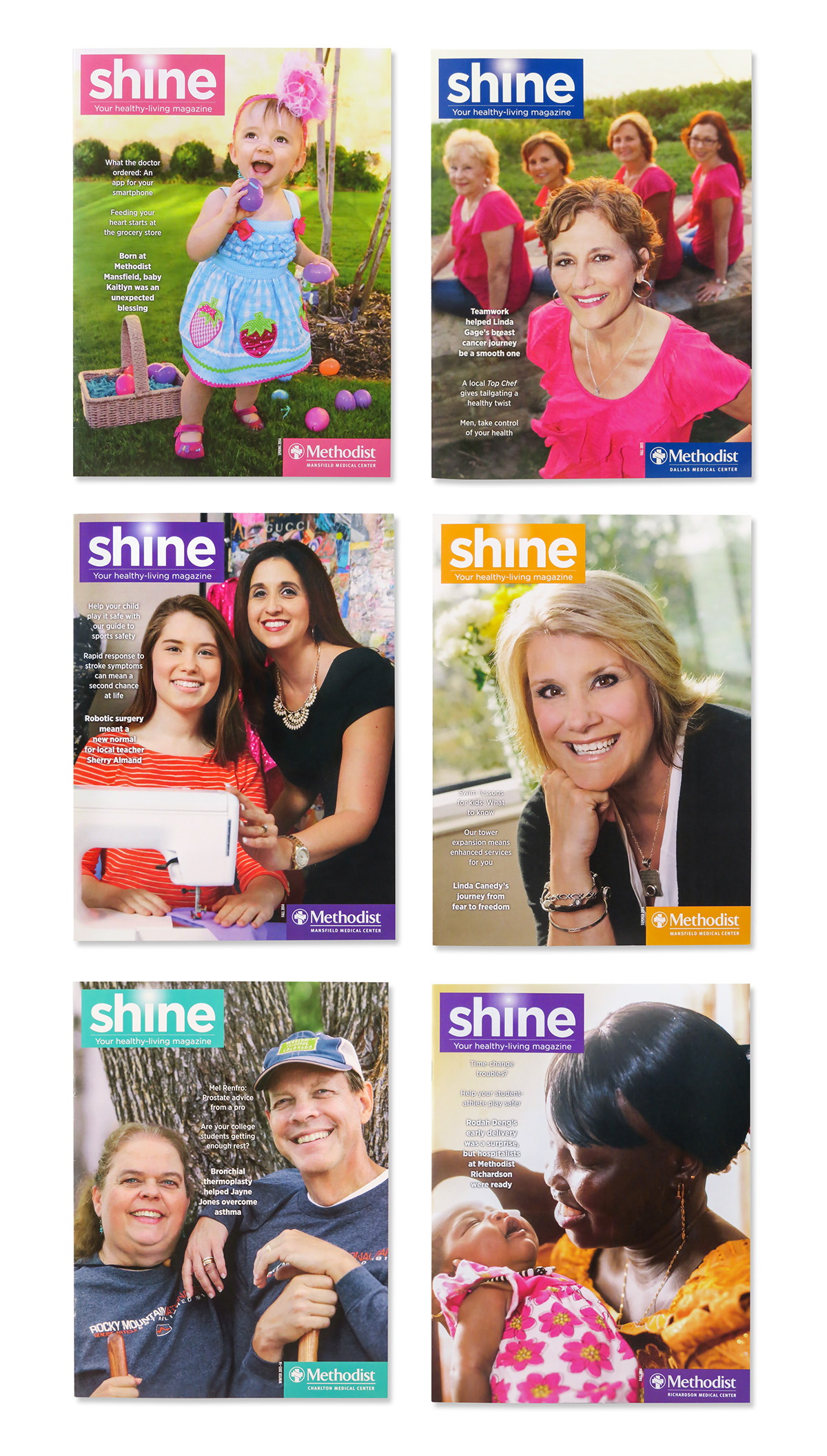
Cover Examples. Client always submitted multiple photos for the various patient stories, and we were asked to chose the images that were the best options for the cover.
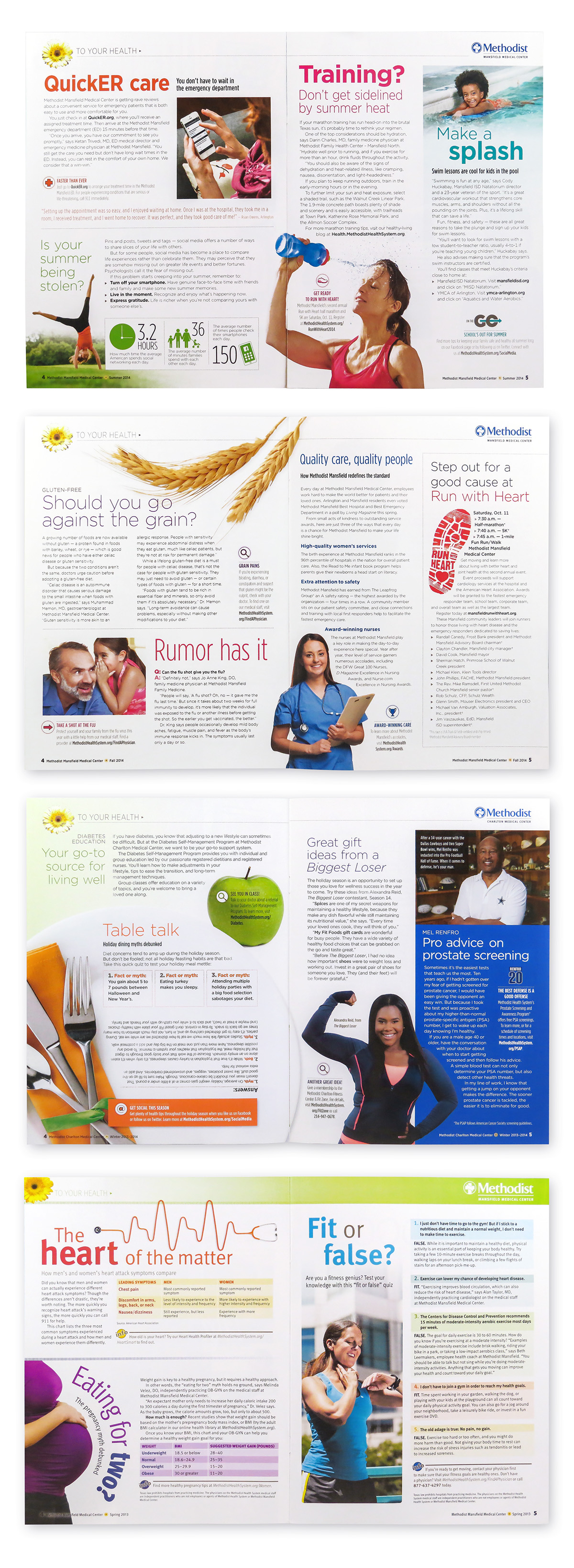
Examples of multi story pages, usually a two page spread after the table of contents page in the publication. You can see how the publication look changed over time from 2013 to 2014 based on the last spread of this group, compared to the others above it. The movement towards more white space, and switching from Meta to Gotham fonts helped create a more airy feeling to the publication.
Examples of single story pages. Often grouped together in the publication since the majority of the layouts were two page spreads. Often the single page stories were patient stories, but they could also just be general health and wellness stories, where we selected stock imagry or created imagry to illustrate the topics.

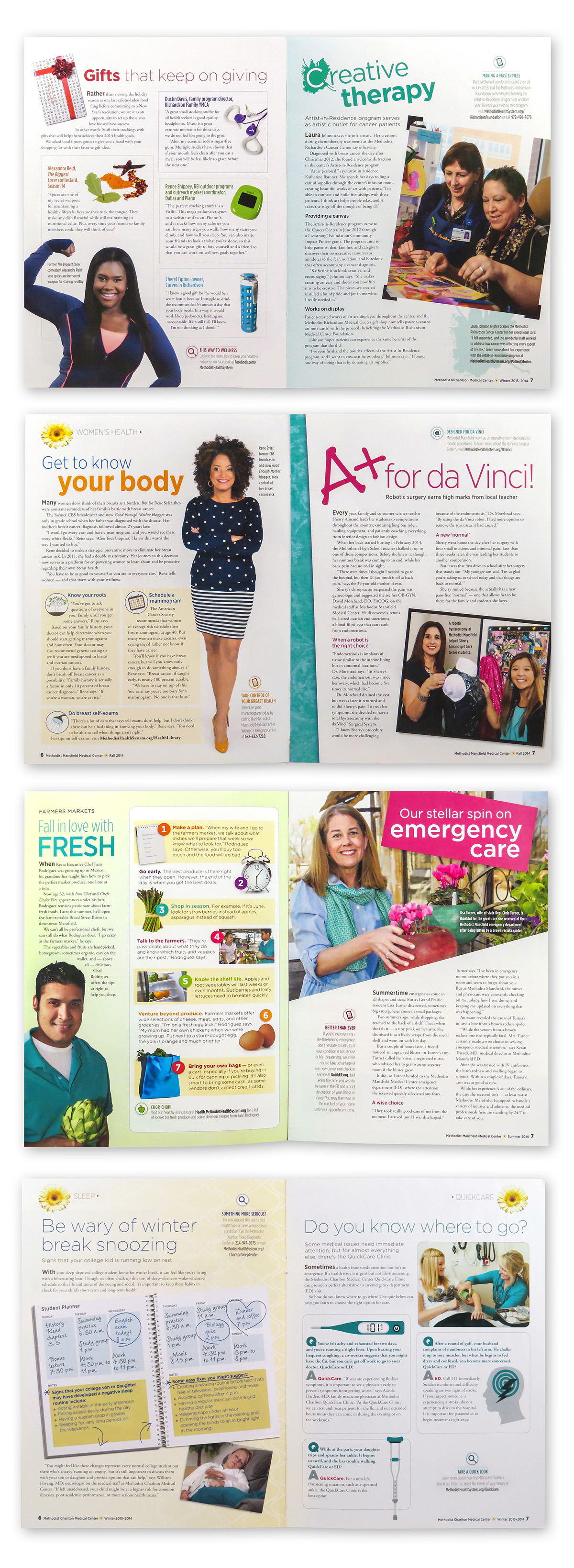
Two-Page Spread examples. The Client had their own photographer take sets of photos of the patients featured in the articles, and then sent them to us to choose and edit which ones would appear in the publication. The spreads were allowed to use different fonts for the headlines when appropriate, and color was determined by the photography. Sometimes we would create art to supplement, like the illustration of part of the DaVinci Machine on the "High Tech with a human touch" spread. I created the illustration to make the robot aspect of it seem less sterile and scary, as the machine can be pretty intimidating. The part illustrated was the part that the surgeons interact with to move the arms of the main machine - emphasizing the human touch aspect. Generally, the client prefers to stick with their photography. However, working with this client for 3 and a half years, I was able to introduce different approaches, some that stuck, and some that were misses, but I loved working on this job for the creativity I was allowed to explore for the various spreads.
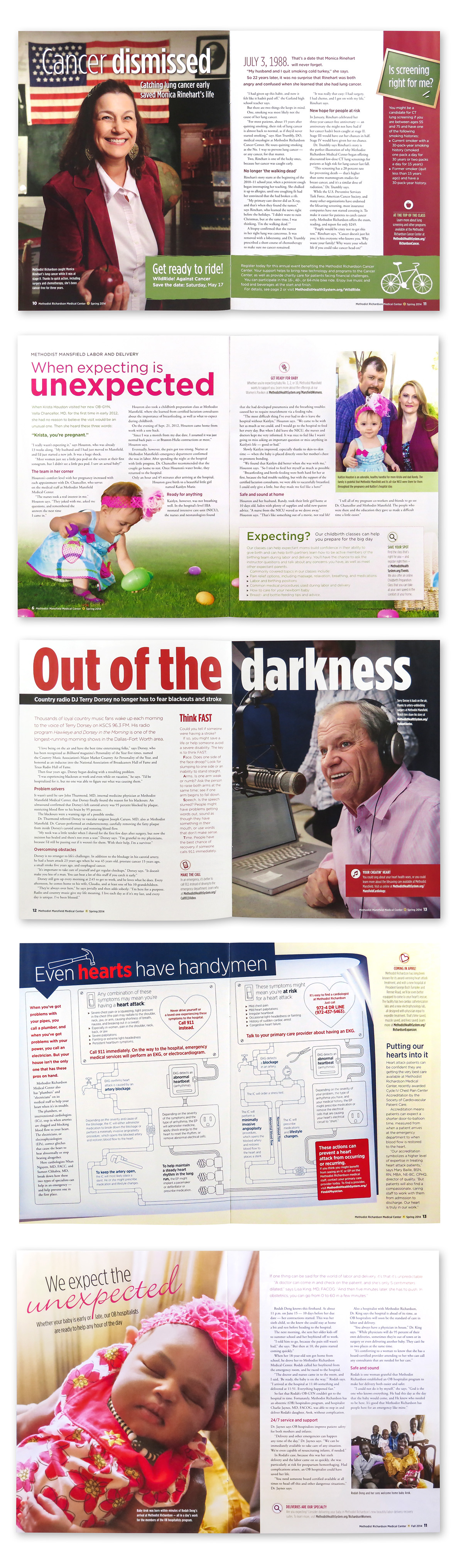
More two-page spread examples. The "Even Hearts have Handymen" spread was a custom illustration/graphic that I did, based on a tree chart the client sent us, where I took the information and the headline copy and created an infographic with pipes and wires and tools to illustrate the risks of having a heart attack. We went with the pipes and wires as a metaphor for the systems of the body, and how if one part breaks, it effects the entire system.
The "When expecting is unexpected" spread shows some of the liberties we had with photos supplied from the client. We often cut out the people if we felt it was appropriate; if the background was too busy, or if we were craving a little more whitespace on the page.
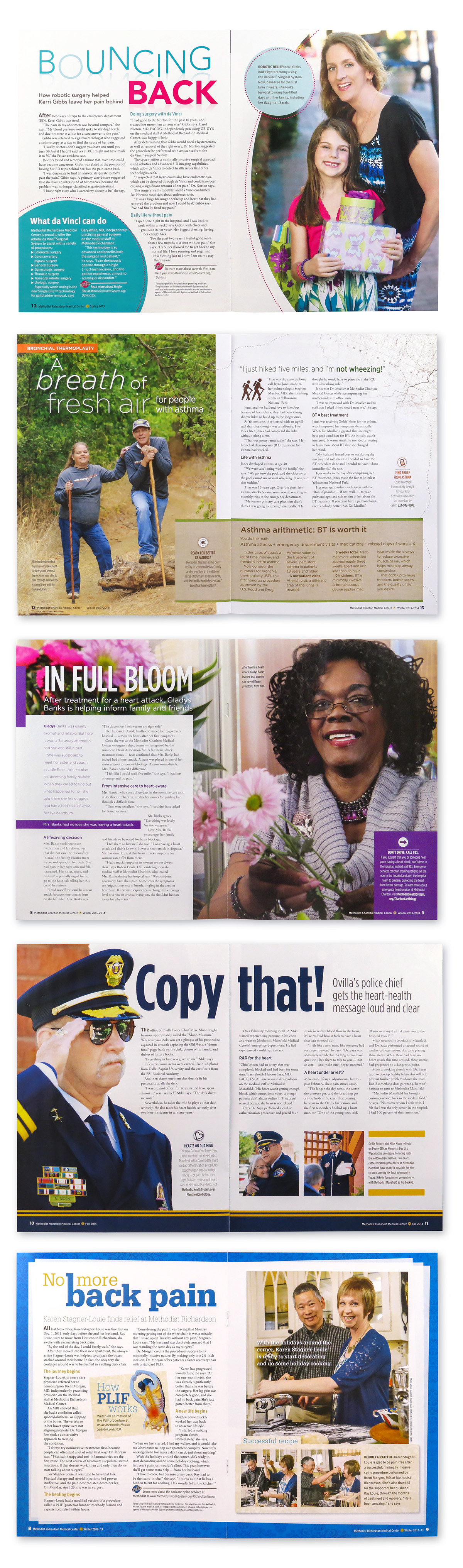
More examples of two-page spreads - we sometimes included more than one photo from the client, but after the transition to more white space in 2014 and on - we tended to focus on one large image, to keep the pages from looking cluttered. If another photo was added, it was more for adding context to the photo situations.

