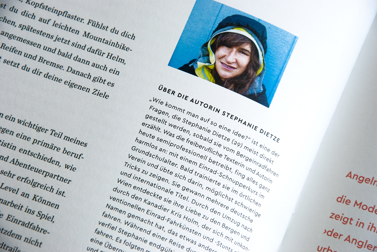
Über Magazin, issue #8
German agency Releit und Junker publishes the oversized and monothematic Über Magazin. It features creatives and artists from various disciplines. The eighth issue focusses on the topic of “hours” and uses Miller and Cera as temporary typefaces. The next issue will have a new art direction and new typefaces.
—
2015


Haiwyre studio website
Glasgow-based graphic design studio Haiwyre is using Cera Stencil for their logo and headlines and complementary Cera for anything else on their website.
—
2015


Kempinski Luxury & Lifestyle Magazine and App
For the redesign of the Luxury & Lifestyle Magazine for Kempinski Hotels, Patricia Urban used Cera as the main typeface for text and headlines, accompanied by Adobe Caslon Italic. Former issues were set mainly in Futura, which often had to be replaced by a more humanistic typeface like Frutiger for readable running text. To avoid this inconsequence, Cera was introduced and made its debut in real life (even before having proper italics yet).
The magazine for Europe’s oldest luxury hotel group covers topics like travelling, luxury, culture, lifestyle, art, trends, fashion, wining & dining, design and exclusive products quarterly. Some issues are available both in printed form and as digital iPad app.
—
2014


Visit typemates.de to explore more typefaces beside Cera
or subscribe our newsletter for updates like Cera Soft or Cera Brush.


