
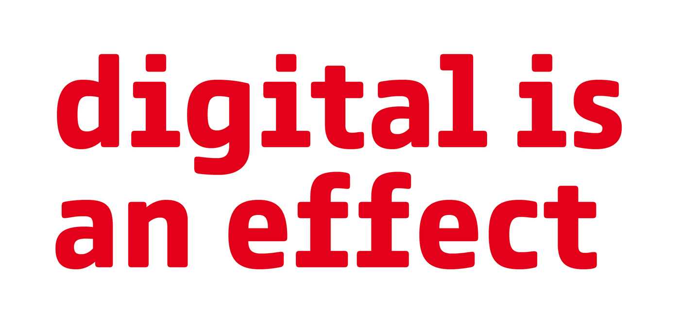
Comspot is a rounded and characterful typeface mixed with some typewriter flavour and human touch. The font is especially designed for hard- and software dealer who need some attractive figures to sell their products.
In June 2015 Nils Thomsen designed this font as a corporate font for the Hamburg based hard- and software reseller CPN Cooperation Network GmbH and its Partner Comspot.
The client wants an individual typeface for all media. It should work in reading sizes and of course also display very distinctive in larger sizes. Comspot can do!
Subscribe our Newsletter for updates:


The typewriter character is mostly visible in the folowing letters: f and t got a wider middle stroke, while w, M and W are designed tighter with ad lower middle part. Special glyphs like 'f i j l r G I J L' which make most trouble in monospaced fonts got an alternate glyph with strong serifs to emphasis the typewriter character.
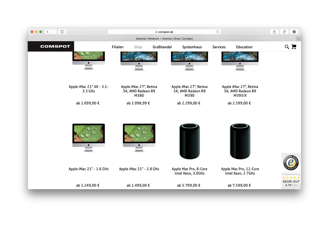
Very important are the figures. The main reason is that Comspot wants to sell their products. Prices should look nice, prices should work in tables, and the figures should display very well on printer or other product names. Now Compsot sells more!


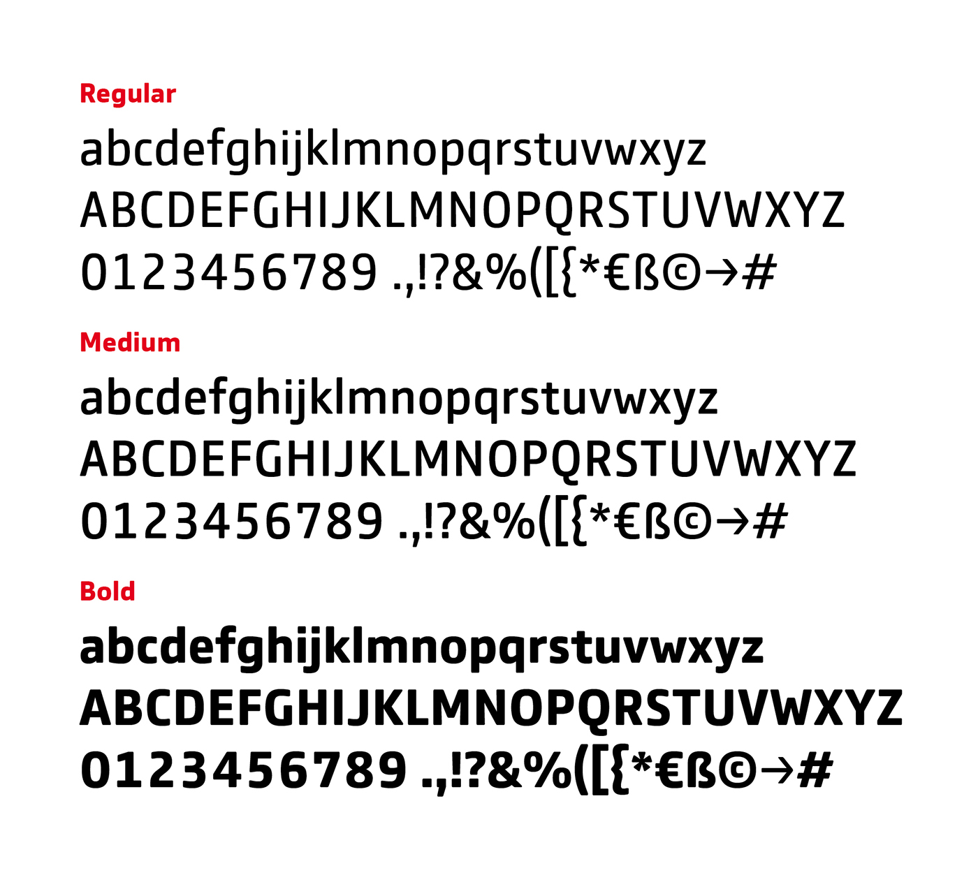

For now the Comspot font got three weights: Regular, Medium and Bold. But we are working hard to extend this family from Thin to Ultra Black in 10 weights plus italics to have another work horse ;)
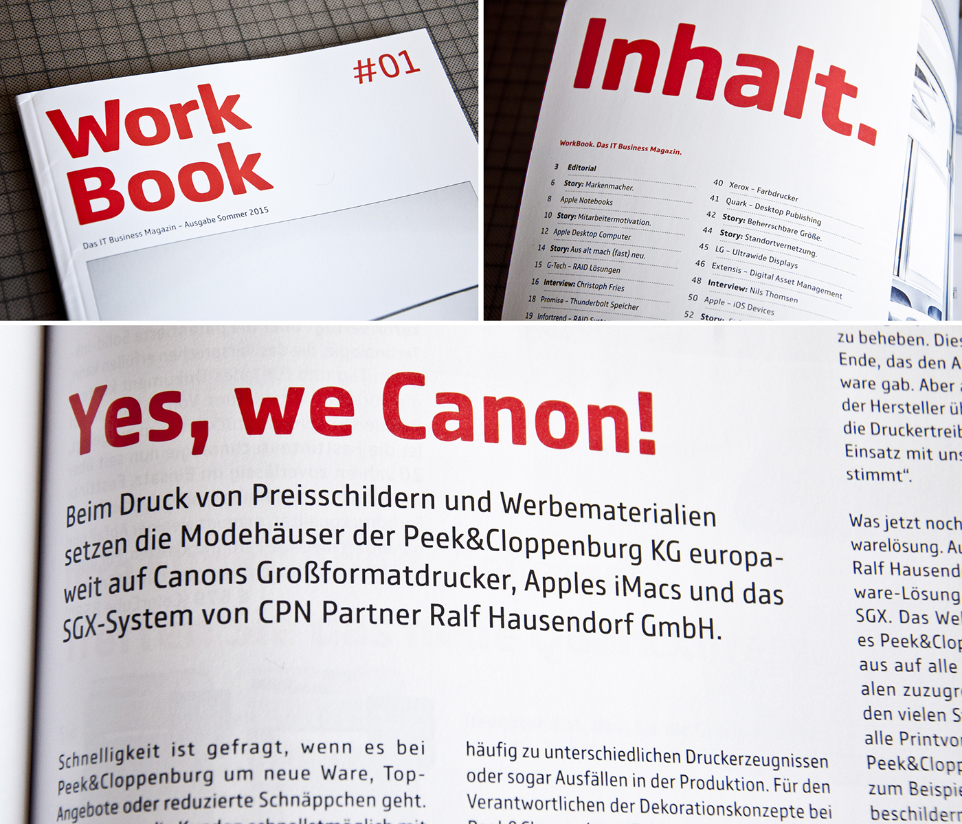
The typeface is now used mainly in their shops to display their products. But it also comes along their magazine and their website. Especially hand hinted for the web! www.comspot.de
If you like our style, we got more fonts on www.typemates.de


