Comfortable Confusion
"At Autobahn we work with letters and we play with their definition. Whether we’re designing an identity, website or campaign, we consider letters to be images." –Rob Stolte & Maarten Dullemijer
We all use letters to convey written communication. But when letters are presented as images, something strange occurs. As a reader, you have to make a decision: do I look at an image, or do I read the text? Watching and reading simultaneously is difficult. It creates a short circuit in the brain between the left and right hemispheres. It's what we call Comfortable Confusion. Combined with clear concept and dialogic design, this is our starting point for intriguing communication.
This method stems directly from the founders personal characters at Autobahn’s creative core. Where the one is practical, intuitive and covers the broad lines, the other is analytical, logical and detail oriented. Through discussion and exchange of ideas the two characters merge. Together they form a unique corpus based on their mentality. The result of this collaboration is notable design and intriguing communication that literally stimulates the brain of the beholder.
This was the startingpoint for Aleph:

Origin of Type
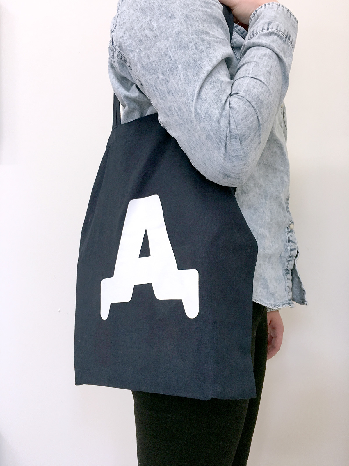
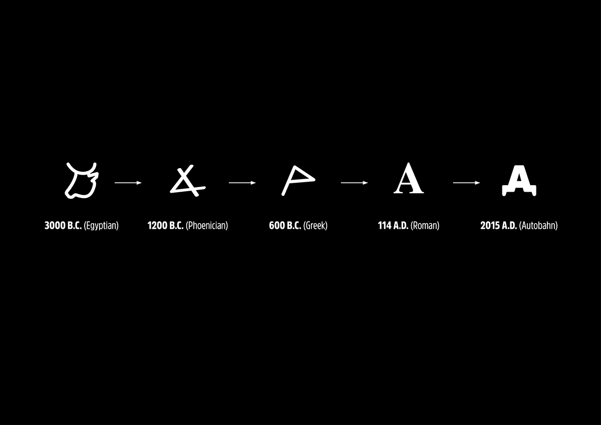
For our 10th anniversary, we’ve created a new visual identity for ourselves. We used the first letter of our name as a given, because frequently we explain to people that what we do at Autobahn is best illustrated by showing how human communication in writing has developed over the years: The letter 'A' finds its origin in an Ox head (Aleph, or 'first') around 3000 B.C.
Over time, it gradually changed into the form we today recognize as the letter 'A':
New Identity
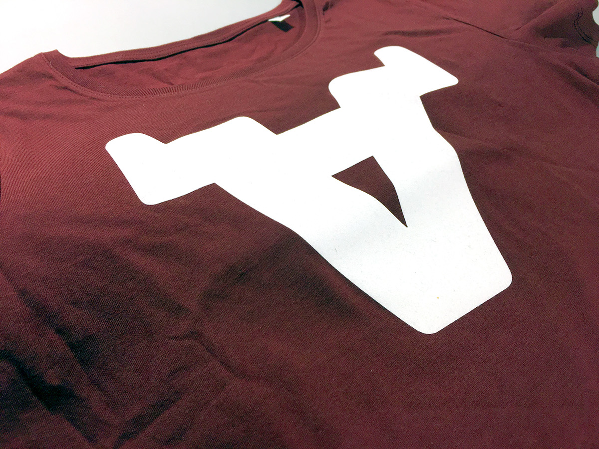
Autobahn celebrates its 10th anniversary in 2015. For this special occasion, we created a new logo and identity for the studio. In this new logo, we’ve combined the two definitions of the letter 'A'. By turning the letter around, its definition changes although the shape stays the same.
The Oxhead and letter 'A' are connected in a design that spans human 'design' over 5000 years:

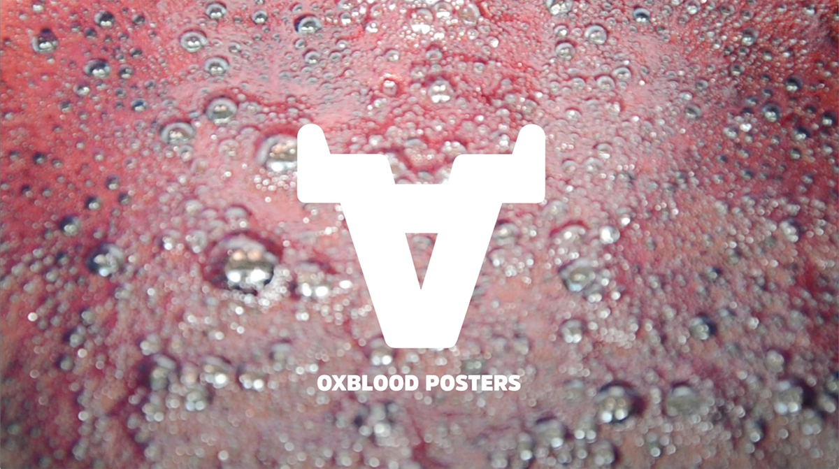
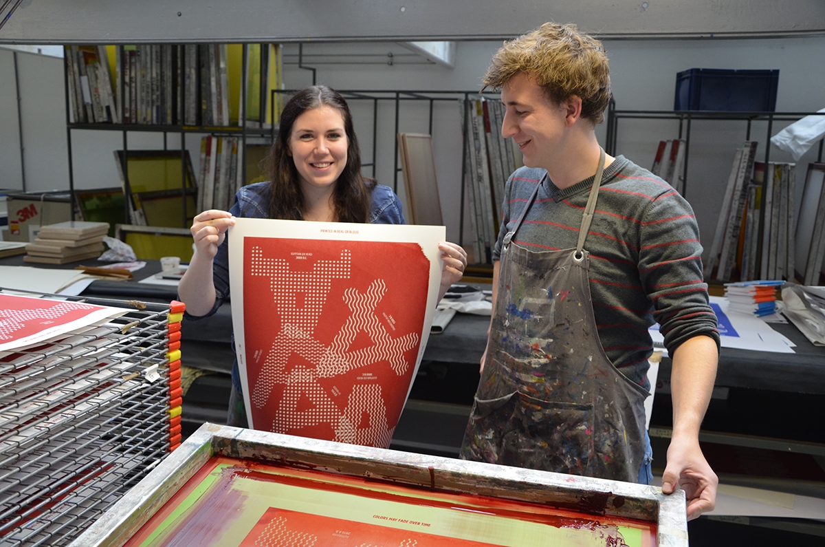
Red
For the Autobahn identity we created an ink that is actually a Pantone fashion color, but it does not exist as a printing color: Oxblood Red.

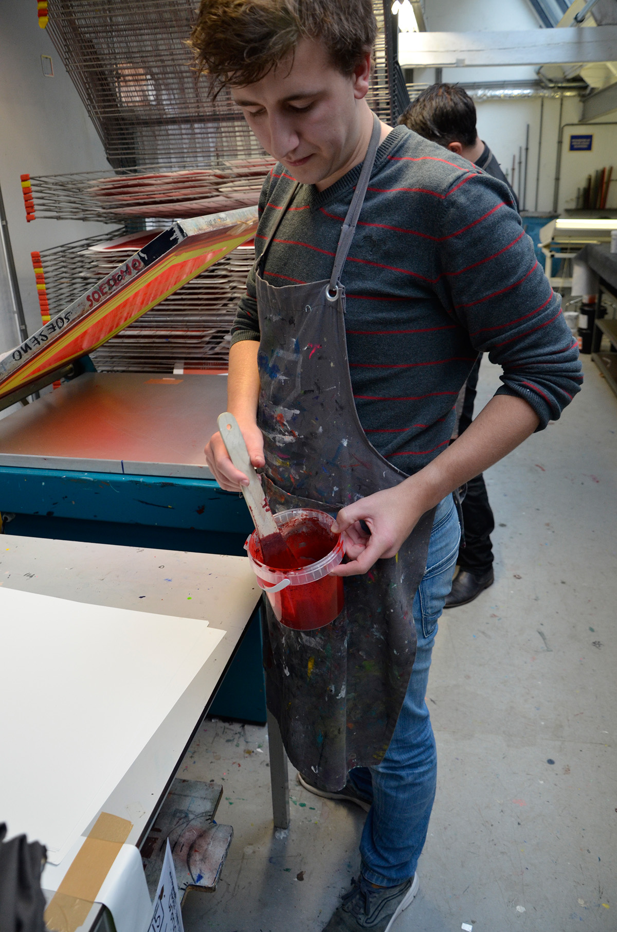
Print
We teamed up with Ramon Goedvree from Kapitaal Utrecht to create silkscreen printed posters with real Oxblood, in an limited edition of 30:
Follow us on Facebook for regular updates.


The poster is for sale. Please contact us for inquaries about price and availability or its design.
Oh, and mind you: the colors may fade over time due to organic materials...