
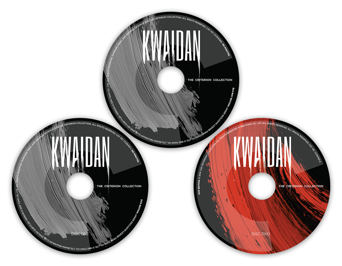
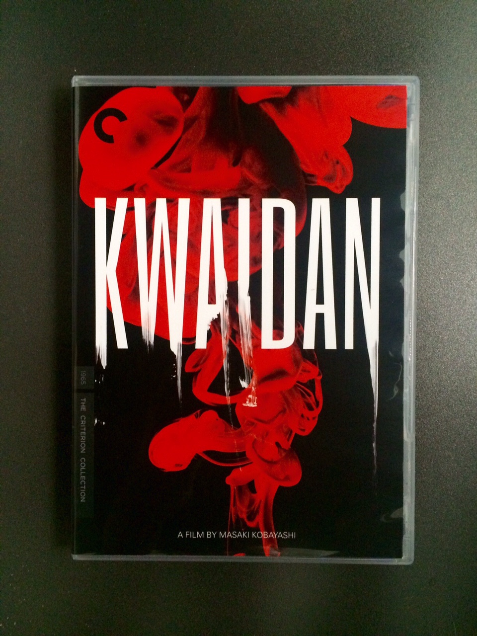
KWAIDAN
CRITERION DVD BOX
The idea behind the packaging redesign of cult movie Kwaidan (1965) for The Criterion Collection was to create a beautiful artistic visual inspired by the original title sequence of the film, with a deep & spooky feel. At the same time, we wanted to produce an iconic image that was also rooting into the symbolic & aesthetic of the stories, as well as in Japanese culture through colours & a traditional calligraphy twist.
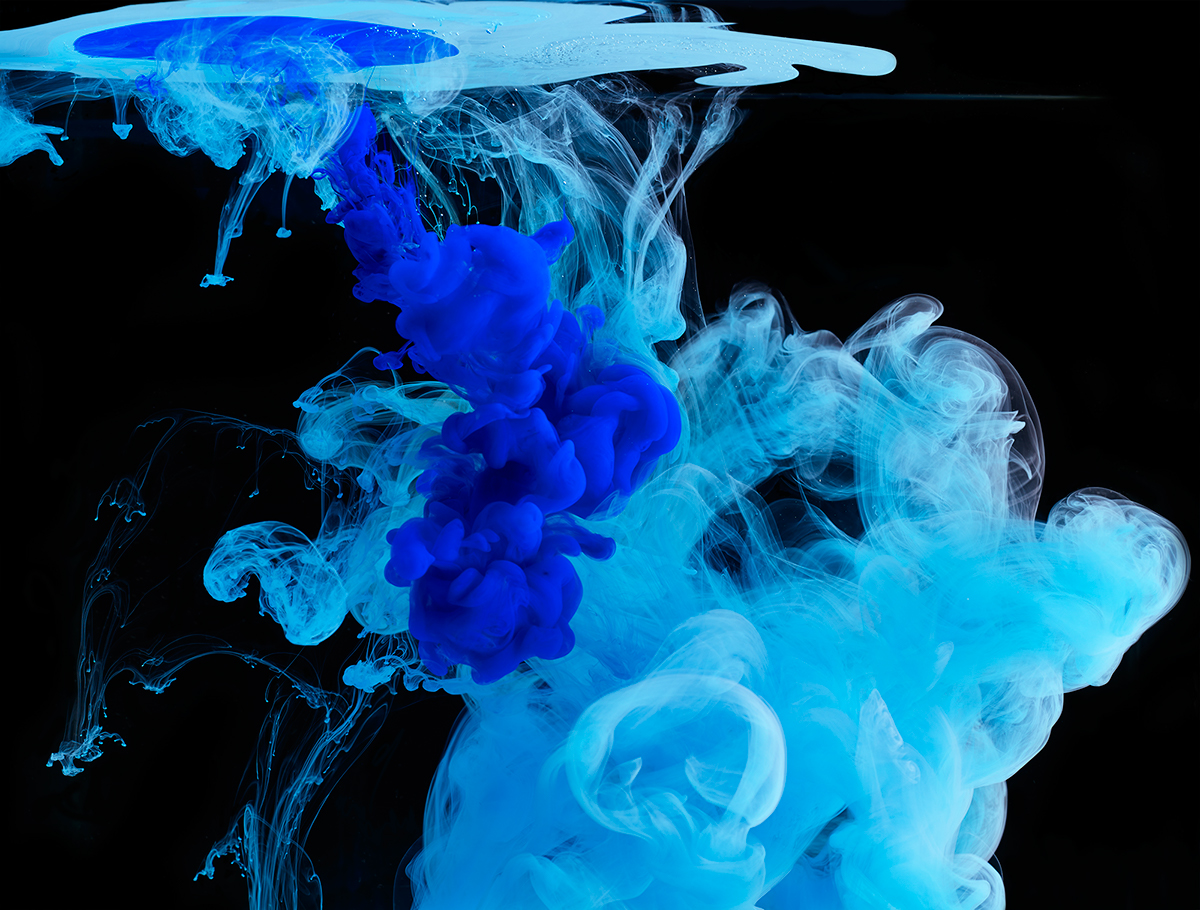
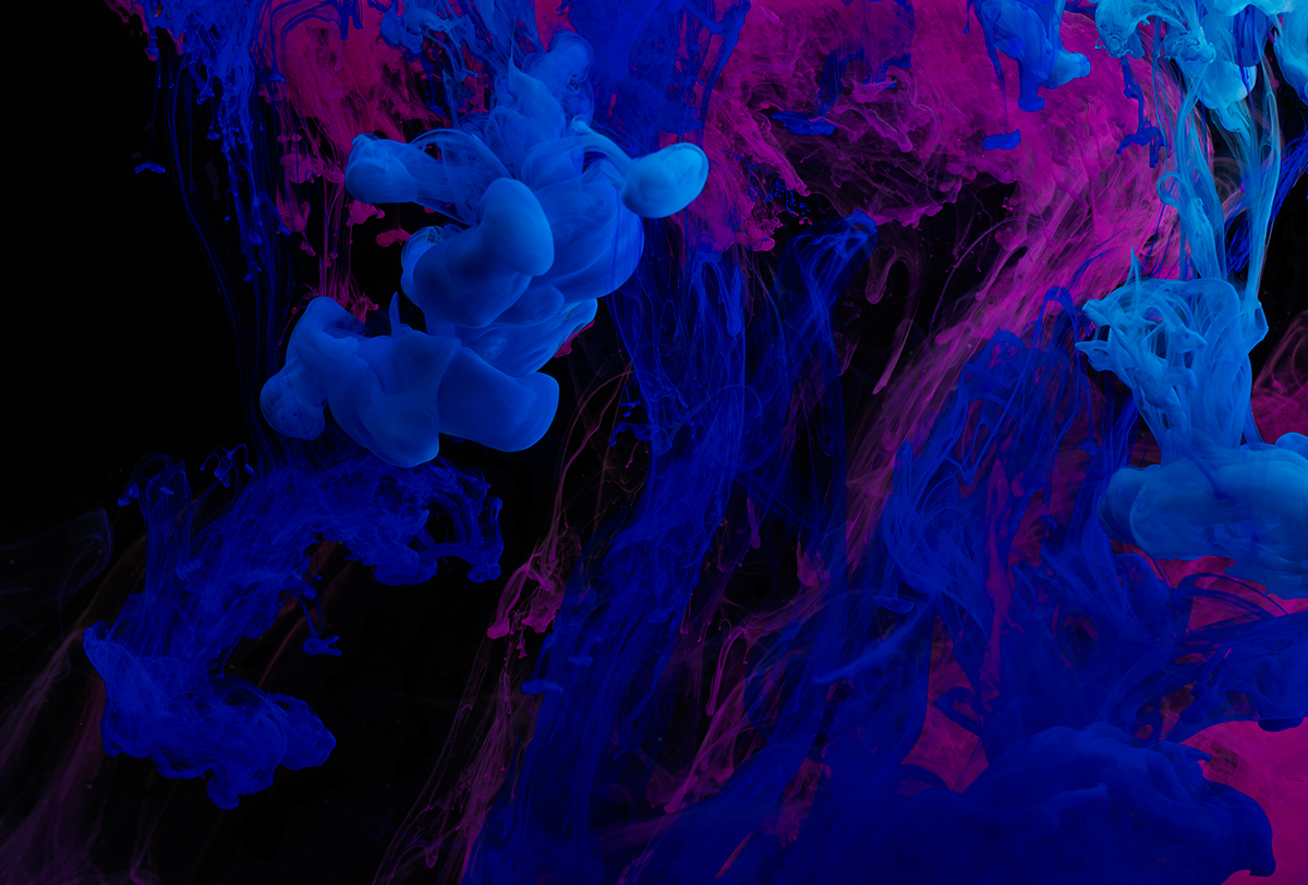
Conceptually, we immediately got very inspired by the original title sequence, featuring black ink dropped in water - a physical interaction that I also always found mesmerizing and loved playing with; fluids dynamics being a big love of mine through the work. We ended up with a huge image library, from which we selected a series we felt had the richest volutes and details to transcend the ghosty feel we were after.
Conceptually, we immediately got very inspired by the original title sequence, featuring black ink dropped in water - a physical interaction that I also always found mesmerizing and loved playing with; fluids dynamics being a big love of mine through the work. We ended up with a huge image library, from which we selected a series we felt had the richest volutes and details to transcend the ghosty feel we were after.


CREDITS:
Client: Criterion Collection
Art Direction: Eric Skillman
Design & Typography: Sean Freeman
Creative Production & Design: Eve Steben
Photography: David Lidbetter


