Orlando Gives - Final
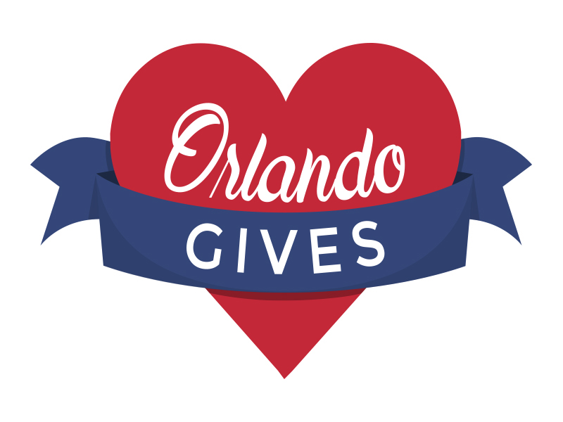
With the concept left up to me, the clients initial request was for the logo to be approachable and light. I wanted to show something that represented Orlando without relying on metaphors tided directly to the city of Orlando and the surrounding areas. I wanted to communicate the idea of a caring embrace around community and the feeling of inclusion.
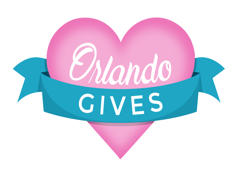
The initial palette was inspired by the softer side of the neon colors seen throughout Florida in the 80's. The heart represents the caring nature of the organization while the ribbon wraps around loosely embracing it.
As with any design, the typefaces can make or break a project. Balancing a soft and legible typeface with an approachable yet strong typeface was the aim. The use of Maudy Script for “Orlando” was inspired by an old postcard I had seen from the 70's. Paired with Montserrat, this captured the feel I was looking for.
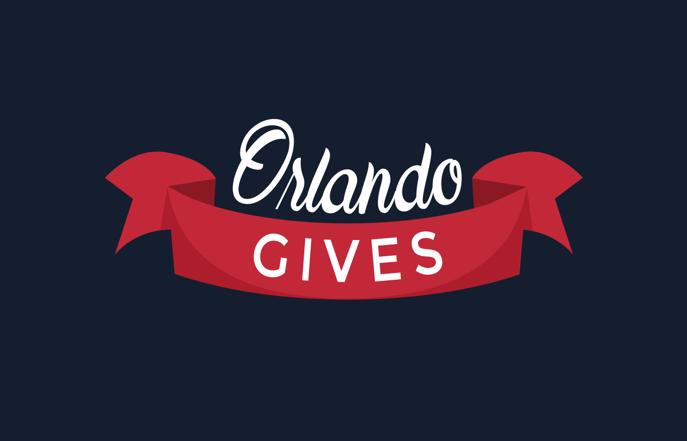
After reviewing the first pass with the client, I was asked to follow the same palette as Giving Tuesday. After making the requested changes, the board chose to remove the heart and go with the typeface and ribbon.