Research website / trends
I was researching into different areas how websites are laid out and structured. I then considered these themes: Pretty penny
1) "Money penny" associations
2) Classy
3) Pot of Gold (Journey)
4) Eye - Catching
5) Independent
6) Edgy
7) Boyish Style
8) Rough Edge
2) Classy
3) Pot of Gold (Journey)
4) Eye - Catching
5) Independent
6) Edgy
7) Boyish Style
8) Rough Edge

It’s quite simple web layout
Classy
Boyish style with girly side to it
Image suggests with a mixture of adventure / journey

· The colours struck out at me
· Its web designer page
· Creativity
Web layouts


Grid layout


Comparing different width of gutters and margin


In the top example there are only two columns and second example where has four columns
In the narrow gutters you can use more columns into it

Its uses more narrow gutter and much wider margins. The content is clear in fatfreemedia example because its use smaller margin and wider gutter.

It is very narrow gutters and makes it look far much messier

Conclusion
The one I liked were fatfreemedia because its cleaner look and not messy like the other website looked at ‘Big thinkers’. It because you see the images clearer and see them content even more.
Looking at different types of typeface

I think that the above typeface image is bit too much for the group company website because too masculine for pretty penny.

I think this above typeface image will work for company website (Pretty Penny) because it’s not too masculine style like. And also I liked about this typeface it’s a bit classy and modern.

I think that this typeface image is simple and classy and will work for the company brand website. And also with bolder typeface will work for header, less bold works will with content.

I think that this typeface is too heavy for the website because if you put a heavy style background with this it will not fit to a pretty style aspect.
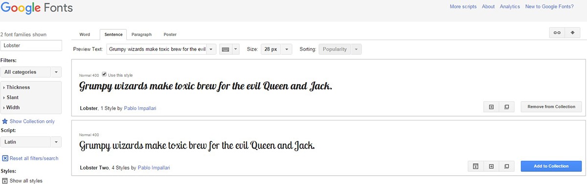
I found this font in google font site and wouldn’t be possible to add to wix using html format
Hierarchy of information e.g. larger fonts for headers and small text for the content
“Highly prototypical” sites – those with layouts commonly associated with sites of its category – with simple visual design were rated as the most beautiful across the board.
(http://conversionxl.com/why-simple-websites-are-scientifically-better/ , 21.10.2015)
Prototypical graphic design websites


This was the original design for our company website. I changed the design of it because I wanted the design to compliment the logo but the logo design had to many colours to work with this background shown above.

The previous screen shot used a background image but I have to remove it to use a single colour that will complement the logo. Also change the navigation button colours to match the rest of the whole colour scheme.

Business cards

Business cards (Same example above)

Letterhead

Company logo


