This visualization uses the NYTimes api to gather mentions ofvarious wars over the years and prints each total for every monthbetween January 1981 and March of 2009 (approximately when the projectwas due). The Processing program makes a series of calls to the api andprints the number of mentions in the form of a bar chart in a superlarge print file. The labels of each bar were automatically added inProcessing but I added the legend and title of the poster myself.
Ofinterest is how many times WWII is mentioned consistently overeverything else and indeed if another war starts, mentions of WWIIincrease. The spike around 10/95 is the 50 year anniversary of WWII.And the slight rise of the mention of Afghanistan in the 80s isactually mentioning the Soviet-Afghan War and not the U.S.'s post 9/11war.
This is probably the simplest visualization I've done andyet because it's easy to understand I think it is one of the moreeffective ones. If timing and interest permit, I'd like to make chartsfor other kinds of mentions. Not so much because the work itself isunique (far from it) but because the results are lovely and would makegood nerd wall art.

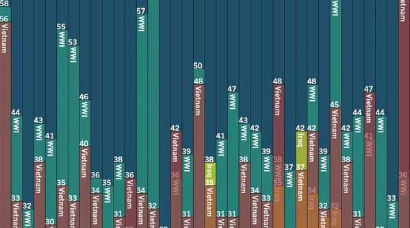
Closeup of the poster
