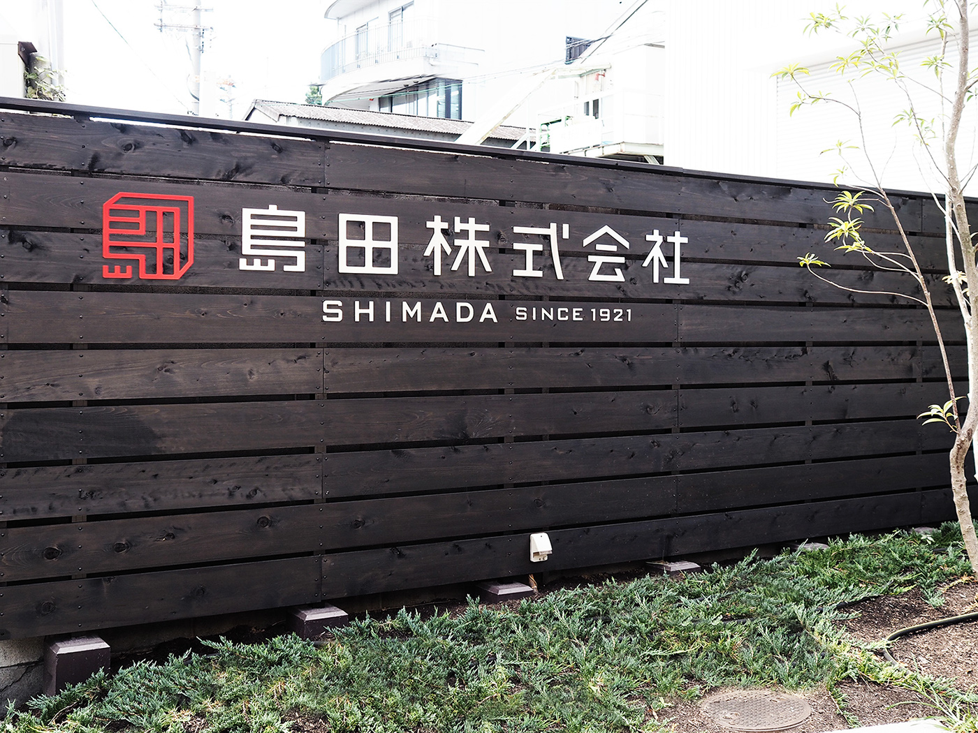
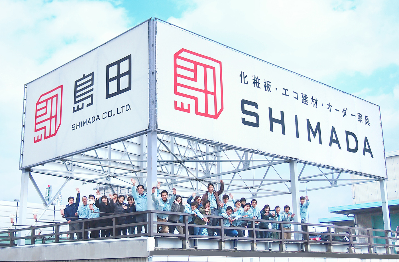
大阪市西淀川区に本社を置く島田株式会社。1921年創業の老舗企業として家具材料・内装材料の販売や、家具製作などを行っている。今回tegusuではオフィスの新規移転に伴うCIリニューアルの相談を受け、CIと使用ガイドラインの制作、サイン関連のデザイン、名刺などのデザインを行った。
Shimada Co., Ltd., an old firm established in 1921 and based in Nishiyodogawa-ku Osaka city, sells furniture materials and interior materials, as well as makes furniture.
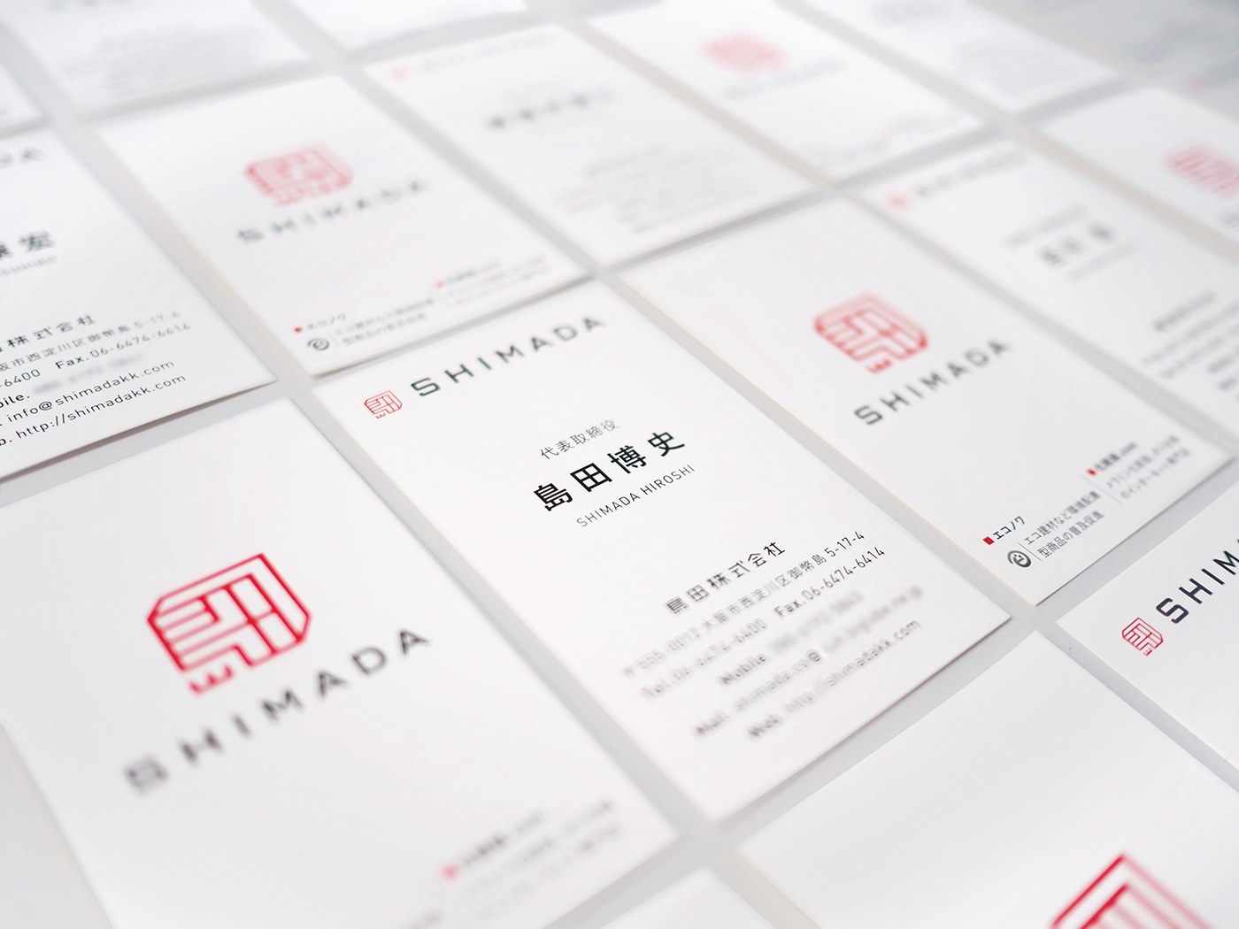
In response to the company’s consultation regarding CI renewal upon the office relocation, tegusu established CI and a guideline for use of it and designed signatures and business cards.

基本コンセプトの設定にあたっては同社の三つの理念(以下要約)をヒントにした。
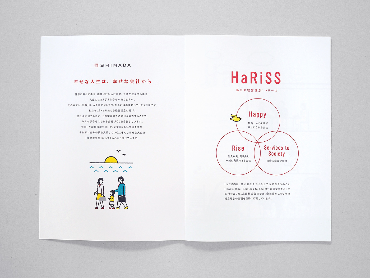
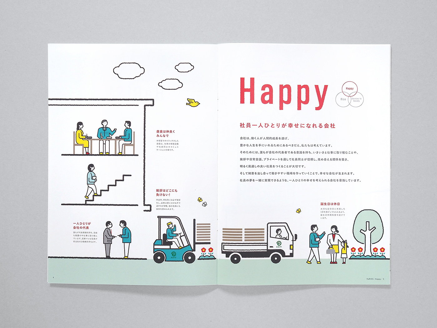
1)社員全員が幸せでいること
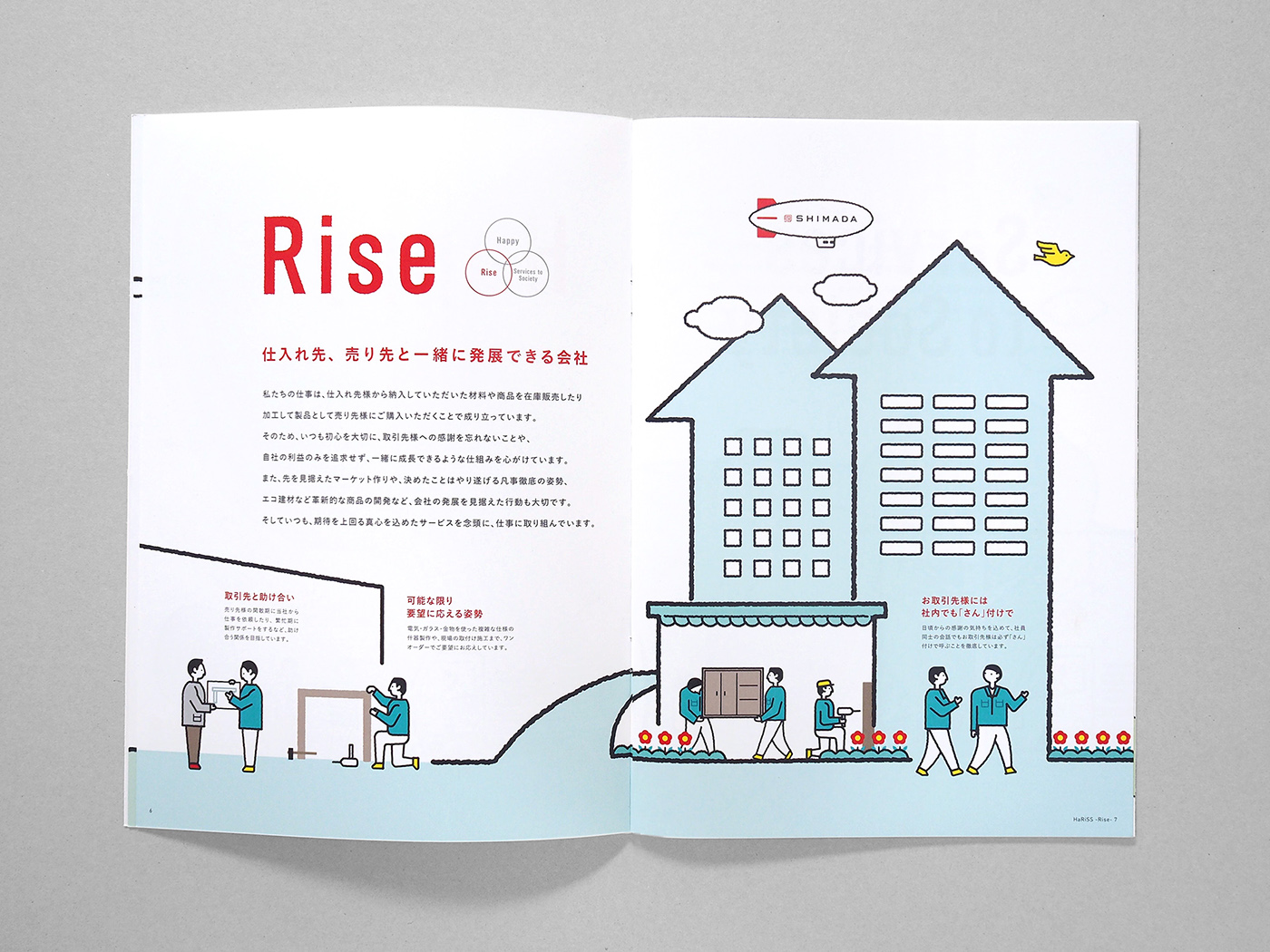
2)顧客・協力先と共に成長し革新的なサービスを提供すること
3)社会に役立つ企業であること
社長の誠実な人柄や、会社全体の真摯な姿勢が伺える言葉であり、ここから「信頼」「実直さ」「パートナーシップ」「歴史と伝統」「経験」などのキーワードに結びついた。またこれらのキーワードをもとに、二つの具体的なモチーフをアイデンティティに落とし込んだ。
1) Provide every employee with a feeling of happiness.
2) Grow with customers and affiliates to offer innovative services.
3) Always contribute to society.
These reflect the president’s honest personality and company-wide sincere attitude, which led us to the key words including “confidence”, “conscientious”, “partnership”, “history and tradition” and “experience.” Based on these key words, two specific motifs were embedded into the identity of design.

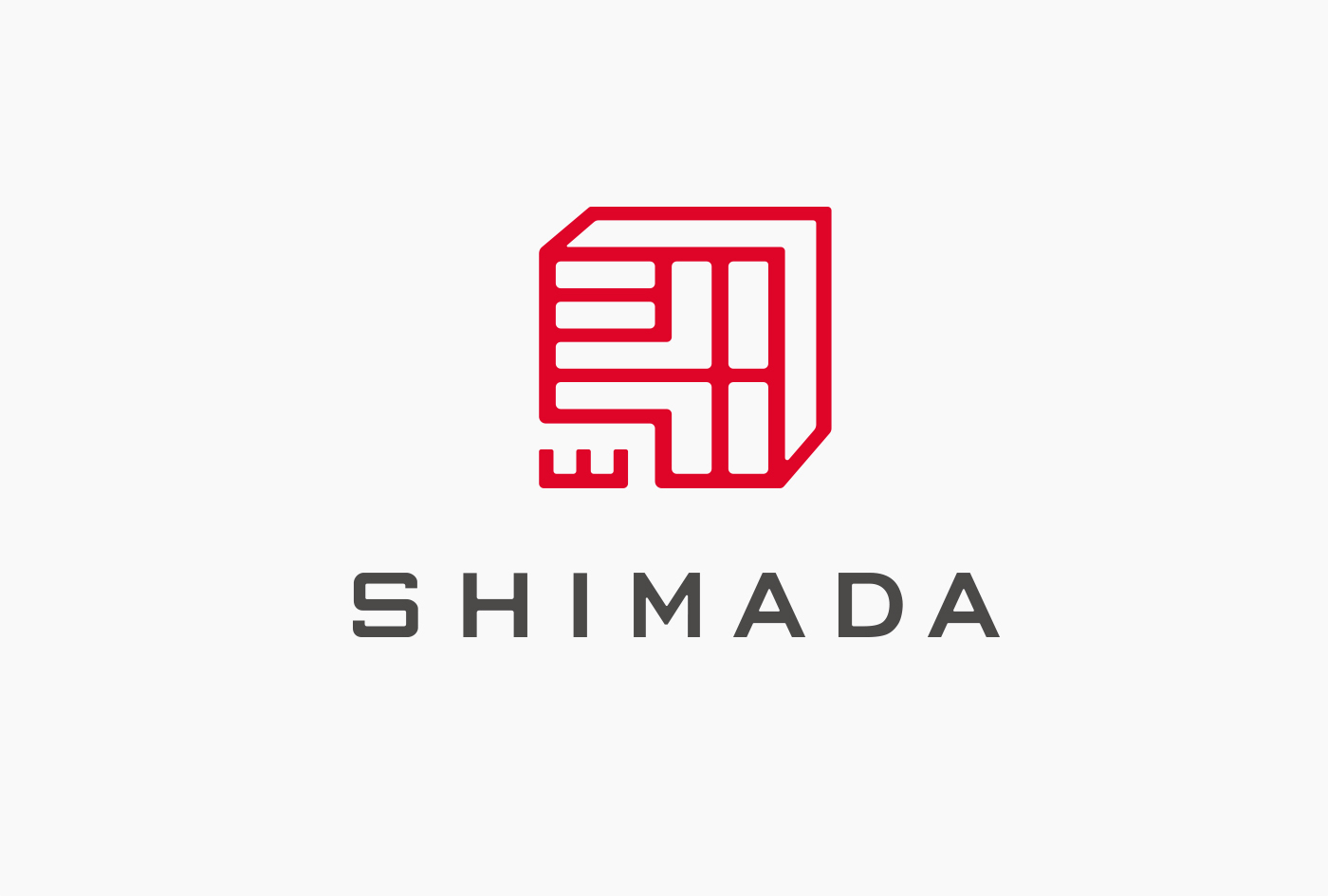
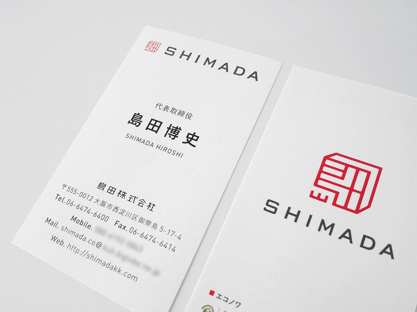
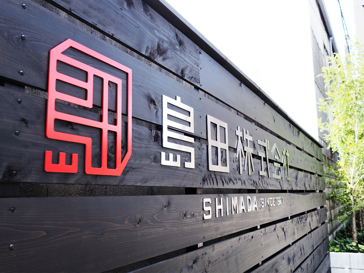
1つは「印章・印鑑」。日本は「ハンコ社会」と言われるように、ビジネス文書や公的文書、銀行通帳など、さまざまな書類の認証を表すものとして印鑑を押す習慣があり、それは言わば「信用」「信頼」の象徴である。その役割にインスピレーションを受け、島田株式会社が100年近い会社の歴史を継承し、気持ちを新たに三つの理念を遂行する証として印鑑をモチーフとした。
2つ目は「箱やフレームの構造物」。化粧板や家具材などにより空間や内装に「新しい価値」や「彩り」を与えていくように、「未完成のものに息吹を与える」企業であることを連想させるモチーフとして、フレームや白い箱をデザインの題材にした。
上記を組み合わせ、「島田」という漢字をアレンジすることで一つのシンボルを作成した。
ーー
First is “seal and signature.” As is called “Hanko (seal) society”, Japan has traditionally used a seal to express that a document, both business and public, or a bankbook is authorized. Thus, a seal can be said as a symbol of “credit” and “trust”. This inspired us to design Shimada’s succession of almost 100-year history and determination to achieve the three policies with a forward-looking attitude in the motif of a seal.
Second is “a structural object such as box or frame“. tegusu chose frames and white boxes subject to design, because these are associated with an idea that decorative laminate and furniture materials offer “new value” and “colors” to a space or décor, and that motif suggests that the company “quickens something incomplete”.
The symbol we created consists of the combination of the above and arranged Chinese characters for “Shimada” (島田) .
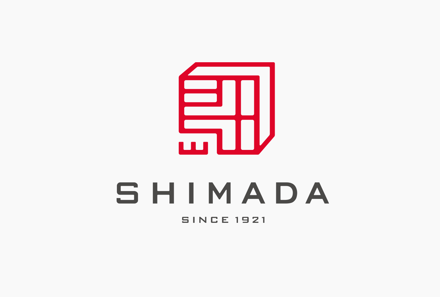

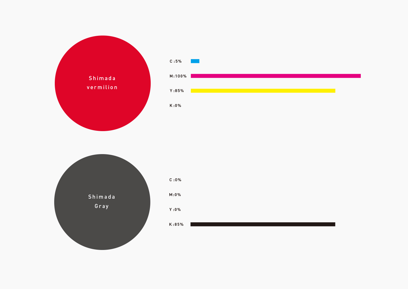
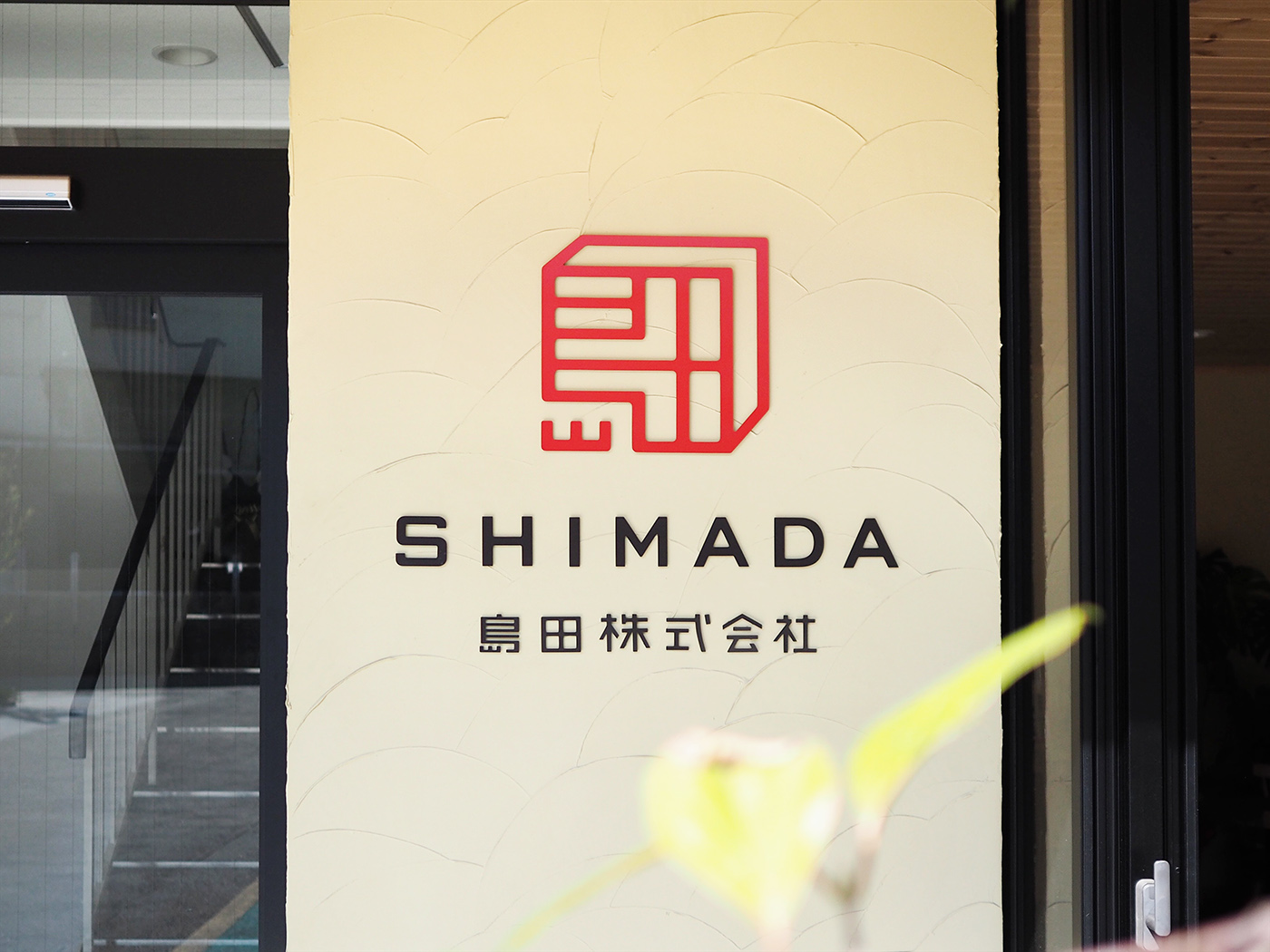
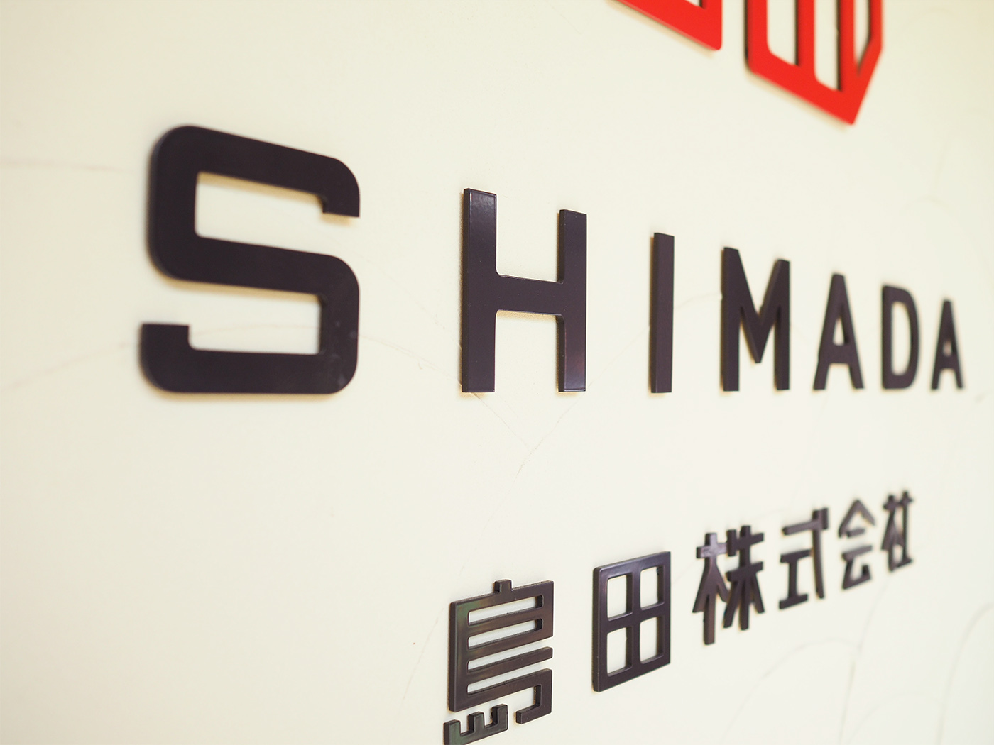
ロゴは角印をイメージし英文もすべて正方形におさまるように設計している。またガイドラインでは使用の際のマージンの確保、基本カラー以外のさまざまなカラーパターンにおける使用見本を明記し、企業イメージの統一に配慮している。
The logo forms an impression of a square seal, a typical shape of corporate seals, having all characters including alphabets fit inside the square. The guideline specifies the margins to be secured when the logo is used and all samples of color patterns to be used other than its basic color, to unify the corporate image.

Brochure
Client:島田株式会社/Shimada Co., Ltd.
Art Direction & Design:Masaomi Fujita
Construction & Design:しまだ設計室/Shimada Architect


