BRIEF:
Design a Gourmet Street Food structure in the heart of the city of Berlin. The architecture of this should reflect contemporary design tendencies and take into consideration the urban context and impact.
Design a Gourmet Street Food structure in the heart of the city of Berlin. The architecture of this should reflect contemporary design tendencies and take into consideration the urban context and impact.
IDEA:
Wabi Sabi is a place to meet, socialise and celebrate Japanese culture. Customers will be able to relax and enjoy sushi in a fast-paced urban environment. The stylish architecture and sophisticated colours promote the space in a way that will help younger generations to reconnect with healthy lifestyle. Wabi Sabi brand aims to bring healthy eating and Japanese culture together.
BRAND VALUES:
The Wabi Sabi visual identity is bold, friendly, simple, confident and modern. The brand will be promoted through various deliverables such as marketing materials and sushi packaging. In addition we have developed a pattern taking the origami fish from the identity for use on brand deliverables and interior walls.


Wabi Sabi has a humorous and informal tone of voice that speaks directly to the customers.


The arrow shaped signage would be placed at Alexander platz literally pointing people in the direction of Wabi Sabi.
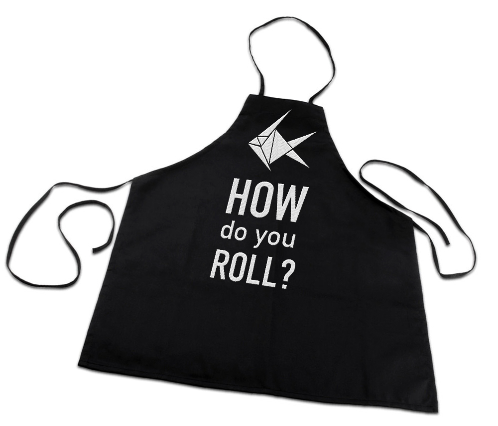
Black aprons will identify working staff in the restaurant and protect the brand image by creating a unique and friendly look.


