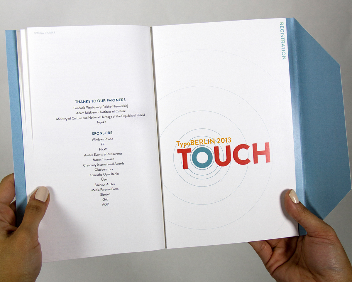
Typo is a yearly design conference held in different cities every year. The 2013 conference was in Berlin, with the theme of touch. Touch was meant to represent the digital age of touch screens and modern design.
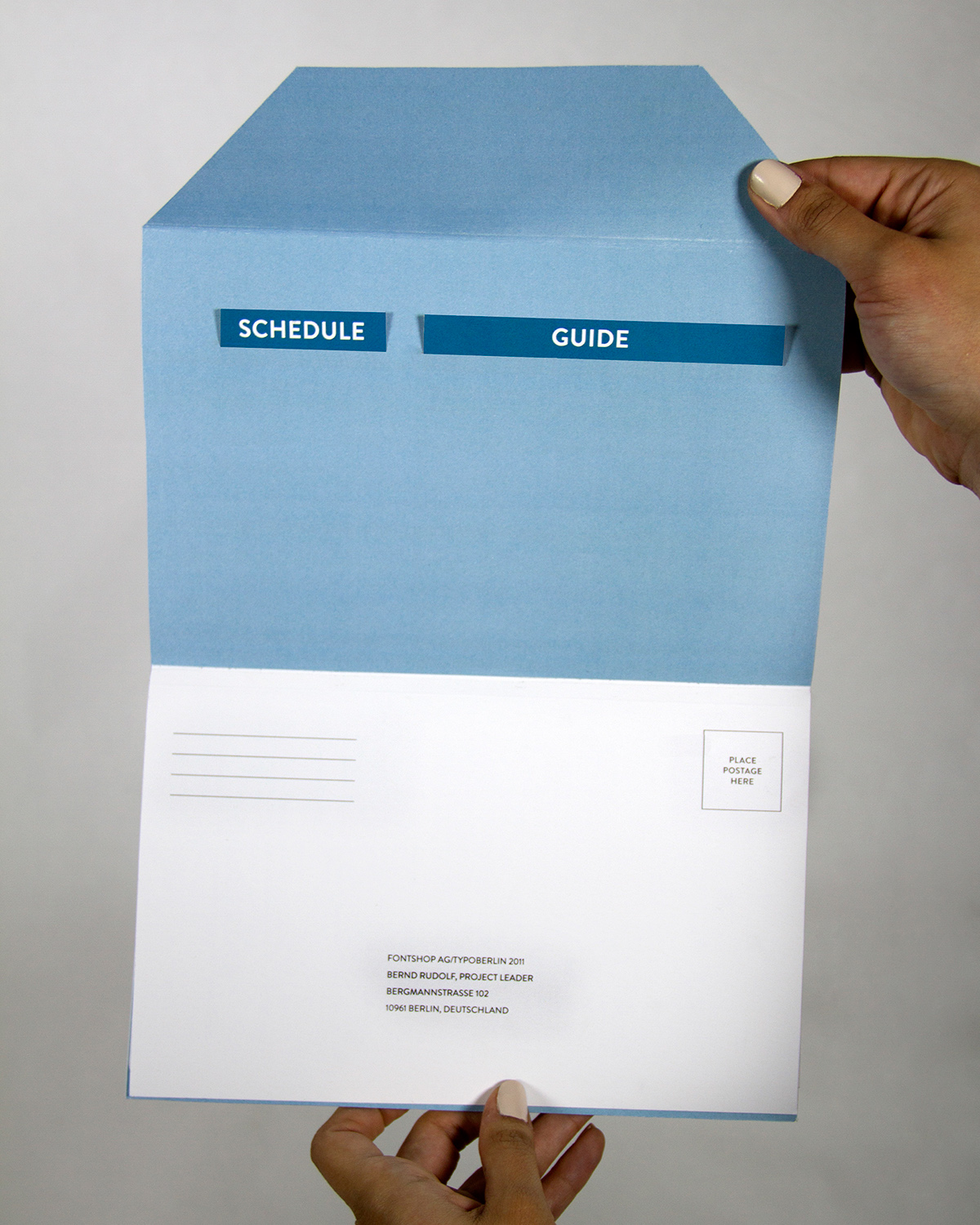
My design reflects the theme through the idea of rippling. This not only relates to touch screen technology and the symbology used, but also the greater networking effect of conferences. The design has a few main components, all of which must function together as a mailer. The mailer is composed of a central booklet, registration form, schedule, and guide.
The central booklet holds the key information for the event: location, how to get there, housing, and a day-by-day description of each lecture or workshop. The registration form follows that, which can be torn out and mailed back. In the back is two pockets which hold the schedule and guide. The schedule is business card size when folded up, which allows for the user to carry it in a wallet or pocket easily. One side has a map of the venue, while the other has a day-by-day schedule. The guide holds recommendations for things to eat, see, and do in Berlin. Together these components make a compact brochure to advertise and bring to the conference.