

This is just a quick overview of what our marketing landing pages typically looked like at Q2. We would design a new landing page for every campaign, and while we reused the same styles, because each content offer was unique, each page had some unique treatments.

This is a screenshot for a proposed redesign of the Q2 jobs page. Unfortunately I never saw this page built before I ended my time with Q2. The new elements to this redesign included, the PDF content offer, the full-width image sections, new photography and testimonials, and a new video and video section.
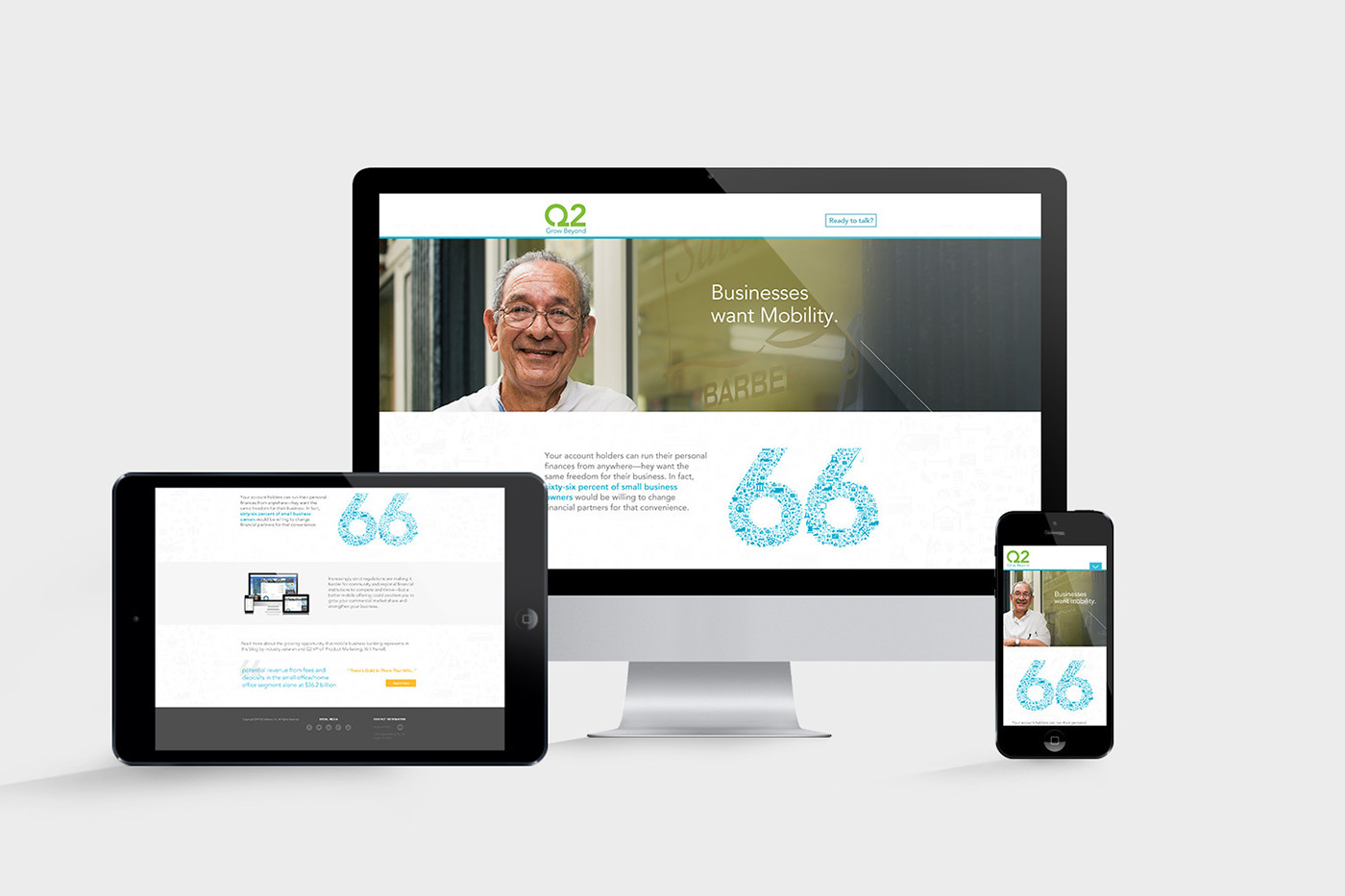
Another example of a landing page in our B2B marketing campaigns. This image shows our responsive landing page design, which was a new process and consideration for our team.

Here is another glance at various landing pages I designed at Q2. The desktop screen is displaying a page that employed a slider containing several individual videos on our security platform. I designed an interaction using color and scale to display the active slide. The landing page on the tablet on the right was for an event we were promoting to our customers. This page included a section with two speakers in columns side by side, and on click the speaker bio would display while hiding the other speakers photo (site prototype below.)
These were some of my first experiences intentionally designing web interactions, and I sure wish I still had source files for them, but these screenshots are all that remain.

Another landing page featuring some custom icons.
This video animation displays an interaction I designed for a blog article that served as a campaign landing page. The next-step at the bottom of the page promoted two different white-papers. Depending on which image the user clicked on, the email form would display for that content. I delivered this video to our developer to build this interaction.

This was a contact form on our landing page that needed some attention (original at the top.) I wanted to remove as much extraneous information, input fields, and other links as possible to reduce friction, increase conversions, and have an all around better experience for the user. The visual design got an update as well to match current landing page form styles

We saw an opportunity to update the thank you page on our site after the user submitted a contact form. The page was practically blank with no imagery, no hierarchy, and pretty bland copy. With the help of one of our skilled copywriters and our in-house photographer, I updated the page to feel a little more intentional and personable. We also included a link to our blog to try and re-engage the user with more content and value
This Marvel prototype of this landing page shows several firsts. This was the first time I broke out of the template of the typical landing pages we had been churning out, the first time I designed it for mobile first, and the first time I used a Marvel prototype to deliver the design to our developer. This became much more useful context for our developer than just delivering a PSD.

This is an example of a dynamic banner ad I created for one of our multi-channel B2B marketing campaigns.


