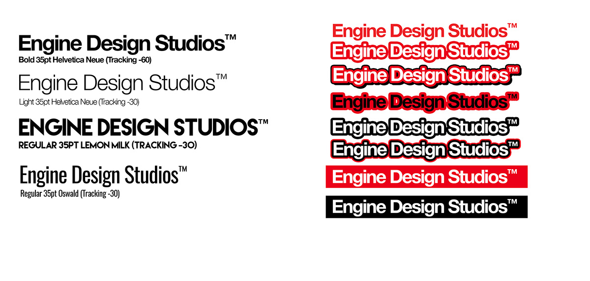
The Engine Design Studios Logo is of industrial + minimalist style, comprised of several elements that make up its unique + contemporary form, which carefully align to our studio's culture.
First let's start with the most impactful characteristic, the colour scheme. The pantone selection of #eb0019 (Glowing Flame Red) &
White #FFFFF (often referred to as "Pura Vida" here in the studio) purposefully suggests a sense of urgency, a period where the generation of analog and digital are shouting to be heard + understood. Its bold, passionate colours derive themes of : revolution, dignity, discipline, activism, culture, love, spirituality and most importantly universal, personal & general awareness.
White #FFFFF (often referred to as "Pura Vida" here in the studio) purposefully suggests a sense of urgency, a period where the generation of analog and digital are shouting to be heard + understood. Its bold, passionate colours derive themes of : revolution, dignity, discipline, activism, culture, love, spirituality and most importantly universal, personal & general awareness.

The rings that circulate around the common "e" internal shape are inspired by the piston rings from a fuel injected, gas pressured piston along with the gaskets and valve openings. A unit embodied by a mechanism of several parts working in tandem for a by-product of useful energy conversion to essentially acquire movement in a forward direction.
The thin lines that segment the negative space highlight a meticulous level of detail which coincides with level of accuracy we strive to maintain both internally and externally. Its outer rings are vibrant and creates an optical track, Look at the logo, let your mind go and trace the lines... That sense of momentum within a logo is the metaphoric energy that helps it sustain through lifetimes.
EDS Animation done by Dan Berry (Portland, OR) for the studio in 2014.


Visual application of the logo on our company profile. The Diego Martin hills have great significance in our story. Our journey began in hot, steel garage at the foot of these very hills.
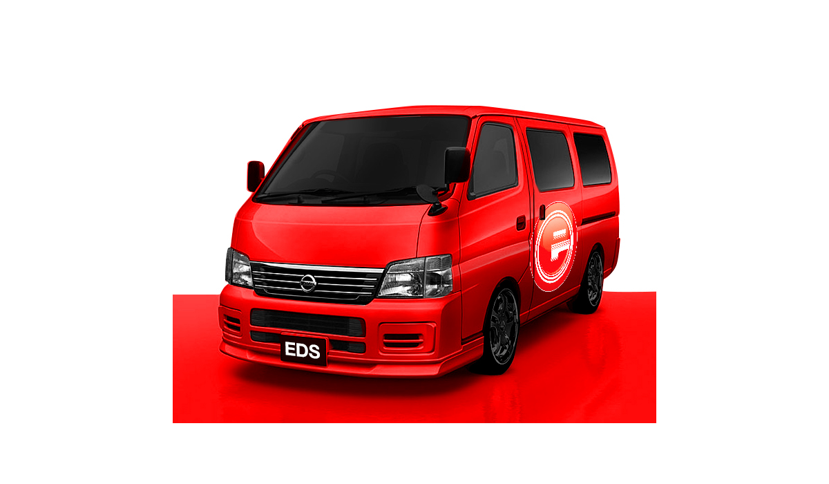
EDS Vinyl wrap on Nissan E25 Panel Van.