

My client wanted a backend and frontend design for a webapp they’re developing. Along with the design, I developed the logo and brand image. I also built the frontend and backend design with Bootstrap and several Javascript libraries.
Frontpage Design
I wanted a modern looking website with a strong use of color, photography and shapes. I ended using SVG shapes to mask the photos or create non-rectangular containers. It gives the page an unusual look that goes well with the overall style.
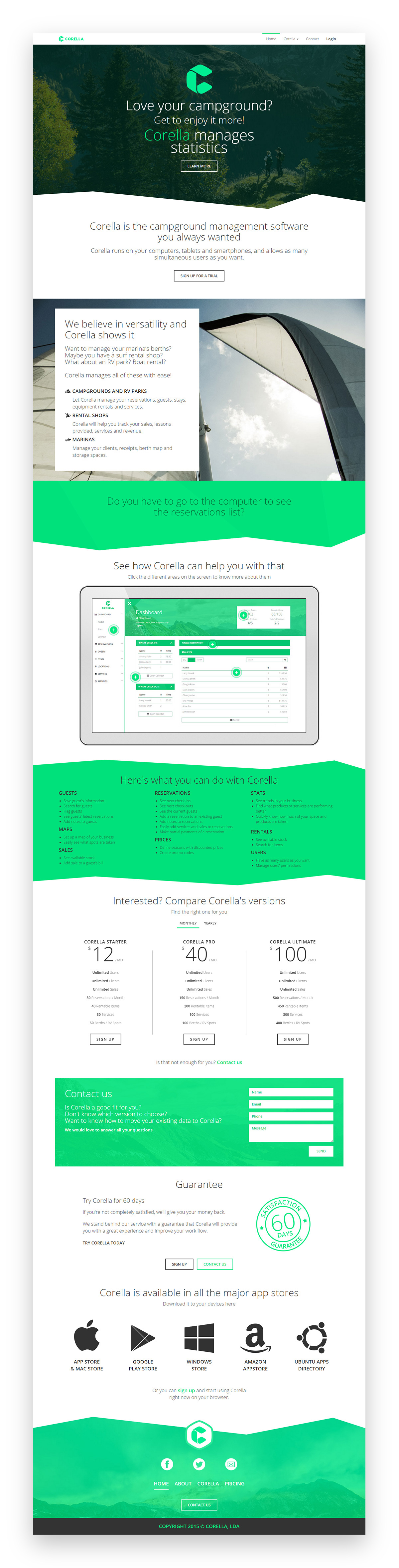
It’s a responsive page, and it looks just as good on phones as it does on larger screens. I’m very happy with the final result, and so was my client.

The client asked for a fun or unusual 404 page. This was the result.
Backend
One of the main issues my client referred was that the other campground/marina management softwares are very difficult to use and they take a while to teach to new employees. He wanted something incredibly simple and intuitive.
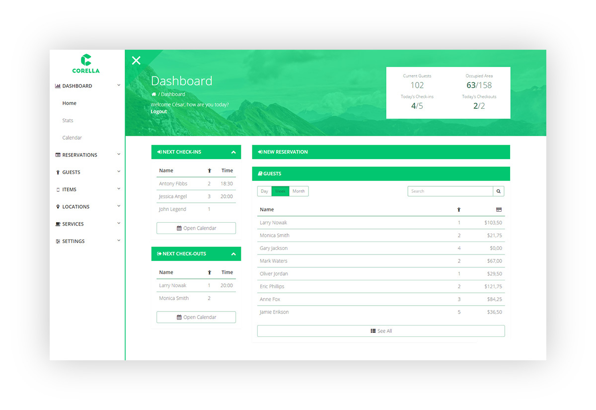
I decided the screens that were needed, and then discussed with the client which were the most common tasks and most useful information to display. I gathered all those on the main dashboard screen. So on that screen (above), one can see the next check-outs, next check-ins, the current guests, the current taken area in the campground (or berths in a marina). One can also search for other current or past guests and create new reservations without leaving this page.

Since the dashboard will be open on most employee computers in the campground, potentially visible to customers, I didn’t think it would be a good idea to have statistics and graphs readily visible on it. The client agreed with that decision. So all those are in a separate page, accessible through the sidebar.

The sidebar is an element I’m very happy with. It sits outside the screen most of the time, because all the common tasks are achievable through the main dashboard. It opens and closes with a click or tap on the menu button at the top. For increased productivity, the sidebar also opens if the mouse pointer stays on the left edge of the screen for over 300ms. To close the sidebar, a simple click outside it is enough. On mobile devices, one can just swipe from the left of the screen to open the sidebar, and swipe from the right to close it.

I used icons whenever possible to illustrate options and lists, to increase usability. One can scan a list and quickly find what they’re looking for through the icons.
The backend also uses in-place editing for ease of use. That way, users don’t need to navigate through more pages to change data. Whenever they see something they want to change, they just have to click or tap on it, and an editable field will show up that allows them to save the changes straight away.

Overall, I planned and built 24 backend pages, plus the single frontend page, all of them responsive and tested. Everything was built with Bootstrap, which I personalized to match the branding.
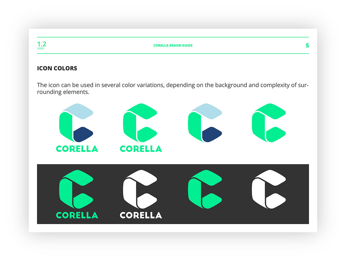
Branding
Initially, I created a simple listing of the colors and font sizes I was going to use. At the end of the project, I organized that information into this brand guide that I provided to the client:


This was a very fun project to work with. I had a lot of liberty to experiment and try things. I’m very happy with the result, and the client was even more so.
What do you think?


