
My concept for this logo was to show the idea of movement. I made the ‘S’ spiral outward to show this and represent the actual meaning of the word spiral. The oblique font style helps move your eyes from left to right so that your eyes are not just stuck on the ‘S’ itself. I used the color red for this logo because when I think of the color red is a radical hue that represents bravery, passion, and power.
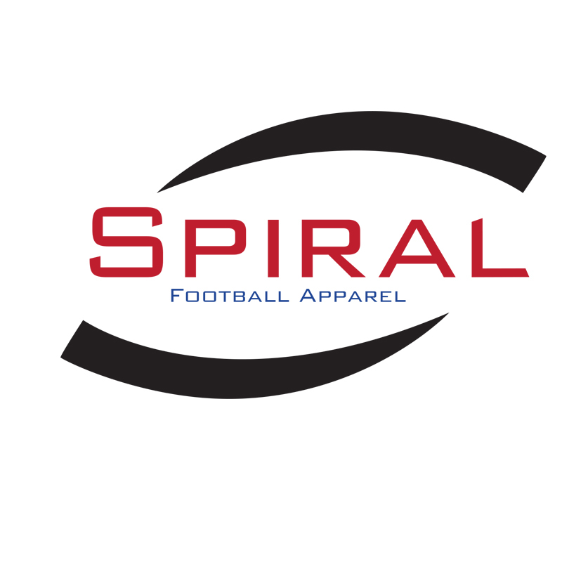
My concept for this logo was to show the idea of a spiraling football, without actually drawing the football. The lines on the top and bottom of the words do successfully represent the idea of football while also creating unity. I used red and blue in this logo to represent American colors just as the National Football League does.

My concept for this logo was to use sports equipment to represent that this is a football apparel company. The football I used does not look like a football at first glance, and that is why it works. In the color version of this logo, the color of the football looks almost like a target. This helps show that when you will wear this attire you will be on "point" with your football skills. The use of the color in the football also helps the football look like its in motion.

