Preface. Info.
Η εργασία που ακολουθεί, είναι το αποτέλεσμα του 3ημερου workshop που διοργανώθηκε από το toolkit startup #2, τον Απρίλιο του 2015, υπό την καθοδήγηση του Δημήτρη Κανελλόπουλου, Design Director στο Comeback Studio, με θέμα "Εικονίδια, Σύμβολα, Εικονογράματα".
Το workshop παρουσιάσε τις βάσεις για τον σχεδιασμό συμβόλων, εικονιδίων και εικονογραμμάτων, προσφέροντας στους συμμετέχοντες τις γνώσεις, τη μεθοδολογία και τον τρόπο χρήσης τους.
Αναφερθήκαμε σε σημαντικά παραδείγματα συμβόλων και συστημάτων συμβόλων. Μιλήσουμε για τη δομή και τον σχεδιασμό τους, και αναλύσαμε τον τρόπο και τόπο χρήσης τους.
Οι συμμετέχοντες έπρεπε να σχεδιάσουν σειρά ή σειρές συμβόλων, περνώντας από τα βασικά στάδια, έρευνα, μελέτη στόχου, προσχέδια στο χέρι, και τέλος σχεδιασμός στον υπολογιστή.
Συμμετείχαν 20 συνάδελφοι και εδώ παρουσιάζουμε τις 15 εργασίες που τελείωσαν και εκτέθηκαν στην ομαδική έκθεση τον Oκτώβριο του 2015.- - -
Project presented is the result of a 3 days workshop held by toolkit startup #2, in April 2015, and by the guidance of Dimitris Kanellopoulos, Design Director στο Comeback Studio, under "Icons, Symbols, Pictograms".
We talked about important examples of symbols, discussed their structure and design, analyzed how and where they are used.
Participants were called upon to design one or more series of symbols, going through the basic stages of researching, studying the goal, making initial sketches by hand, and finally designing on the computer.
During the workshop we analyzed and selected the thematic areas of each participant.
20 designers took part and we are showcasing the 15 projects that were finished and took part at the workshop's exhibition in October 2015.
20 designers took part and we are showcasing the 15 projects that were finished and took part at the workshop's exhibition in October 2015.


Γεωργία Λούμπαρδη | Georgia Loumpardi | Be
Το θέμα που διάλεξα ήταν ο σχεδιασμός εικονιδίων για περιοδικό. Βάση αυτού αποφάσισα να επανασχεδιάσω τα ήδη υπάρχοντα σύμβολα του περιοδικού parallaxi που κυκλοφορεί στην Θεσσαλόνική χρησιμοποιώντας ως βάση το υπάρχον λογότυπο. Στην συνέχεια σχεδίασα τα σύμβολα που θεωρούσα οτι αντιπροσωπεύουν την κάθε κατηγορία και τα εφάρμοσα στην έντυπη μορφή του περιοδικού και στο site.
----
The topic I chose was the icon design for a magazine. Basis of this, I decided to redesign the existing symbols of the magazine parallax, that is circulating in Thessaloniki, based on the existing logo. Then I designed the symbols that represent the thought of each class and apply them in the printed version of the magazine and on the site.


Νίκος Γιούρης | Nikos Giuris | Be
Σειρά σήμανσης για χρήση σε παραλίες. Τα σύμβολα σχεδιάστηκαν ισόπαχα με στρογγυλεμένες απολήξεις. Σκοπός της σειράς είναι η αποτροπή κακών συμπεριφορών από τους επισκέπτες της παραλίας. Παράλληλα με το project σχεδιάστηκε και γραμματοσειρά στο ίδιο ύφος.
--
Sign series for beach use. The symbols were designed at the same width with round endings.
The goal of the series is the prevention of bad behavior from the beach visitors. While designing the symbols, a suitable font was developed at the same style.
--
Sign series for beach use. The symbols were designed at the same width with round endings.
The goal of the series is the prevention of bad behavior from the beach visitors. While designing the symbols, a suitable font was developed at the same style.

Σάββας Αμπατζίδης | Savvas Ampatzidis | Be
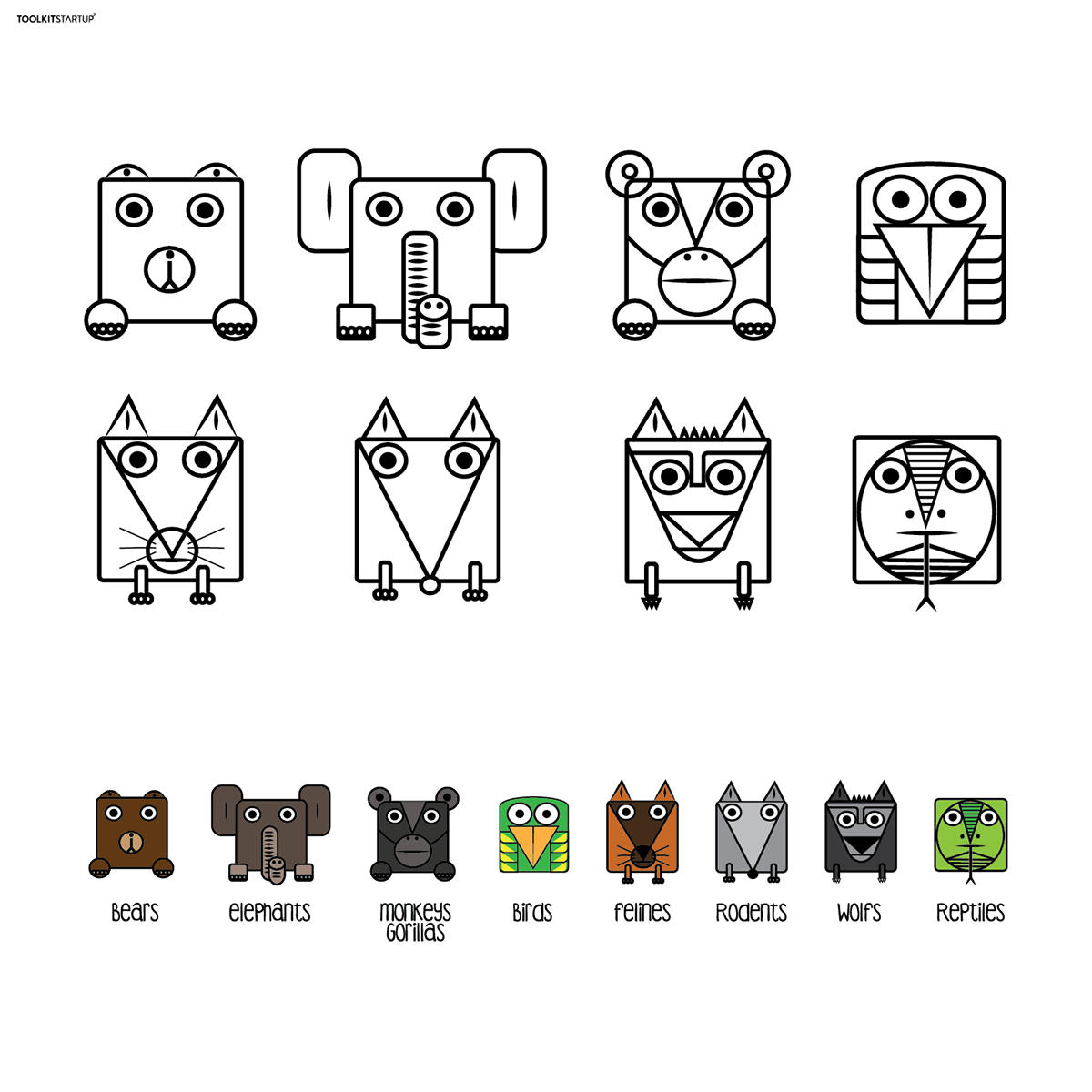
Mια σειρά από σύμβολα που θα κατευθύνει τους επισκέπτες του ζωολογικού πάρκου σε είδη ζώων που θα θέλουν να δουν. Χρησιμοποιησα απλά γεωμετρικά σχήματα για να αποδόσω τα χαρακτηριστικά του κάθε είδους.
--
I designed a series of symbols that will direct visitors of zoo park in species that will want to see. Use simple geometric shapes to the performance characteristics of each species.
I designed a series of symbols that will direct visitors of zoo park in species that will want to see. Use simple geometric shapes to the performance characteristics of each species.

Ραχήλ Ζελίλοβα | Rachel Zelilova | Be
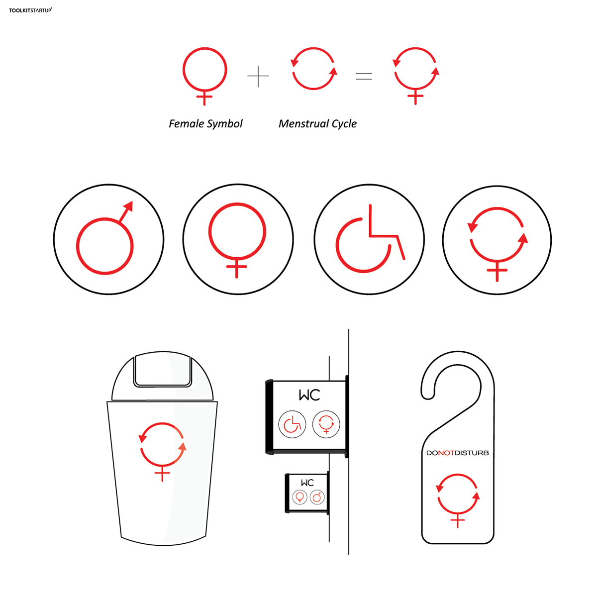
Παρατηρώντας τα σύμβολα που υπάρχουν για άτομα με ειδικές ανάγκες αναρωτήθηκα μήπως θα έπρεπε να συμπεριλαμβάνεται σε αυτή τη κατηγορία ένα ακόμα σύμβολο. Μια γυναίκα που διανύει την 28η μέρα του κύκλου της."
"Το 50% των γυναικών κατά την διάρκεια της περιόδου, υποφέρει από πόνους, κράμπες και γενική δυσφορία, ενώ ένα 10% υποφέρει από δυσβάσταχτους πόνους που κυριολεκτικά καθιστούν αδύνατη την διεκπεραίωση των καθημερινών υποχρεώσεών τους.
Για αυτό το λόγο σχεδίασα ένα σύμβολο για τις γυναίκες που διανύουν την περίοδο τους, όπως επίσης και κάποιες περιπτώσεις όπου θα μπορούσε να εφαρμοστεί ώστε να διευκολυνθούν οι δύσκολες αυτές μέρες.
--
Observing the signs for disabled people, it occurred to me that it’s possible there could be one more symbol. A woman in period. The 28th day of the female menstrual cycle.
50% of women during their period suffer from strong pains, cramping and discomfort, while another 10% suffer from excessive and sharp pains that make it difficult to cope with daily responsibilities. Therefore, I designed a symbol for women in period and some possible occasions where it could be applied in order to make those days easier and more tolerable.

Ιωάννης Πελέλης | Ioannis Pelelis | Be
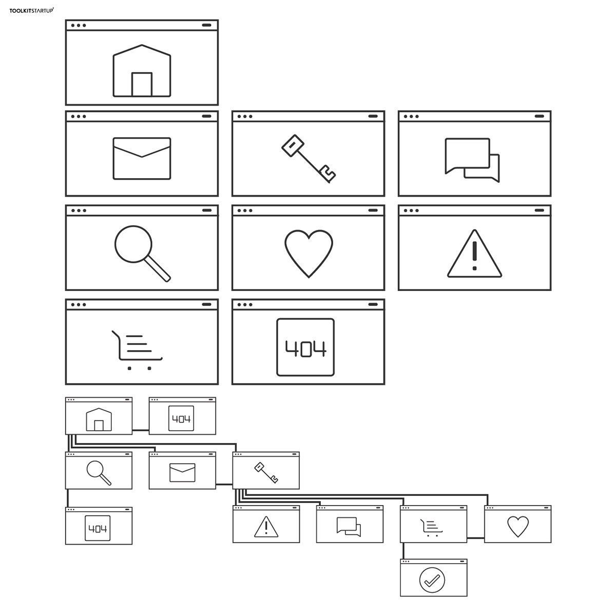
iconflow. Προκειται για εικονίδια που μπορούν να χρησιμοποιηθούν ως χάρτες περιεχομένου για web applications.
Οι χάρτες περιεχομένου βοηθούν πρακτικά τον σχεδιαστή, τον προγραμματιστή και κάθε άλλο άτομο, να αποκτήσει μια καλύτερη εικόνα των πιθανών μονοπατιών που έχει ένας άνθρωπος σε μια ιστοσελίδα.
Επειδή λοιπόν οι χάρτες περιεχομένου γίνονται συνήθως στο "χέρι" ή με μικρά wireframes, διάλεξα να εικονοποιήσω ορισμένες συνηθισμένες σελίδες και να δημιουργήσω μια απλή εφαρμογή τούς. Σύντομα και στο ιντερνέτ!
---
iconflow. These are icons that can be used as user flow maps for web applications. User flow maps practically help the designer, developer or any other person to have a clear picture about the possible paths of someone, when navigating a website. So, because user flow maps are usually created on "hand" or with small wireframes, I chose to design some common pages and then create a simple application. Soon on your browsers!

Χρήστος Παππάς | Christos Pappas | Be
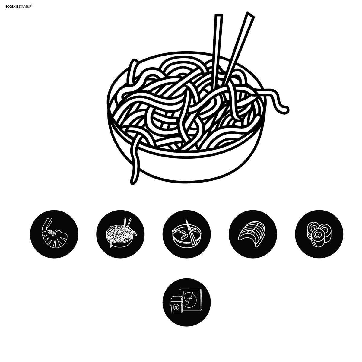
Σύμβολα απο τα πιο γνώστα πιάτα της Κινας. Σκοπός τους είναι η εφαρμογή τους κυρίως σε εστιατόρια ή οπουδήποτε κριθούν αναγκαία ώστε να γινεται αντιληπτό το μήνυμα τους απο τον καθένα μας ανεξαρτήτου εθνικότητας.
Επιπρόσθετα, το περιβάλλον παρέχει την αναγκαία πληροφορία για την αντιληψη ενώ παράλληλα δεν ειναι «γεματος» από μεταφράσεις της ιδιας λέξης διότι το τα σύμβολα είναι ένας κώδικας διεθνούς επικοινωνίας.
Επιπρόσθετα, το περιβάλλον παρέχει την αναγκαία πληροφορία για την αντιληψη ενώ παράλληλα δεν ειναι «γεματος» από μεταφράσεις της ιδιας λέξης διότι το τα σύμβολα είναι ένας κώδικας διεθνούς επικοινωνίας.
---
Symbols of the most reputed dishes of East Asia, China.The idea is to use this symbols instead of letters at chinese restaurants mostly and at places that are suitable for use too.In this way people of different nationalities will understand what this room is for. Also another benefit is that there is no need to translate the word shrimp for example. This results in a charming enviroment with only the necessary information for the people to comprehend the place because symbols are code of international communication

Ιωαννα Δημητρίου | Ioanna Dimitriou | Be
---
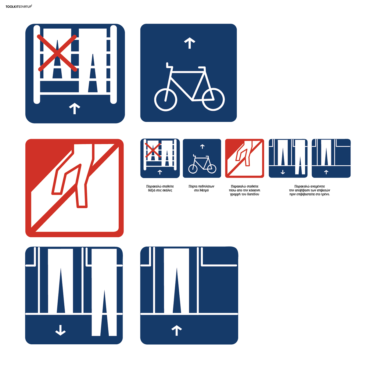
During the workshop of Toolkit Startup 2 (Thessaloniki, Greece) I designed some infographics for the metro stations.
I realised that at the metro of Athens there are many announcements about things that we are allowed or not allowed to do but there are not symbols for theme. So I decided to collect them and make them image.
These infographics have to be simple and easy understandable by anyone uses metro. So, I made them minimal but with all the details needed.


Σοφία Δρογουδή | Sophia Drogoudi | Be
Στο project που μας δώθηκε για το Toolkit Startup 2, θέλησα, εμπνευσμένη από το καλοκαίρι, να δημιουργήσω ένα σετ εικονιδίων για ένα beach bar.
Διαλέγοντας τα πρώτα πράγματα που μας έρχονται στο μυαλό σκεπτόμενοι το καλοκαίρι όπως φαγητό, κοκτέιλς και σανίδες του σερφ, δουλεψα χρησιμοποιόντας κυρίως περιγράμματα. Στο τελικό αρχείο προστέθηκαν κάποια γεμίσματα με patterns σε μια παλέτα 3 διαφορετικών χρωμάτων.
Στο πόστερ που μας ζητήθηκε επέλεξα να δουλέψω στο ίδιο στυλ εικονογράφησης με αυτό των εικονιδίων, βαζοντάς τα -που αλλού;- στο περιβάλλον που ανήκουν. :)
--
Inspired by summer, which i love, i wanted to create a fun icon set for a beach bar.
I chose the basics, drinks, food & surfboards and worked with lines and some pattern fills later on the final posters.
For the poster, i wanted the illustration style to be as simple as the icon sets' so i worked with lines there too.
I hope you'll enjoy! :)

Κωνσταντίνος Σέλλας | Konstantinos Sellas| Be
--
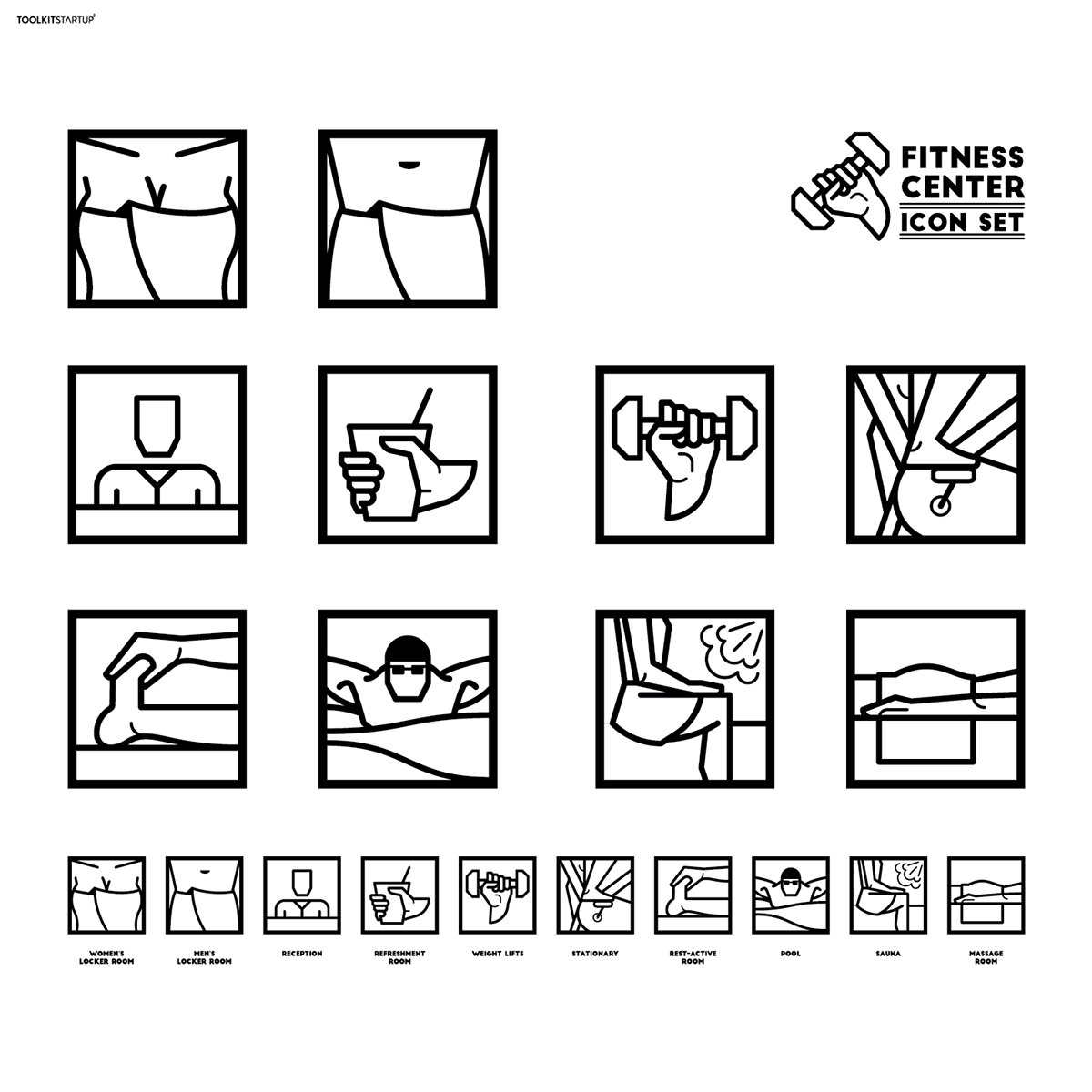
I designed an icon set for a hypothetical fitness center. It is a line - based set with medium to thick lines. Each icon represents a certain room inside the gym and it is placed inside a square. The color palette that has been used is pure black and white. Simple line sketches combined with that particular colors makes the set and each icon separately, easier and faster to recognize/understand, guiding each on to the room of his/her will, without interferences ot misunderstantings.

Κωνσταντίνα Μπενάκη | Konstantina Benaki | Be
--
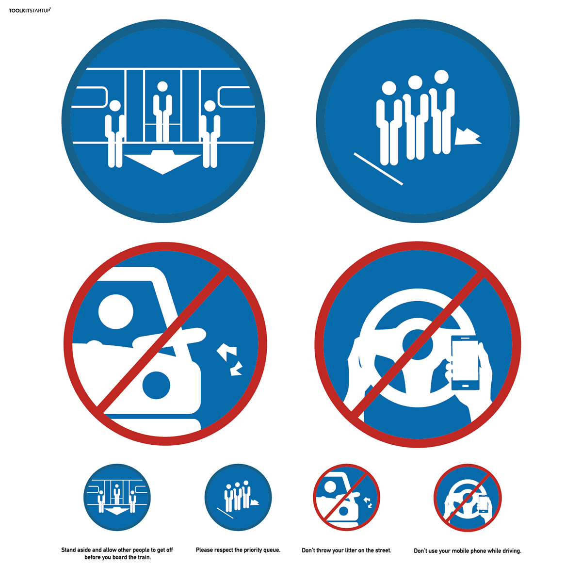
During the workshop, I had the chance to design a set of four pictograms, symbols that comment on, or to be exact, indicate good manners and responsibility in urban/social-life behavior.
I had the idea to create these pictograms while observing the commuters’ behavior during rush hour. All those people packed together on the platform, so eager to get on the train that seem to forget all about good manners, the delays, even the accidents that might occur as a result of the recklessness.
I had the idea to create these pictograms while observing the commuters’ behavior during rush hour. All those people packed together on the platform, so eager to get on the train that seem to forget all about good manners, the delays, even the accidents that might occur as a result of the recklessness.
The second pictogram came out of the need to indicate the compliance to the “first-come, first-served” basis among the people waiting in queue in areas like public services, hospitals, museums, super-markets etc.
The last set of pictograms focuses on drivers’ behavior. The first comments on the fact that many drivers throw litter out of the car while driving – not only an environmentally irresponsible act but one that possibly harm a pedestrian or a passing motorcyclist. The second deals with the use of a mobile phone while driving, a life-threatening habit for the driver him/herself, the fellow passengers and basically anyone that might be unintentionally involved in a possible car accident.
The last set of pictograms focuses on drivers’ behavior. The first comments on the fact that many drivers throw litter out of the car while driving – not only an environmentally irresponsible act but one that possibly harm a pedestrian or a passing motorcyclist. The second deals with the use of a mobile phone while driving, a life-threatening habit for the driver him/herself, the fellow passengers and basically anyone that might be unintentionally involved in a possible car accident.
All pictograms have a number of effective implementations. I believe that these pictograms can help make everybody’s life better.


Γιάννης Σταθόπουλος | Yannis Stathopoulos | Be
Η περιοχή των Εξαρχείων παραμένει μια από της πιο ζωντανές περιοχές της πρωτεύουσας. Είναι ταυτισμένη με τους κοινωνικούς αγώνες και δεν είναι σπάνιες οι φορές που οι δρόμοι της μετατρέπονται σε πεδίο μάχης ανάμεσα σε ένα κομμάτι του αντιεξουσιαστικού χώρου και τις "Μονάδες Αποκατάστασης της Τάξης" της Ελληνικής Αστυνομίας. Αντίθετα σε ότι θα περίμενε κανείς, οι περισσότεροι κάτοικοι θεωρούν την περιοχή αρκετά ασφαλή και ακόμα και στις περιπτώσεις που υπάρχουν εκτεταμένα επεισόδια, λίγα μέτρα μακριά από τα φλεγόμενα οδοφράγματα η ζωή συνεχίζεται σαν να μην συμβαίνει τίποτα.
Οι ντόπιοι γνωρίζουν καλά τα κατατόπια και πως να κινηθούν με ασφάλεια. Θα ήταν όμως χρήσιμο και οι επισκέπτες να είναι υποψιασμένοι για τις ιδιαιτερότητες της γειτονιάς. Θα ήταν ας πούμε σωτήριο να γνωρίζει κανείς που δεν ενδείκνυται να παρκάρει το γυαλιστερό του Hummer ή πως δεν είναι πολύ σοφό να τραβάς φωτογραφίες στην ευρύτερη περιοχή της πλατείας.
Σε αυτή την κατεύθυνση και με χιουμοριστική διάθεση, σχεδιάστηκε μια σειρά συμβόλων με σκοπό να πληροφορήσουν τους ανυποψίαστους για τις κακοτοπιές ή και της εύκαιρες που κρύβουν τα Εξάρχεια. Ως μορφολογική αναφορά χρησιμοποιήθηκε ο κώδικας των πινακίδων οδικής κυκλοφορίας. Η "γλώσσα" τους απλουστεύτηκε περεταίρω, ώστε να λειτουργεί μόνο με δυο χρώματα ανά σύμβολο.
---
Exarchia is one of the most vibrant an beautiful neighborhoods of Athens. The region also serves as a stronghold for the city's radical left and anti-government rebel groups and it often turns into a battleground between raged youngsters and the riot police. Though such a situation may seems terrifying, most of the locals feel quite safe and day to day life is rather peaceful and laid back. In most of the cases, even when hell breaks loose in the main square or the nearby University - also an epicenter for city unrest - life goes on as usual in stores and bars located less than a few blocks away.
Though the locals know their way around and can sail calm in the neighborhoods troubles waters, it would be quite useful for the guests to have a hint about the areas "hotspots". For example there are places which is more likely than others to have your brand new BMW blown to smithereens. Furthermore, one should be warned about the possibility of been assaulted for just photographing the urban landscape in Exarchia's main square.
In this scope I have created a special set of symbols suitable for the case. The signs are designed to resemble standard traffic sings but in a more minimal layout using just 2 colors per application. they can be used as standalone applications or in combination.


Λυσίμαχος Μαλτούδογλου | Lysimachos Maltoudoglou | Be
Η παρακάτω ιδέα προέκυψε από τις μορφές των τεράτων της ελληνικής μυθολογίας.
Πιο συγκεκριμένα ο ανθρωπομορφισμός η ποικιλομορφία και ο συμβολισμός τους, λειτούργησαν ως στοιχεία δημιουργίας στιλιζαρισμένων συμβόλων με κριτήριο τα χαρακτηριστικά των προσώπων. Τέλος, επιλέχτηκαν παχιές γραμμές, η χρήση του αρνητικού χώρου καθώς και ένα γενικότερο χιουμοριστικό ύφος.
Πιο συγκεκριμένα ο ανθρωπομορφισμός η ποικιλομορφία και ο συμβολισμός τους, λειτούργησαν ως στοιχεία δημιουργίας στιλιζαρισμένων συμβόλων με κριτήριο τα χαρακτηριστικά των προσώπων. Τέλος, επιλέχτηκαν παχιές γραμμές, η χρήση του αρνητικού χώρου καθώς και ένα γενικότερο χιουμοριστικό ύφος.

Αλέξανδρος Γιαννακάκης | Αlexandros Giannakakis | Be
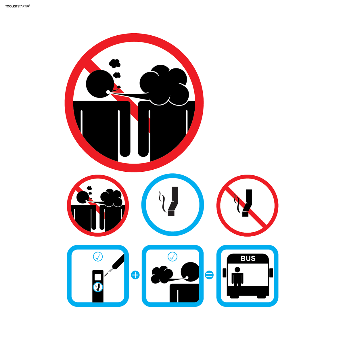
Η Ελλάδα παρουσιάζει την υψηλότερη αναλογία καπνιστών μεταξύ των δυτικοευρωπαϊκών χωρών (37,6%). Το project με αυτα τα σύμβολα σκοπεύει να ευαισθητοποιήσει το σύνολο των καπνιστών ώστε (αφού δεν το σταματούν) να δημιουργήσουν μια "υγιή" συνύπαρξη με τους μη καπνιστές και με το περίγυρο τους (περιβάλλον).
Τα σύμβολα ειναι για καθημερινές ενοχλητικές συνήθειες σε σχέση με το τσιγάρο. 1. Απαγόρευση στο φύσημα καπνού στο πρόσωπο. 2. Σήμανση για το που πετάμε τη γόπα του τσιγάρου. 2.(2)Βήματα πριν εισέλθει καπνιστής σε λεωφορείο, πετάς τσιγάρο και φυσάς τον καπνό εξω απο το λεωφορείο πριν μπείς.
Σύνθημα του project: Δεν μπορείς να καταλάβεις το κακό που σου κάνει; τουλάχιστον κανε καλό στον περίγυρο σου.
---
Greece has the highest proportion of smokers among the Western European countries (37.6%). The project with these symbols intends to sensitize all smokers so (since they do not stop it)to create a "healthy" coexistence with non-smoking and the environment .The symbols is for daily disturbing patterns relative to the cigarette. 1. Prohibition to smoke blowing in the face. 2. Marking for where we throw and don't throw the cigarette. 2. (2) Steps before entering the bus, throwing away cigarette and blowing the smoke off the bus before entering.
Slogan of the project:
You can not understand the damage to your health
at least don't damage your surroundings

Μαρίζα Τσάκωνα | Mariza Tsakona | Be
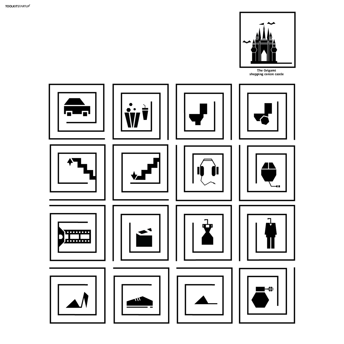
To origami shopping center castle είναι ένα εμπορικό κέντρο που φιλοξενείται στο εσωτερικό ενός κάστρου, στην φανταστική πόλη “Origami City”.
Στο κάστρο μπορείτε να βρείτε μαγαζιά με ρούχα και παπούτσια για γυναίκες και άνδρες, μαγαζιά με ηλεκτρονικές συσκευές, αρωματοπωλεία, τουαλέτες, σινεμά και θέατρο.
Η δεξιά μεριά του κτιρίου διαθέτει κυλιόμενες σκάλες με κατεύθυνση προς τα επάνω, ενώ η αριστερή μεριά του κτιρίου διαθέτει κυλιόμενες σκάλες με κατεύθυνση προς τα κάτω.
Το Εμπορικό κέντρο διαθέτει ελεύθερο parking. Όλες οι σηματοδοτήσεις έχουν σχεδιαστεί με γεωμετρικά σχήματα για να θυμίζουν τα origami φτιαγμένα από χαρτί, που έχουν έντονες γωνίες.
---
The origami shopping center castle is a shopping center inside a real castle in an imaginary town “Origami City”. In the castle you can find stores for clothes and shoes for both men and women, stores with electronic devices, perfume stores, toilets, a cinema and theater. The right side of the building provides an interior escalator in order to go to the upper level of the shopping center. The escalator that gets you down to level 0 is located on the left side. The shopping center provides free parking. All the sign boards have been designed with geometric shapes in order to resemble the origamis made from paper, which are recognizable by their sharp edges.

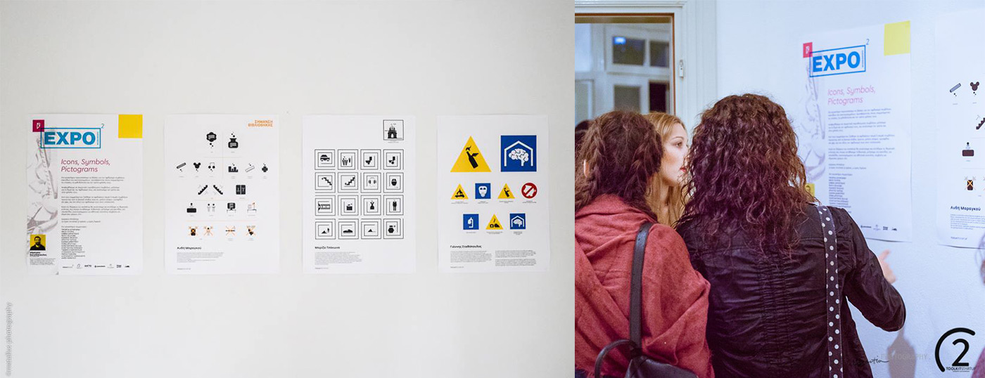
Ανθή Μαραγκού | Αnthi Maragou | Be
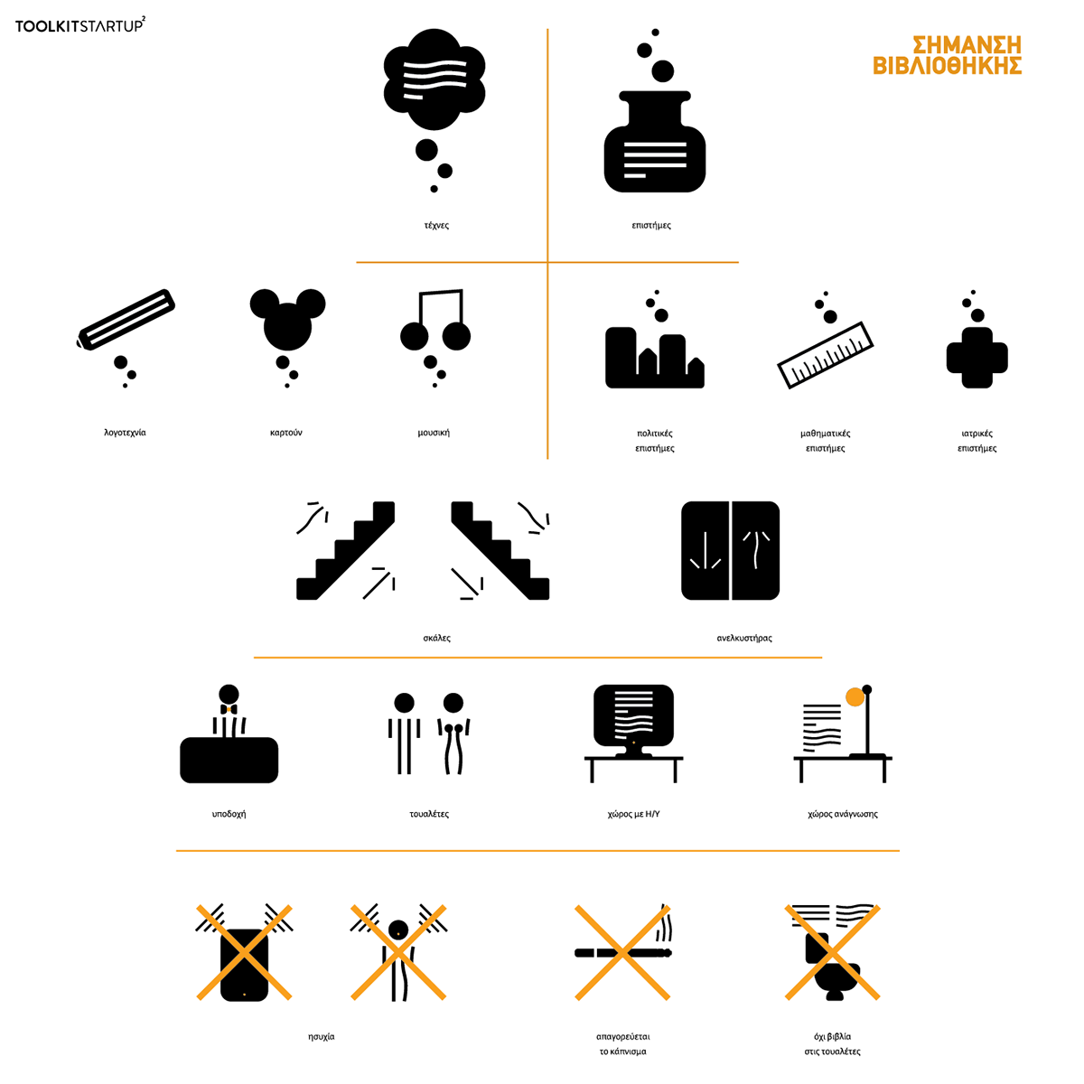
Επέλεξα να αναπτύξω κάποια βασικά σύμβολα για τη σήμανση μέσα στο χώρο μιας βιβλιοθήκης.
Καταλήγοντας στις δύο σημαντικότερες κατηγορίες βιβλίων που συναντά κανείς μέσα σε αυτές, απεικόνισα από τη μία τις τέχνες (έννοια που βασίζεται στο συναίσθημα και την υποκειμενικότητα) και από την άλλη τις επιστήμες (έννοια που βασίζεται στη λογική και το πείραμα).
Με την ίδια λογική, σχεδίασα σύμβολα σωστής συμπεριφοράς για αυτούς που χρησιμοποιούν τις βιβλιοθήκες.