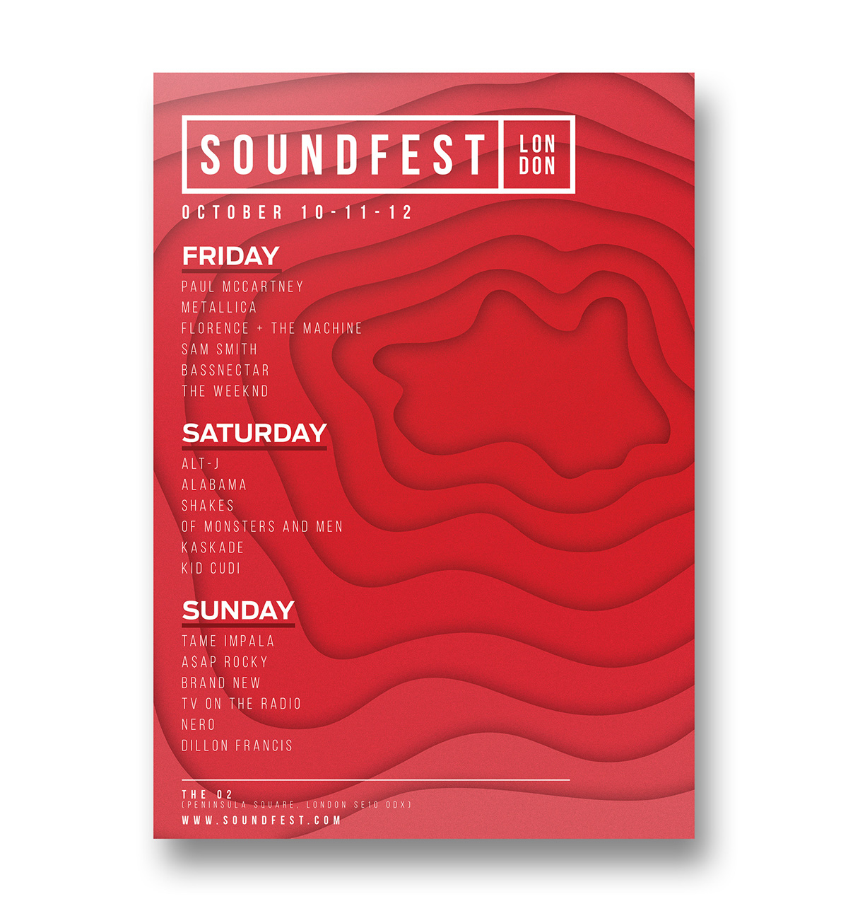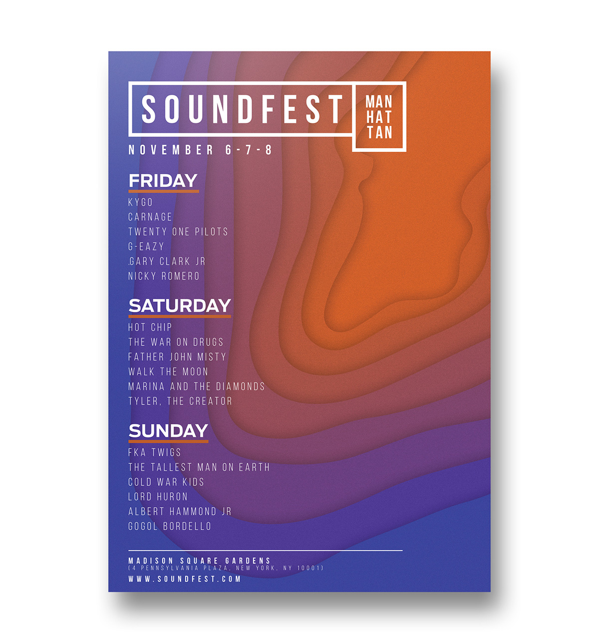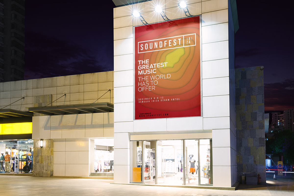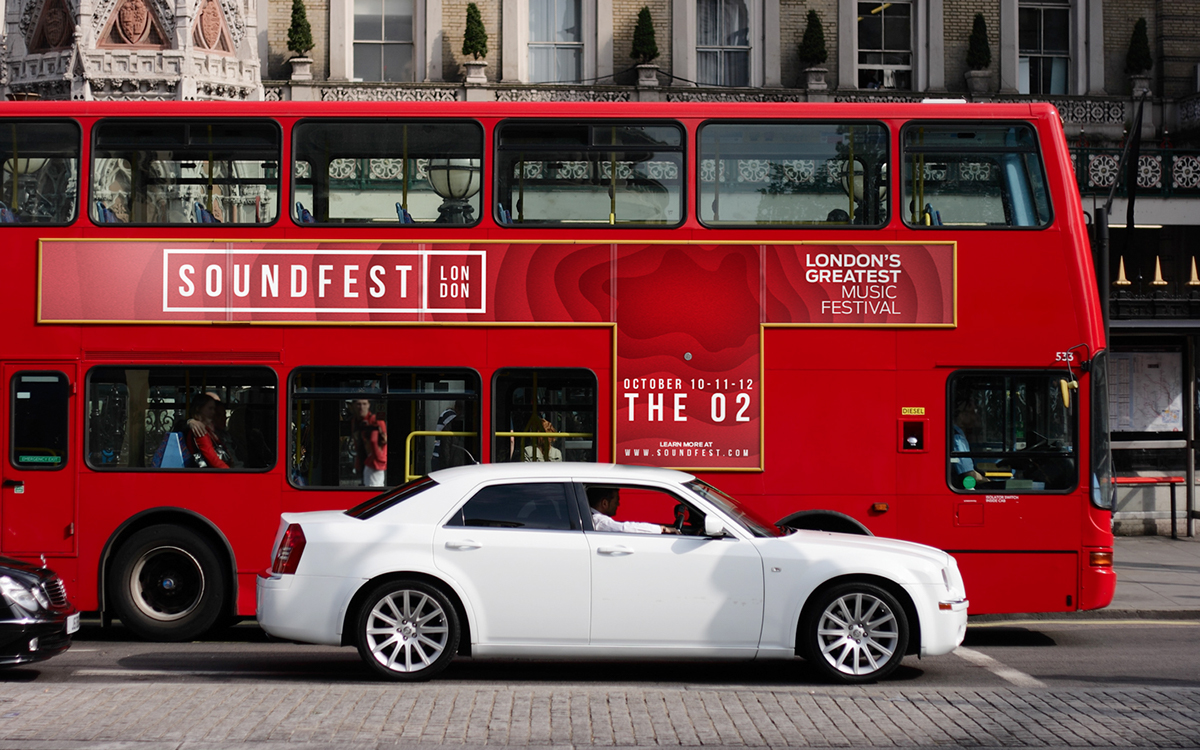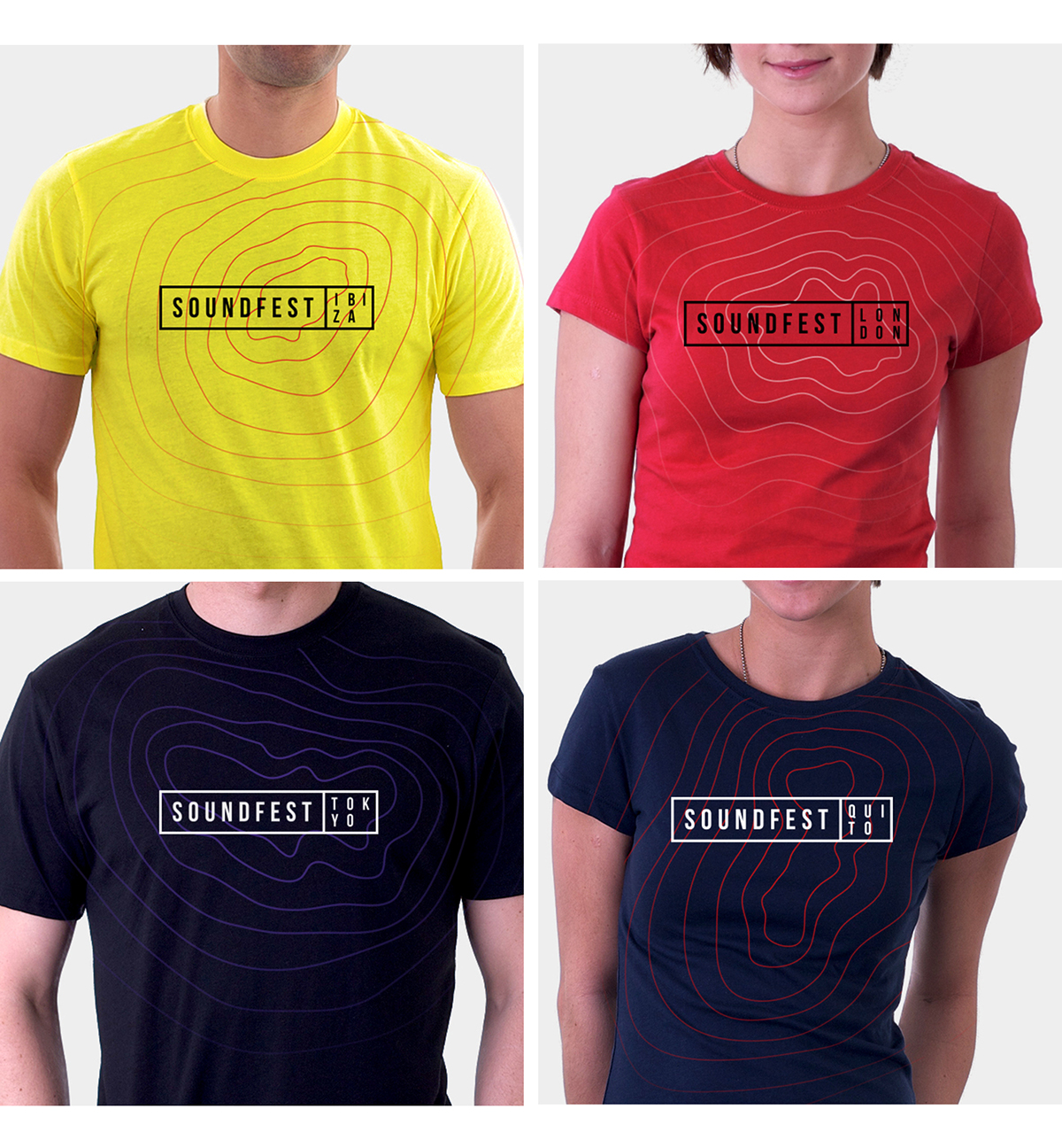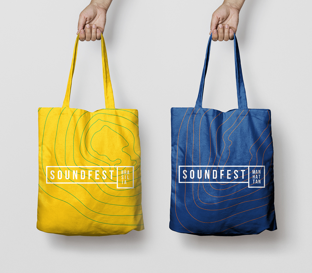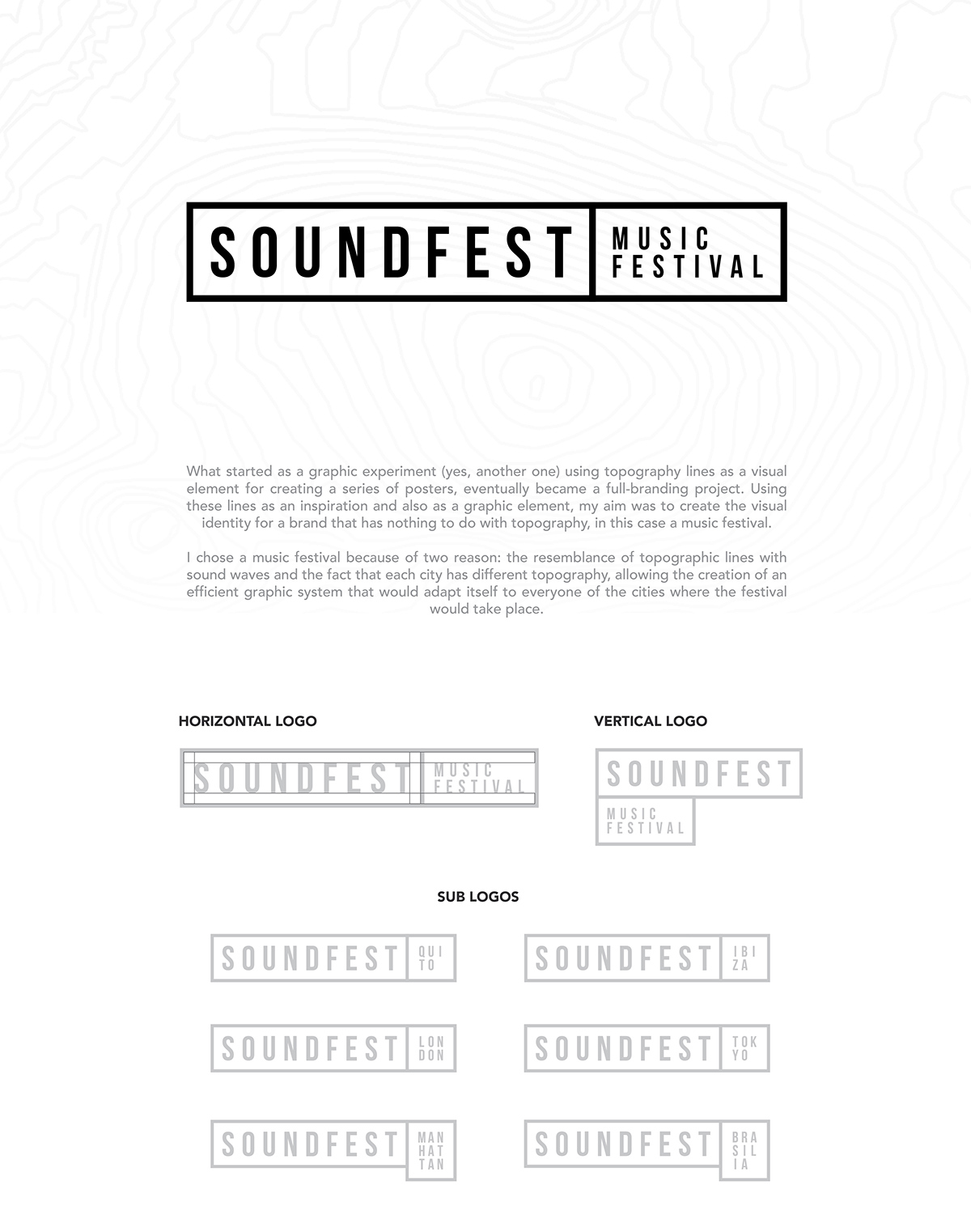
The logo is built with a simple yet modern typography and the frame around it allows the logo to be arranged in different ways, making the logo adaptable across a wide range of formats (posters, tickets, web, etc) so it doesn’t lose legibility. This also helps the logo to maintain a unified visual identity when changing the name of the cities. Inspired by the rhythm of the cities, this composition has the intention of creating a strong contrast with the almost-chaotic topography lines.

The color palette of each poster was inspired by the cities’ flags. This allowed the visual identity to have a unique personality according to each city, a unifying visual code and a more “natural and personal” feeling to the different audiences. Combined with a layout style that focuses on the topography illustration but without sacrifing legibility, each poster feels unique and stands out by showing a beautiful combination of colors.
One could say that there's a feeling of "chaotic order" in the visual composition