"The JustIngredients team approached PW for a new design strategy to help simplify their varied product offering and to target both trade and retail customers."
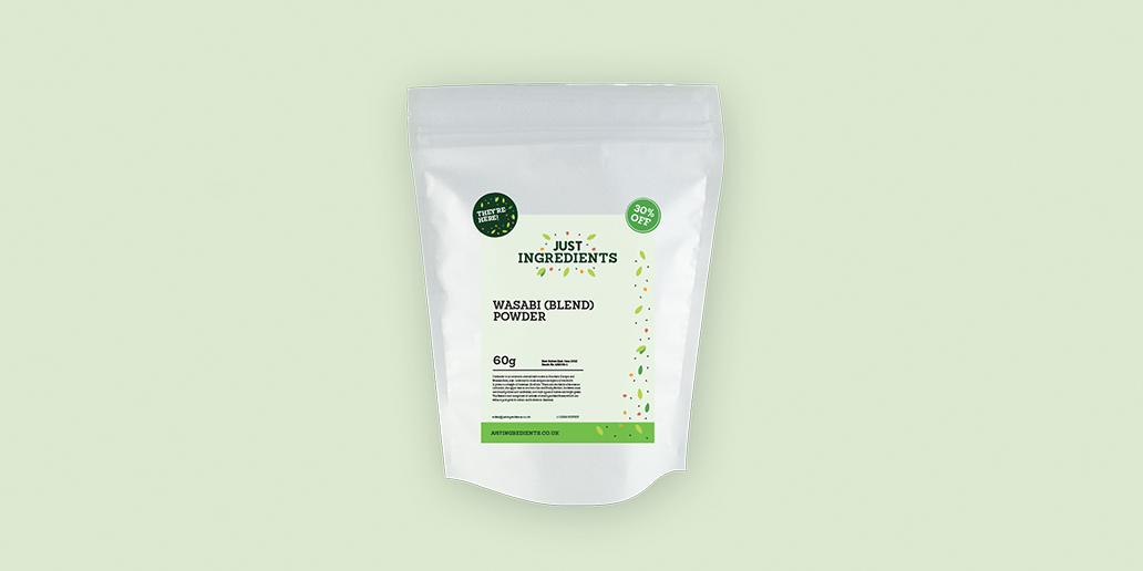
With a diverse product offering the key starting point for the new retail brand was to visually streamline the products to create a consistent and own able identity. The new branding is fun and confident and aims to inspire the customer to explore the vast array of good quality ingredients. With the view that cooking and creating culinary delights should be fun, the branding delivers a simple and playful tone of voice.
The variety available is introduced to the customer through the use of an illustration showing six individual elements that represent the products on offer. The seemingly random scattering of ‘ingredients’ reinforces the playful brand message and is instantly recognisable. The ingredients are then used as a device, creating a pattern which can be translated across packaging, marketing materials and print.
Whereas the retail branding is focused on consumers and aspirational chefs, the trade brand is more subdued. The colour palette is darker with a more serious tone in order to concentrate on the benefits of being a trade customer. While the colour palette and fun tone of voice are pared down, the logo itself and treatment are the same, keeping continuity between both sides of the business.