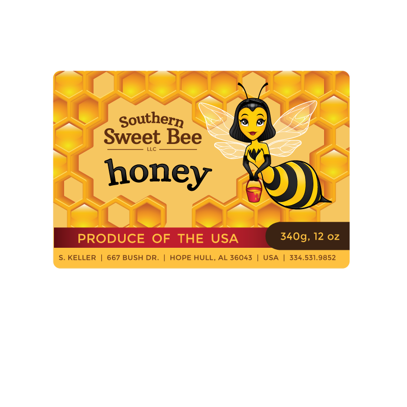
Label design concept for Southern Sweet Bee Honey. They wanted to improve on the original label, keeping the colors close but doesn't have to be exact to prevent confusion amongst buyers. The original script font of Southern Sweet Bee that they were using was causesing a problem with foreigners that only could read standard English font, so avoid script fonts but try to create a type with a designer touch. They liked the idea of a back ground with a large size honey comb with some cells not capped with a three dimension look with honey down in the cells. The Southern Sweet Bee Logo will be placed over this honey comb bringing the honey to you in the bucket. All the information can be adjusted as needed that is on the existing labels. Just the weight will change on the three different sizes.
I started by giving the logo an updated mascot, but they decided to keep the old mascot since they already had advertising and other labels with the old mascot was already established in the consumer market.