
Branding Archive
A collection of all the logos I've designed over time
Below is a big picture of every logo I've designed over time for various logo contests - unfortunately these haven't won any contest (while those who have won aren't shown here for privacy reasons). After this big picture I will present you each logo in part, with a sales pitch in case you're interested in buying any of my designs.
Oh, and word of warning: NO USE IS ALLOWED whatsoever. If you're interested in a design, I can sell it to you. But other than this, you are not allowed to use them or re-publish them!

That was an overview of the logos. As you can see they're already generic, so in case you want one, I can customize it for you - text, colors, minor adjustments, and so on. Now, let me introduce each one of them:

1. A sharp crisp design that fits any large business dealing with alliances, unions, groups or merging. It has a futuristic touch due to the modern fonts and curved abstract symbol.

2. Have a solar energy based company and don't know what your logo should look like ? What about making use of the solar energy! That's right, the power of the sun right in your logo - beautiful sun rays shooting all over, with a touch of abstract on the margins, and a great looking font.

3. Classic but yet modern design for any business dealing with finance. The smooth colors give it a modern touch, while the "f" cutting the circle gives it the classy look expected from any great & trustworthy financial business.
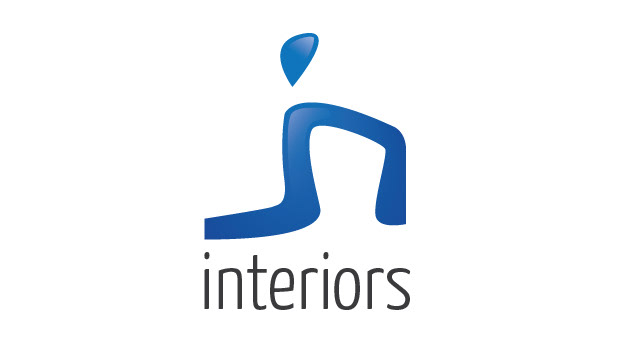
4. Interior designs are all about creativity, imagination and harmonic design! Why shouldn't this be true for your logo, too ? The abstract (yet not so abstract) symbol depicting the "in" letters with a twist on the "i" will make you look like you're one of the greatest interior designers. And in case you haven't noticed, if you turn the symbol 90 degrees clockwise it will resemble a modern chair design.

5. See the modern chair design in the first two letters ? Or the vase acting as an "i" ? That's what interior design is all about: creativity, and a touch of genius. This logo will make your business tick and stand out like no other, because you could probably be the best interior designer out there - so why not have the probably greatest logo out there, too ?
6. Fashion accessories won't sell without a brilliant & luxurious logo that stands out of the crowd. Simple yet catchy, this logo will put the mark on your customers on the first sight.

7. An extreme logo for extreme businesses or individuals trying to get visible, with modern looks, modern colors, and an extreme "X" that breaks any boundaries that you may encounter on your way to success!
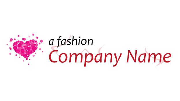
8. A stylish fashion design specifically created for the fashion/beauty industry. Whether you're a perfume creator, fashion designer, or have a fashion/beads boutique, this logo has the perfect combination of colors, typeface and also a beautiful heart symbol for any modern businesses.

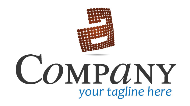
9. This minimalistic logo design can be used both in software businesses that offer fast, efficient and reliable software designs, and in financial businesses (with the circles representing money or coins). The big capital A has a clean & elegant type treatment that is easy to remember and reproduce by anyone (and it can be used independently on letterheads or business cards), while the colors give it an Eco-friendly feel. Note that the capital A can be used as a starting point in the business name, so you can have both a "software business"-like name, and the "A software business" name.

10. This warm and abstract (but still elegant and professional) logo will fit any company that has a minimum of style in the work and services that it provides, or even companies that convey the idea of a group. By making use of capitalized letters, the logo quickly reflects elegance, strength and reliability right from the first look. The abstract symbol consists of several various-sized circles suggesting a group, making it ideal for business groups, collaboration systems, or workflow-based products. The logo will look perfect with a tagline because it completes the symmetry of the design, but will also work without the tagline.
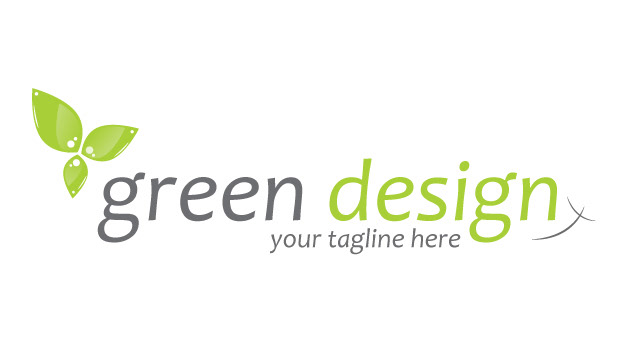
11. A beautiful environmental logo suitable for any type of green business, with a custom made modern & shiny leaf symbol, beautiful typeface and a place for the company's tagline. The rounded strokes at the right side add a finishing touch to the logo, making it look more complete.

12. This logo is suitable for green-enabled companies (that is, environmental friendly) who also deal with water and or fish. This logo has two symbols: a water-line and an abstract fish silhouette, making it perfect for sea, fishing and green companies (or even all of the previously mentioned).

13. This logo is perfect for any business working in the metal industry, or even construction-based businesses, because of the custom made shiny anvil, and the beautiful mixed-characters typeface. Simple, effective and professional, it will definitely make a big and unique impression to any company.
14. Modern logo with a 3D effect applied on the initial, making it perfect for any multimedia company or business. The beautiful mixed-character typeface perfectly fits together with the modern initial, while the 3D effect really makes the logo stand out from your competitors.

15. A great typeface-oriented approach on the logo, with two beautiful colors (dark gray and green-ish), with a twist on the bottom of every letter. This logo will perfectly fit on a design company or business, especially if it deals with a lot of type work. The big initial has clean lines and a beautiful serif, while the bottom dot makes it look complete without needing the complex bottom shape of the initial.
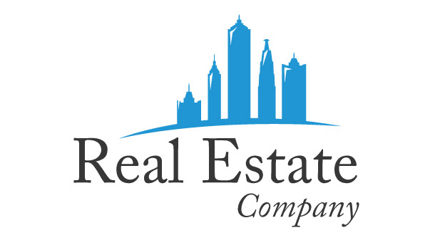
16. Real estate business logo, with an emphasis on apartments and tall buildings. The logo is presented as a city skyline as a symbol, and below it a combination of two beautiful typefaces that make it look outstanding for this kind of niche (it denotes greatness and high values).

17. A voyage business, specifically intended for companies that deal with trips (business or pleasure), flying and airplanes. The two birds suggest two things: flying and high values for the company. The bottom tagline has a beautiful typeface that makes the logo visually rich, and the color combinations make it look perfect in your clients' eyes. Inside the closed (rounded) letters are city skylines, giving the logo a great finishing touch that denotes trust and security.
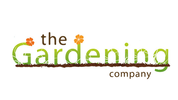
18. A great and fun logo for the gardener inside you. Whether you're a professional gardener or you own a gardening/landscaping business, this logo is both fun and professional. By combining various symbols together (seeds/dirt, flowers, grass), and with the perfect colors, this logo has a unique look that can't be forgotten to easy. It's fresh, unique and outstanding.

19. A clean and professional logo that uses simplicity to denote trustworthiness to any financial/accounting/money-related businesses. The perfect typefaces and the right symbol makes this logo easy to remember and full of confidence in the quality of the services you provide. Green stands for money, while black stands for writing (reports or any other formal letters).


22. If you are a post production company, this logo will definitely mark the dot on the "i" by combining two beautifully designed symbols: a broken disk record (suggesting that you're in charge of making it sound perfect), and a half-headphone that completes the logo. The typeface is both clean and professional, with wide letters and colors that make it stand out.

23. I've used a typeface approach on this logo to make it look complex by means of simplicity, by combining complex typefaces and beautiful colors, and by adding an extra touch with the cloud lines. Perfect for cloud-based businesses or products, this logo will clearly have a powerful impact on your identity or product.
24. This design will fit on two types of businesses: money-related, and design-related. The custom made symbol that starts on the "i" can be thought as money, or as abstract design elements. The beautiful colors and typefaces give it a professional and to-the-point look, and the two round strokes at the right side make a great finishing touch.
25. Whether you're a music-related business or you're just booking/selling tickets, this logo has a great unique effect that makes it not just professional, but fun, complex, entertaining and outstanding. By leaving a letter go beyond the cutting line, the entire logo pops out with freshness, symmetry and beauty.

26. This design hasn't been created for a specific industry, therefore it will fit to almost any business out there. The logo uses a different approach by adding the tagline right above it, while the bottom is decorated with professional-looking strokes that surround a tall lowercase letter. If your identity name doesn't have this kind of letters, the space between the two lines won't remain empty, but instead will be filled with a beautiful thick dot that won't have an impact on the look. The two birds flying around suggest high values and trust, but can also be seen as something abstract.

27. Clean, simple and modern - perfect for any type of business that puts an emphasis on the "b" or "p" letters. This was initially designed for electric companies, but by changing colors it can fit with any type of business. The beautiful typeface makes the logo even more beautiful, and also fits perfectly with the provided symbol.

28. A perfect logo for any online-based real estate agencies, or even companies that deal with building houses. It has a modern feel to it due to the shiny houses-on-the-hill symbol, so it's both fun and professional. Simple, modern and eye-catching.

29. SOLD!

30. A modern (if not futuristic) design suitable for real estate agencies or house building companies, with a great looking abstract house symbol. Typeface has a clean modern look that fits perfectly with the symbol, and the tagline was placed above for a different approach, suggesting creativity and imagination.
31. A minimal design, yet very good looking and interesting because of the perfect strokes that sit inside every rounded shape. But this logo is everything but minimal in terms of quality and creativity, and by adding shadows under the longer lowercase letters, it gives the logo a perspective look, making it almost look heavy. Will fit perfectly in an animation where the letters bounce on the ground. The tagline has a warm and trusting feeling due to its beautiful typeface and location.

32. Suitable for natural and landscaping businesses, this logo has the right feel and communicates the right message to the clients. It has a detailed illustration of hills and trees, and the birds give it an extra touch of confidence and perfection. The colors and typefaces also fit perfectly together with the illustration.
33. A minimal design for any natural/bio/environmental-friendly company that deals with either food or health products. The warm colors will send the right message to your buyers, and by combining a hill-line with a root growing out of a letter and under the "hill", this logo has the perfect look for this kind of business. It will look beautiful on any packaging design.

34. Professional, warm, and trusting - these are the messages that this logo sends to your clients. The beautifully aranged text in a square-like layout completes with the beautiful illustration of hills, trees and birds, and to make it perfect I've made a beautiful place for the tagline, right below everything. This logo will fit any business that deals with landscape design/architecture, or even environmental businesses.

35. Classic, but modern; Simple, but complex; Minimal, but professional - if you have a corporate business, this logo can serve as your identity. It has a complex and effective typeface that makes it look both simple and complex, and by adding an abstract shiny symbol it will be not just easy to remember, but hard to forget.
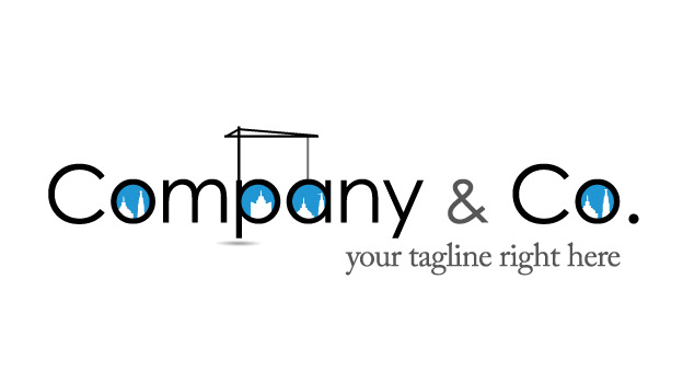
36. A perfect logo for a construction/architecture company - The text and the symbols are mixed together to give it a corporate look, and by adding a crane on the text that lifts on of the letters, it gives a professional look. The symbols inside the closed letters contain buildings, forming together a skyline.

37. A corporate design for any business related to construction, architecture, buildings, heavy lifting, cranes and metal work. It contains an abstract symbol that looks like metal, and the typeface has a "heavy" look to it making it perfect for these kind of businesses and industries. The black and blue colors also make it a perfect fit for this niche.

38. A beautifully designed logo, with perfect typeface and type treatment, making it fit on any real estate agency - whether you're a real estate agent, or building houses, this logo is both professional, unique, sends the right message and even with confidence. The house can be placed on any lowercase letter, either aligned to the left or to the right, and makes a beautiful addition to the logo.

39. Have an african business or company that wants to spread the word about Africa ? This logo is perfect for you since it uses a beautifully designed symbol that illustrates the African continent (with a twist by adding a specific tree that is found in Africa). This shiny symbol denotes variety in culture, new horizonts, warmth and trust, and with the beautiful typeface makes it hard to forget.

40. A design specifically designed for businesses that relate to the african continent. The beautiful drop-like symbol that contains a scribbled Africa silhouette denotes friendship, peace, culture variety, warmth and beauty. Whether you're a business or non-profit company, this logo will definitely make you standout.

41. A great logo for any respectable DJ, with a twist on the symbol that it uses (a shiny guitar, headphones and a microphone, forming together a "virtual" band). The fonts are perfect for a DJ and even includes the "dj" letters, and instead of the tagline you can specify your main music type that defines you as a DJ.

42. Whether you're a DJ, a record company or anything music-related, this logo has a modern design approach by combining various symbols with a modern typeface. Beautiful colors, abstract symbolism and hard to forget. This logo will definitely fit to an indie band,too.

43. Simplistic, minimal, modern and shiny - the perfect combination for any business that identifies itself with the words professionalism, simplicity and beauty in perfection. The perfect fonts and the most interesting symbol make it a logo that can be hard to forget, unique and outstanding.

44. A generic logo for any kind of business, company or industry, with a modern type treatment and beautiful typefaces. The custom made symbol can be applied to any letter of the alphabet, and the shadow beneath it suggests the will of succeeding, of going up no matter what.
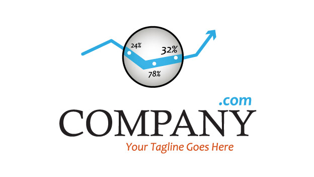
45. A perfect design for any statistics or money-related business (accounting, finance, banking, you name it). The logo also includes a domain extension that is optional, and the colors fit perfectly together in a beautiful harmony. The custom made symbol represents a piece of statistics or even a chart, but at its origins it was designed to represent a magnifying glass that looks at numbers, suggesting perfection in details.
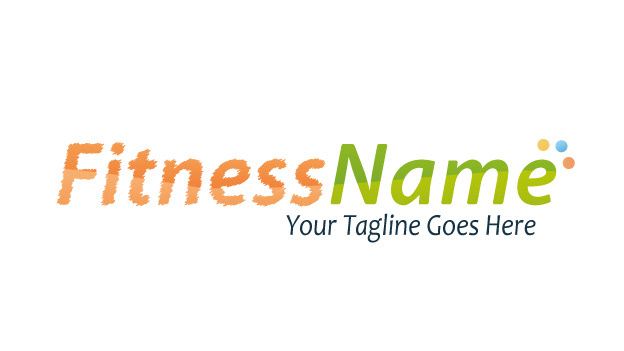
46. By using the perfect colors, harmony and type treatment, this logo will definitely spicen up your fitness-related business. The first part of the text suggests weakness by using a scribble effect, while the second part represents the achievement of getting fit, healthy and strong.

47. Railroad business ? Travel company ? Hicking, mountains and paths ? This logo is just perfect for that. It's minimal, but by using the perfect autumn colors combined with a beautiful path symbol applied on the last letter, this logo is not just beautiful, but memorable and long lasting.

48. A unique and great logo with a hard-to-forget twist: a golf ball character illustration. Meet your new identity! This logo is perfect for any golf-related business, making it both fun and professional by combining this cute character with professional typeface. Just look at the details, and how everything fits together just perfect!

49. A modern design that works on any type of business or niche. It's unique, abstract and fun. It could be used on electric companies, telecom industry, lighting firms and so on. No matter which one you are, this logo will complete your identity just perfect.

50. A great design with a unique effect on the letters - the most beautiful type treatment, modern, catchy and perfect. It looks like it's bending towards you, and will fit anywhere because of its simple horizontal layout. The effect from the "F" letter can be applied on almost any letter from the alphabet, and the shadow below it is the perfect addition that gives it a 3D perspective look.

51. A great design for any respectable company or business, no matter what it does. As long as it's professional and high quality work and services, this logo emphasizes that by means of beautiful typeface and interesting symbolism. The digit inside the symbol can be replaced easily with any other digit that may identify your business.
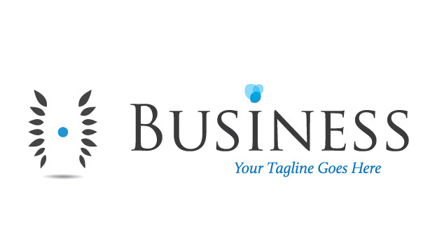
52. A great corporate design for a professional company or business that deals with paper work, consulting or anything that is strictly business. There are two symbols in this design, both abstract: the "H" like symbol on the left that suggests professionalism and quality, and the "dot" on the letter "i", suggesting creativity and open-minded.
53. An intriguing design, perfect for any real estate business. It has a great layout similar to those seen in magazines, perfect harmonized colors, brilliant fonts and a unique symbol representing a house at its building stage. Whether you are a real estate agency or architecture-related company, this logo will definitely hit your clients' soft spots by its unique beauty - and beauty is hard to forget.
54. A minimal design perfect for cloud-based businesses, or even networking-related ones. The blue and dark gray colors are perfect for the eye, and suggest professionalism and trustworthiness. You can easily observe the mixed-case lettering that has a good reason: to suggest creativity and unique [quality of] services.
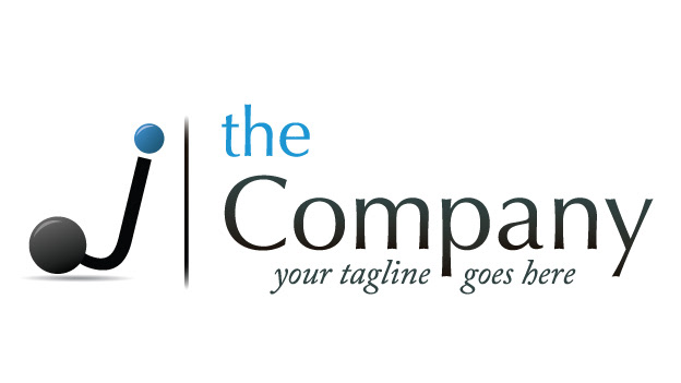
55. A great design for any business that deals with consultancy, consultants, finance or accounting. It has a "J"-like symbol that makes it perfect for any names that contain a "j", but may also be used as an abstract symbol due to the big base circle. Beautiful typeface, beautiful colors, everything is just professional and clean.

56. A minimal design that's making use of a compass symbol as a type treatment, indicating something architectural related - therefore, this design best fits with architecture/construction companies. Simple, yet effective, it will really make a big impression among your competitors.
57. A great design that fits on any business that deals with fashion, beauty or hair. You can use it as a whole, or as an emblem. You can also incorporate 2 or 3 initials inside the emblem. The two curved shapes can be seen as hair or an abstract feminine shape.
58. A medieval-looking logo that can be used by any business that deals with retro fashion or history. It contains an abstract symbol at the top that gives the whole medieval look, and also a gothic-like typeface. Simple, yet powerfull.
59. A great concept that would work best for interior design businesses or even lighting companies. The logo contains a lamp that sits on top of the text and lightens it, giving it a perfect look for these kind of businesses. Also, the bottom text has a classic and elegant feel due to the top and bottom lines.
60. A minimal design that is great for simple businesses or non-profit ones, no matter what type of industry it works in. The best feature of this logo are the two birds at the top right that give it a feeling of greatness, and the colors that are warm and relaxing. Simple and perfect!

61. A minimal modern design good for companies that deal with electricity, computers, internet and other technologies. Every letter has a few dots that give it this professional look and feel, and the color combinations and placement of the tagline are how they should be - perfect.

62. Professional logo design with a twist on the text - by adding "bubbles" at the beginning of the text, this logo is suitable for liquids-related companies, cloud-based technologies, online services and even design companies. Simple, professional and good-looking.

63. The perfect design for your hair & beauty business. Whether you're a simple salon or a big company, this logo will leave a mark on your clients by its unforgettable design. Every letter has a hair curl extension that sends the right message to your clients. Simple, yet effective and professional.

64. A great logo for travel agencies, even airline companies. It has a crisp modern look, perfectly noticable and readable at big distances, and the extra finishing touch is given by the green elements, specially the green bird silhouette that makes it just perfect for airplanes.

65. Is your business dealing with travel or mountain trips ? Or maybe just the mountain wheather ? This design will fit you perfectly because of the beautiful mountain lines, all with sun and even eagles flying around. The text is sitting on a virtual ground represented by a curved line, and the colors are just perfect for this niche.

66. A great looking design for your natural/environmental-friendly/bio/healthy business. Whether you are selling natural products or just deal with manufacturing, this logo definitely hits the spot among your clients by its unique design. The tree has a shiny and modern feel by its abstract nature, and the text layout makes it beautiful for the eyes!
67. A great and unforgettable logo for any food-related business or individual, specially if it's online-based. It has the perfect typefaces for this niche, the best color combinations, and unique approach on symbolism - a cooking glove hanging on a letter, and a big spoon full of soup that is an extension of a letter. It's fun, modern, but still maintains its professional nature.
68. A simple and fun logo for businesses that think of themselves as being quick in service and delivery, professional and high-quality. It's for those companies that have a corporate & fun feel to them, doesn't matter what niche. It's just a fast and great design, with a twist on a rounded letter that matches the "ninja"-like symbol.

69. SOLD!
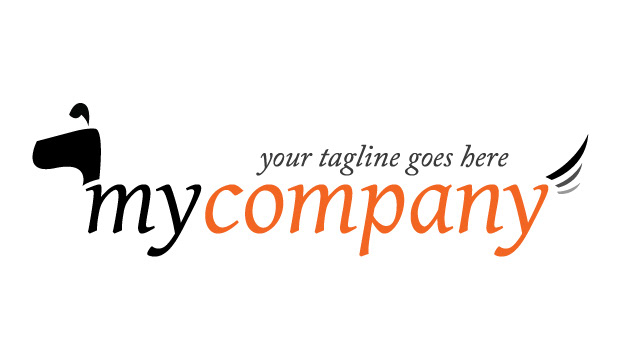
70. Brilliant fun logo perfect for anything dog-related, as long as the dogs are happy! Simple in its design, but powerful in its concept, this logo is perfect not only for internet-based dog businesses, but also for corporate companies (because this design will also look good on stationery).

71. Simple yet powerfull concept of a dog incorporated right in the text - perfect for corporate businesses that deal with dogs or security. This design feels serious, professional and complex even tough it's simple in terms of design. The tagline could also sit below the text, but for a greater impact on the eye, I decided to put it on top.

72. Having a nozzle-related business ? Here's a brilliant catchy design with a 3D looking symbol for the nozzle effect. The text also has a custom treatment due to curved line that cuts into the text. You can also notice the mixed-case lettering that gives it a more professional and creative look.
73. Having a nozzle-related business ? Here's a brilliant catchy design with a 3D looking symbol for the nozzle effect. The text also has a custom treatment due to curved line that cuts into the text. You can also notice the mixed-case lettering that gives it a more professional and creative look.

74. A slick modern and minimal design for any kind of online businesses. It has a simple type treatment (a cutting line and a color effect at the top of the letters), and a beautiful hanging file-like symbol that shows a domain extension. Therefore, this design is perfect only for website names.

75. A unique and beautiful logo with a fun custom made bee character design, making it perfect not just for bee-related businesses, but also for modern or online businesses that idenfity themselves with a bee. Could even be used on teams that are seen as "working bees", to make thins a little more fun and relaxing. The second variation of the logo has a twist on the bee that now looks tired and sleepy.

76. A unique and beautiful logo with a fun custom made bee character design, making it perfect not just for bee-related businesses, but also for modern or online businesses that idenfity themselves with a bee. Could even be used on teams that are seen as "working bees", to make thins a little more fun and relaxing. The second variation of the logo has a twist on the bee that now looks tired and sleepy.
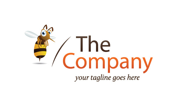
77. A unique and beautiful logo with a fun custom made bee character design, making it perfect not just for bee-related businesses, but also for modern or online businesses that idenfity themselves with a bee. Could even be used on teams that are seen as "working bees", to make thins a little more fun and relaxing. The second variation of the logo has a twist on the bee that now looks tired and sleepy.

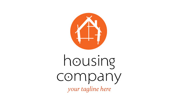
78. An abstract concept related to housing and real estate agencies. This design is simple but easy to remember and hard to forget due the "H" type treatment that has a roof. The beautiful typeface gives it a professional and trusting look, that will definitely have an impact on your target audience.
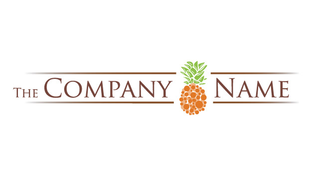
79. A perfect design for any company that sells natural, bio, healthy or environmental-friendly products, specially fruits (because of the abstract ananas symbol). The second variation of the logo has an ananas with a more natural look than this one. Both variations have a classic feel due to the text and the top/bottom lines that surround it, making it perfect for packaging designs.

80. A perfect design for any company that sells natural, bio, healthy or environmental-friendly products, specially fruits (because of the abstract ananas symbol). The second variation of the logo has an ananas with a more natural look than this one. Both variations have a classic feel due to the text and the top/bottom lines that surround it, making it perfect for packaging designs.
Thanks so much for viewing my work!
..and don't forget to push the big blue button below! :D
..and don't forget to push the big blue button below! :D

