

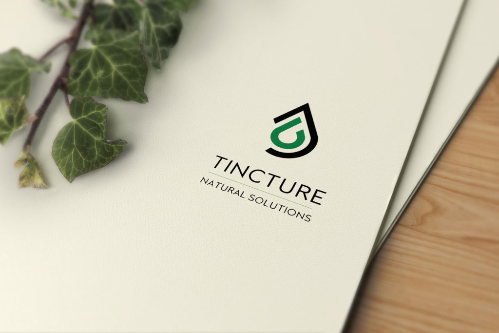
Logo design for Tincture Natural Solutions, the logo sits in the middle and is the amalgamation of the middle two letters 'C' and 'T' aligned in the formation of a drop keeping in line with what the brand stands for.

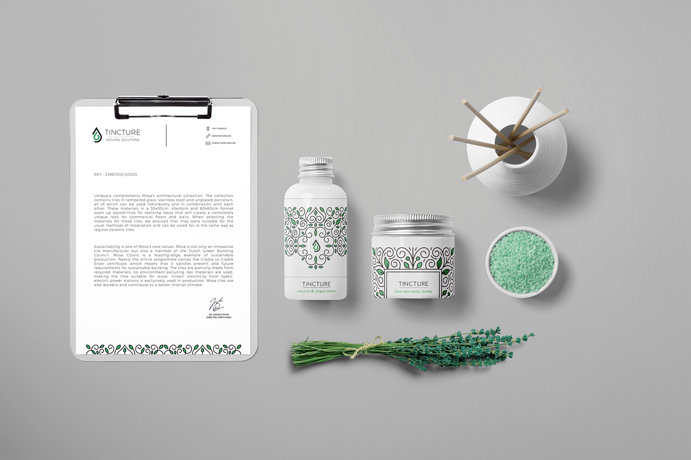
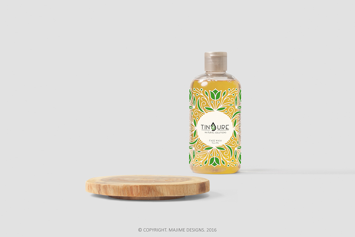
An organic approach was carried through out the design, keeping it as close to nature as possible.


Interior Design for the company office space. Reception area depicted in the above image.


