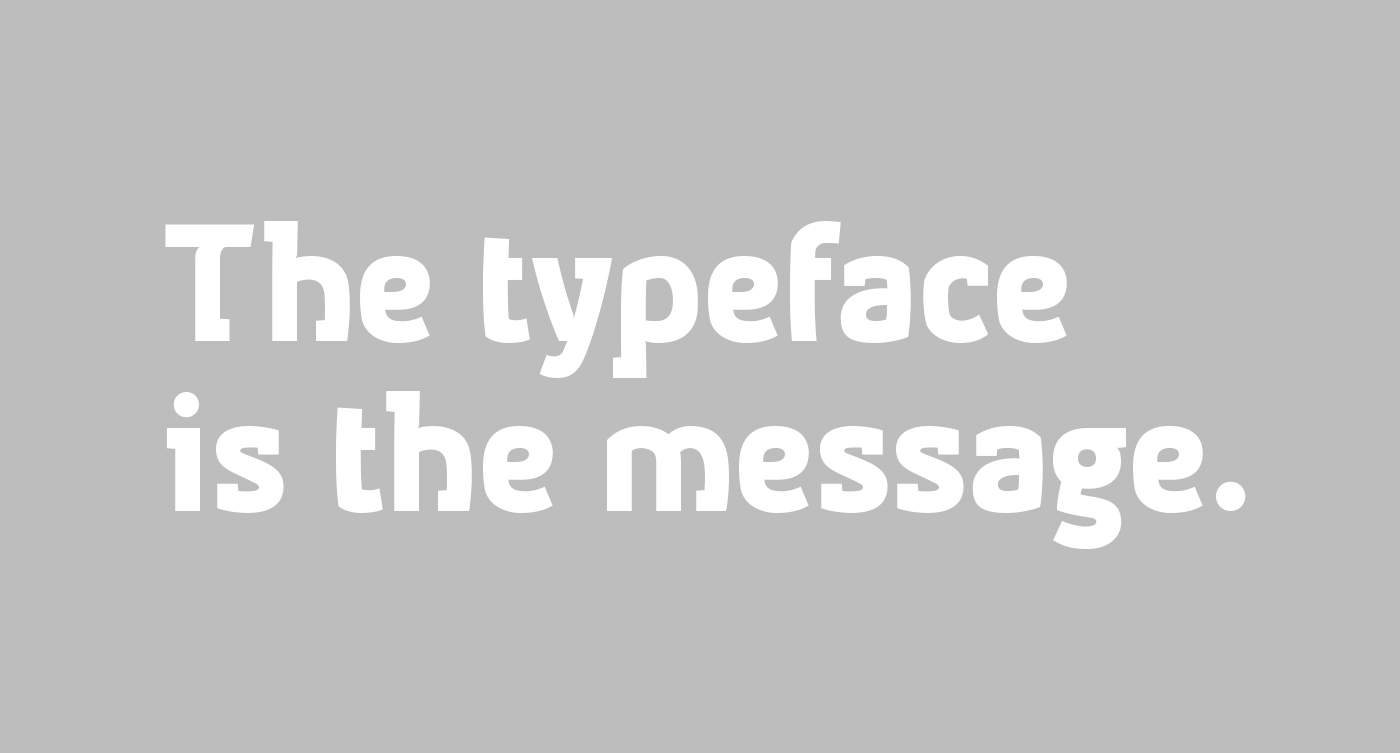

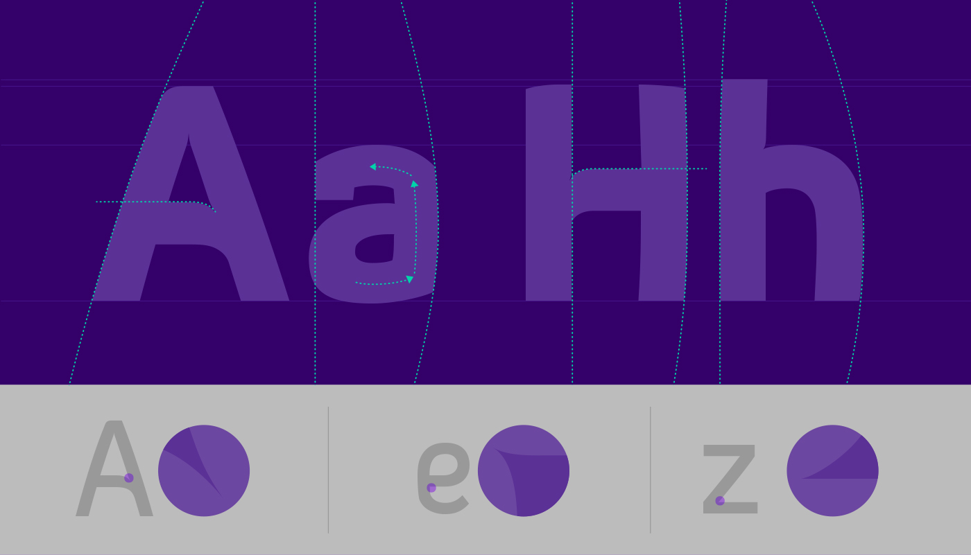
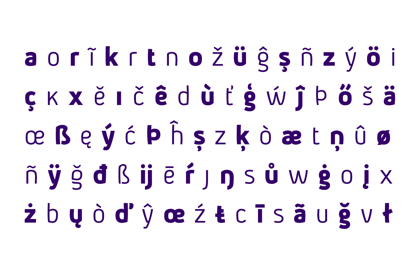
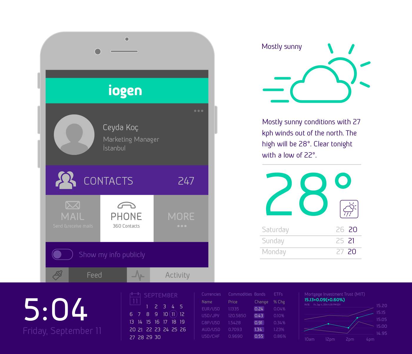

The current design of "iogen" is a result of years of alterations since it's original concept was born in 2010 as "embrio" and it needed a hallmark to make it authentic. The idea of "a typeface speaking pleasantly" is the basis on which "iogen" is constructed. Hereby, the letter forms are based on sharp directional changes and bended vertical strokes, allowing it to speak clearly and pleasantly. The sharp corners, open apertures and open counters of iogen also ensure legibility in smaller sizes.
DOWNLOAD IOGEN FROM MONOTYPE
DOWNLOAD IOGEN FROM MYFONTS
