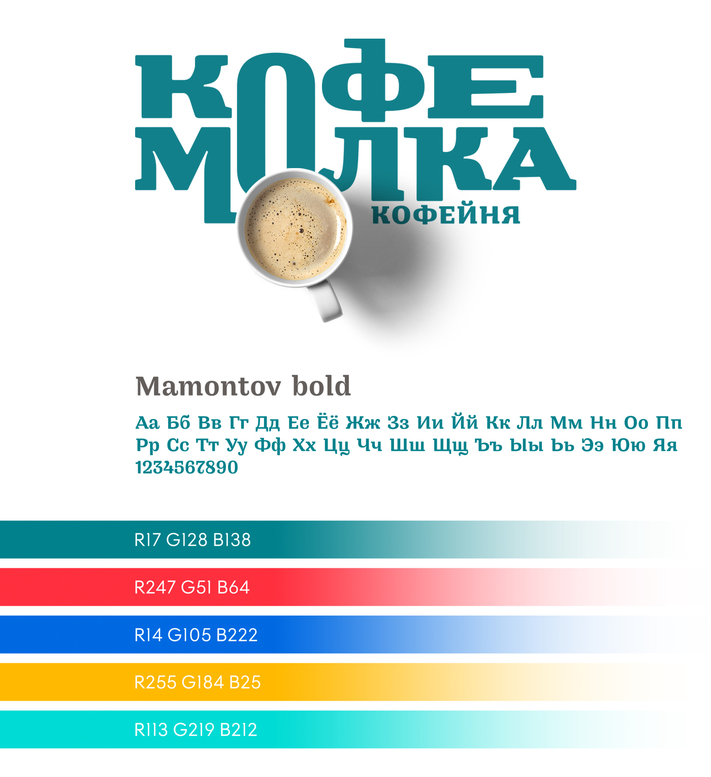
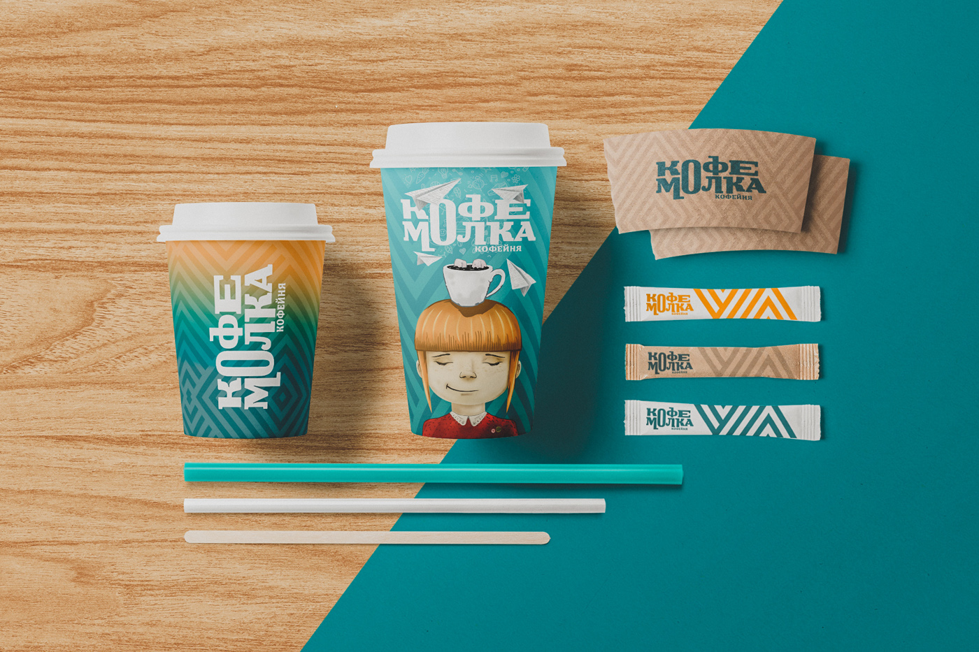
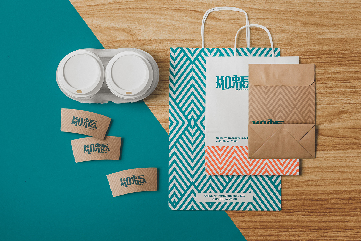
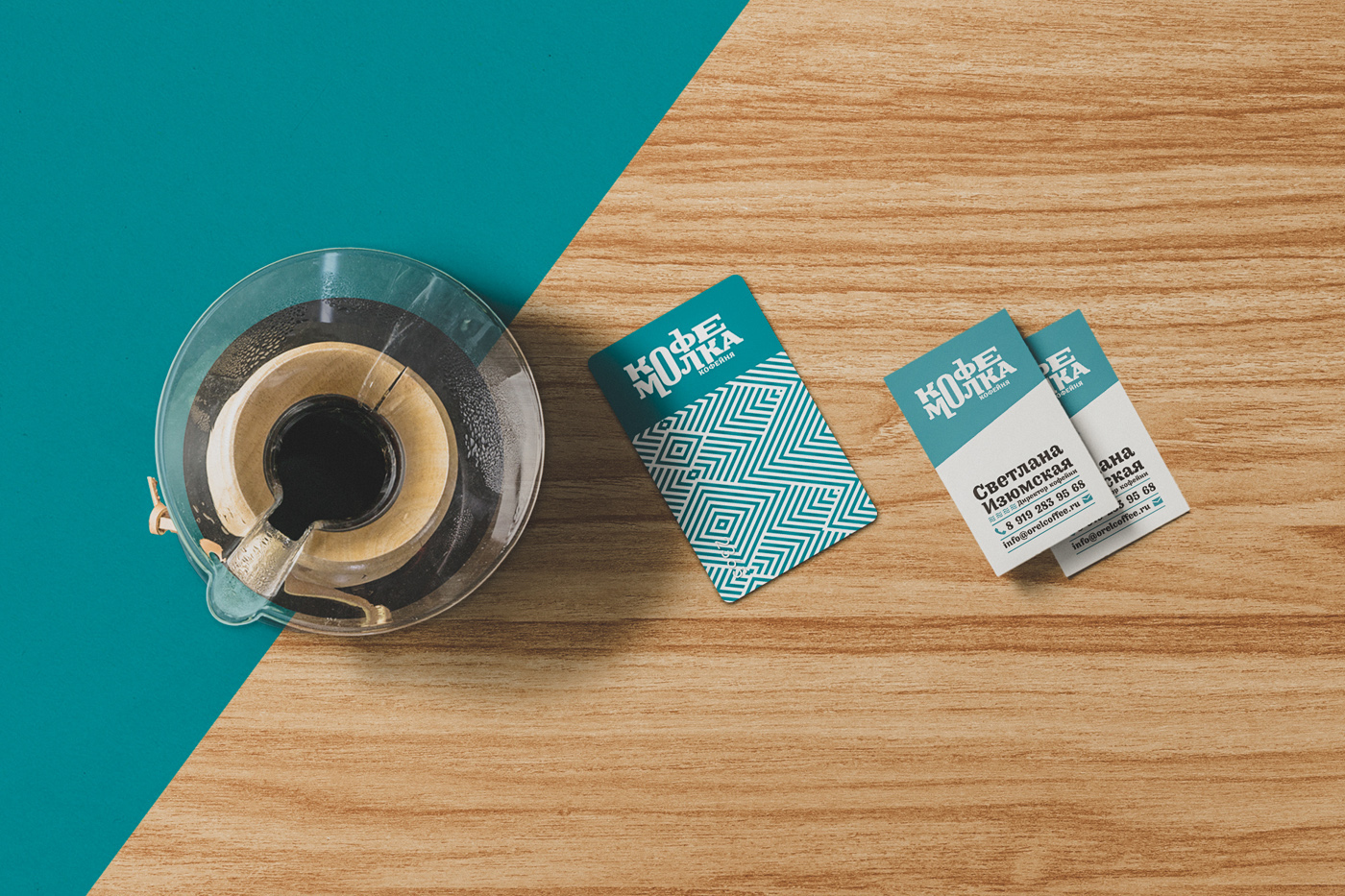
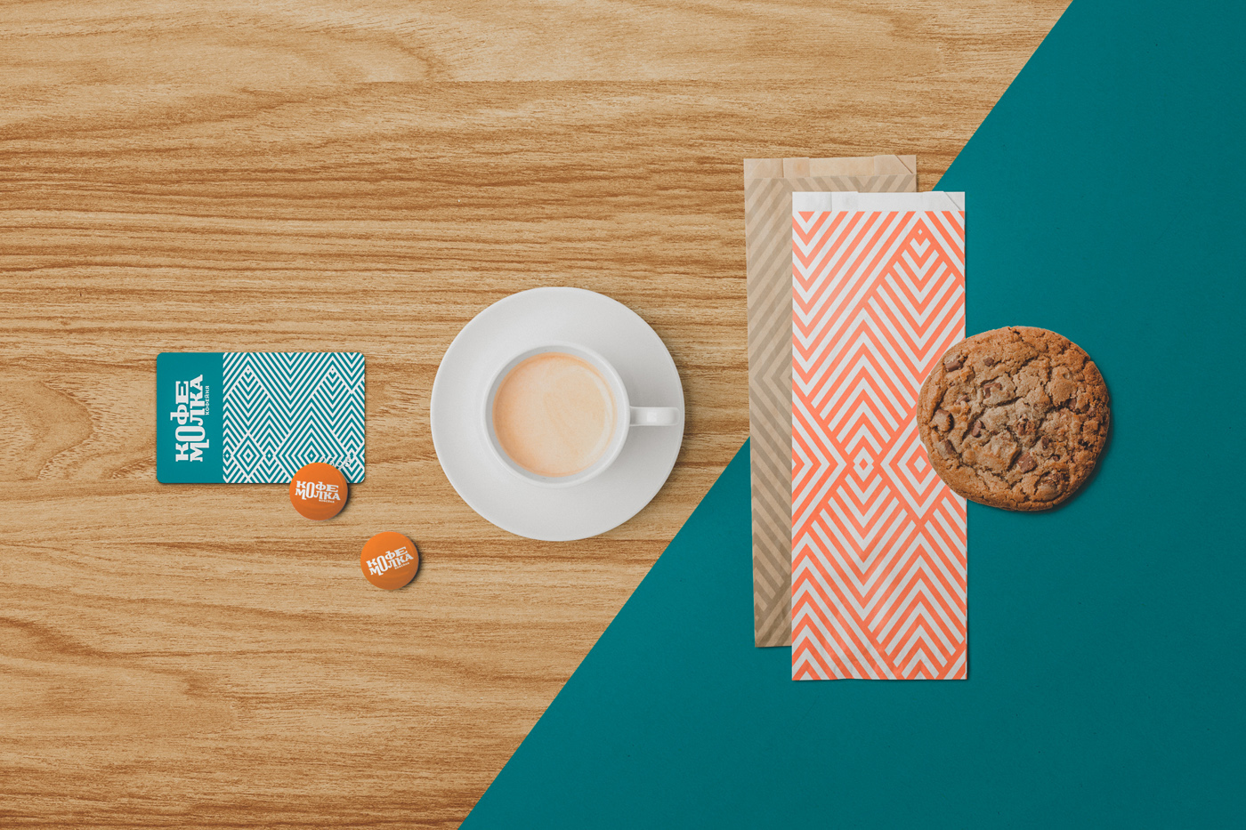
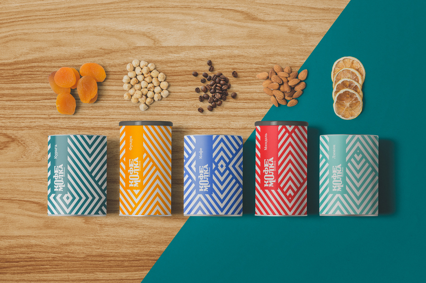
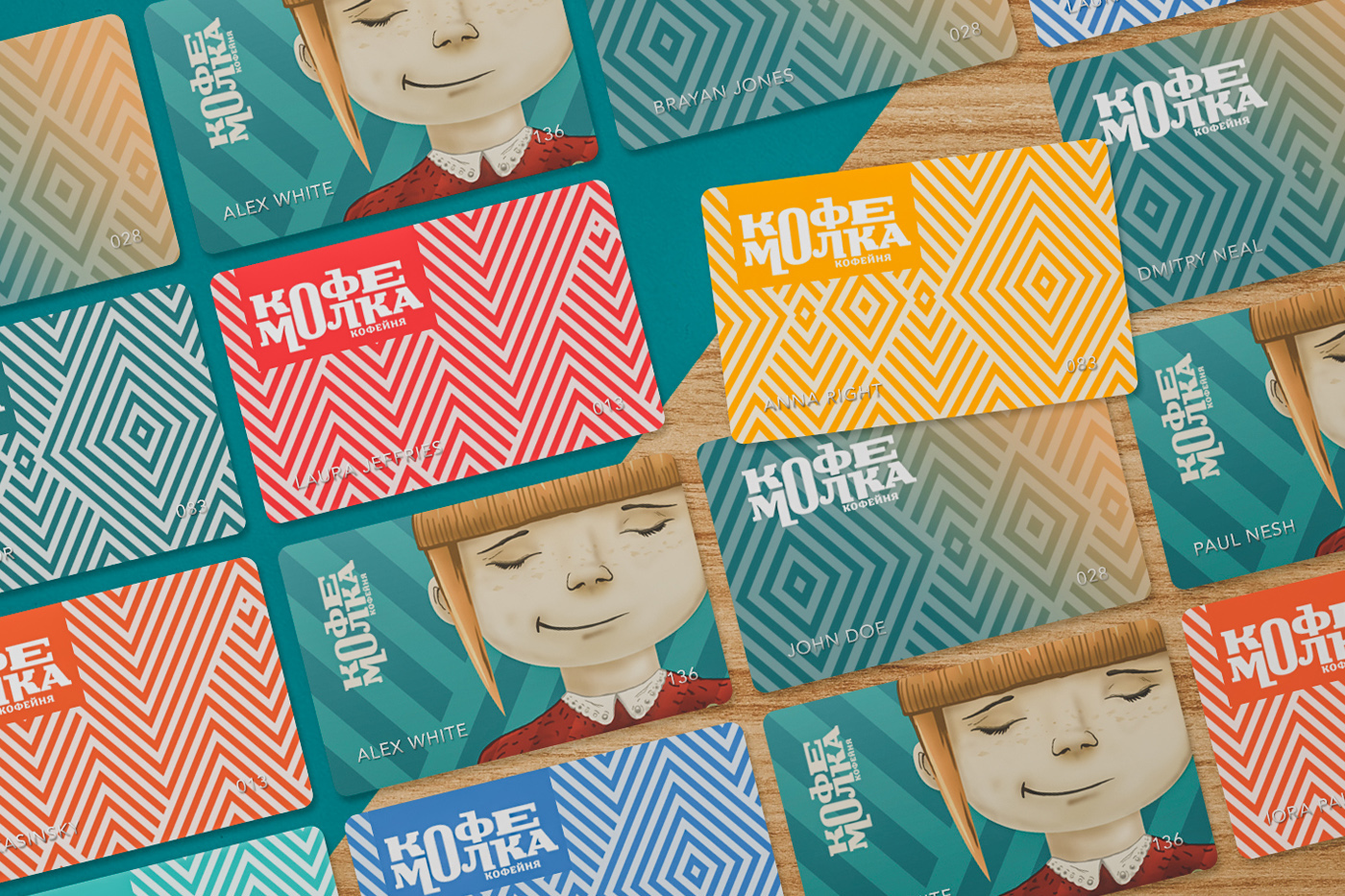
Corporate style of the cafe KOFEMOLKA is based on geometric pattern combined with bright colour scheme. Together they symbolize youth and modernity. The illustrator Evgeny Kalayanov created a special character - cartoon image of a girl with a cup of coffee on her head and an enigmatic smile, who is surrounded by paper airplanes. This surreal, gentle image contrasted to the fairly aggressive geometry of the cafe claims that the coffee shop is intended for a wide audience, which also includes children.
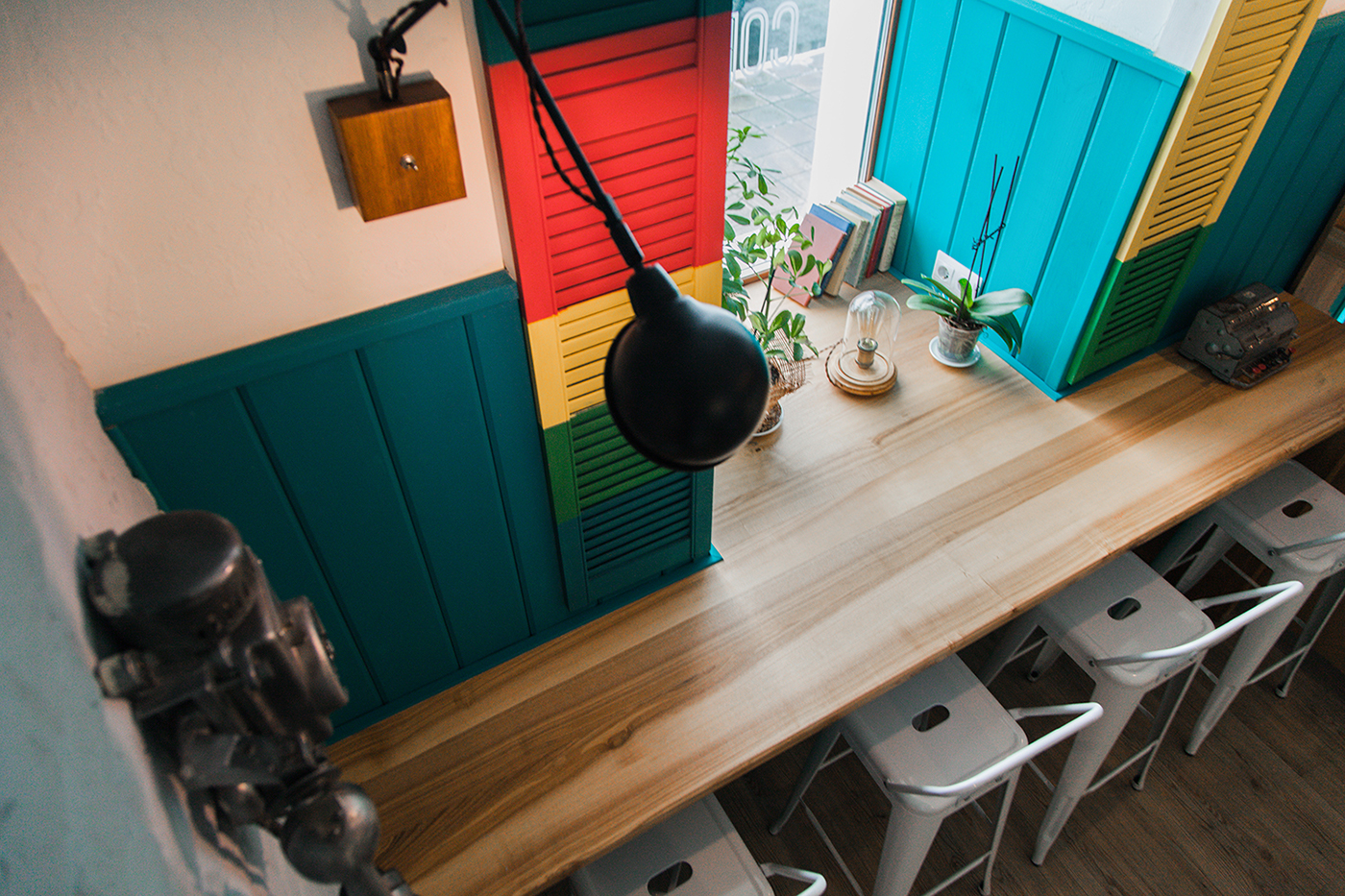
The coffeehouse interior is divided into two zones - the entrance hall which combines the bar with bar stools at the windows and a hall with big tables for big companies of guests. For the interior, turquoise and white have been used as the main colors. They are slightly diluted with bright colored shutters and countertops with active ashen texture. The main role in the setting is played by the plywood which is a basic material for carved decorative compositions on the walls, natural plants and mirrors that art up the second hall.