Sobre o projeto
(PT-BR)
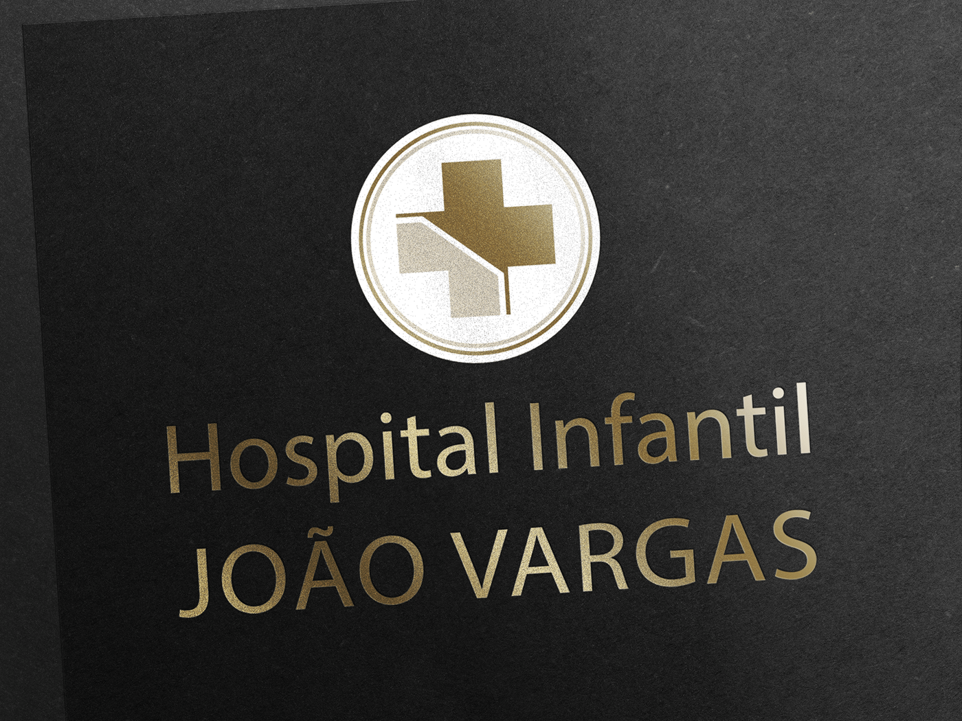
Este manual acadêmico foi projetado para a criação da marca fictício, para o Hospital Infantil João Vargas com propósito do desenvolvimento do aplicativo mobile e alguns materiais impressos.
(ENG)
This academic manual was designed for the creation of the fictitious brand, for the João Vargas Children's Hospital with the purpose of developing the mobile application and some printed materials.

Assinatura visual
(PT-BR)
A marca pode ocorrer em duas versões: uma horizontal, de uso preferencial e outra vertical. O uso da versão vertical será indicado somente nas situações em que a versão preferencial apresentar dificuldade.
(ENG)
The tag can occur in two versions: one horizontal, preferred use, and one vertical. The use of the vertical version will be indicated only in situations where the preferred version presents difficulty.

Grid de construção
(PT-BR)
A consolidação de uma marca requer sempre o uso correto de todos os seus elementos. Para aplicar a marca um segundo método de construção da marca foi utilizado o grid de construção o desenho da marca se constitui a partir das relações entre seus elementos: as distâncias e os alinhamentos estabelecidos proporcionam uma sensação visual de equilíbrio, harmonia e estabilidade.
Os diagramas a seguir possibilitam a visualização da geometria da marca estabelecendo as proporções entre os elementos.
(ENG)
Consolidating a brand always requires the correct use of all its elements. To apply the brand a second method of construction of the brand was used the construction grid the design of the brand is constituted from the relations between its elements: the distances and the established alignments provide a visual sensation of balance, harmony and stability.
The following diagrams make it possible to visualize the geometry of the mark by establishing the proportions between the elements.


Área de proteção
(PT-BR)
Deve ser resguardado um espaço ao redor da marca, livre de interferência de outros elementos gráficos, para preservar sua integridade e legibilidade, a este espaço atribuímos o nome de “arejamento”.
O espaço mínimo recomendado de arejamento da marca é igual à altura da letra “O”. Ou seja, para saber qual o arejamento mínimo da marca, meça a altura da letra “O” da palavra hospital. Esse valor é igual a “x”, distância que determina o arejamento da marcada marca.
(ENG)
A space should be protected around the mark, free from interference from other graphics, to preserve its integrity and readability, to this space we assign the name of "aeration".
The minimum recommended aeration space of the mark is equal to the height of the letter "O". That is, to know the minimum aeration of the mark, measure the height of the letter "O" of the word hospital. This value is equal to "x", distance that determines the aeration of the marked mark.

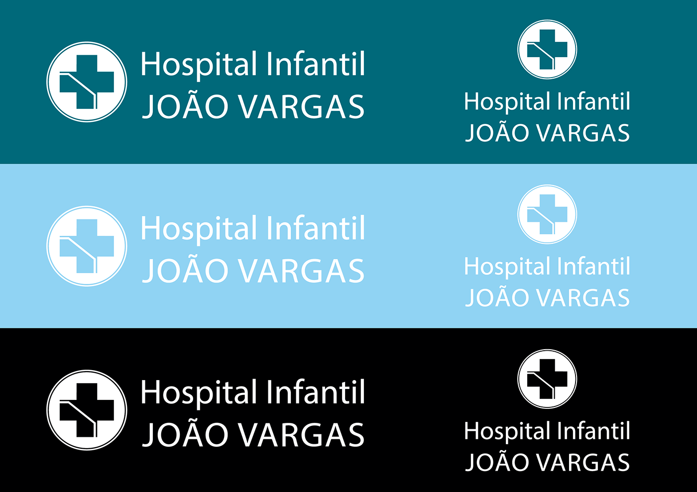
Versão negativo
(PT-BR)
Deve-se sempre dar preferência ao uso da marca nas cores institucionais em fundo branco. No entanto, ela também poderá ocorrerem negativo.
Quando houver necessidade da aplicação de fundo em material impressos a 1 cor, o fundo utilizado deverá ser preto 100%.
As variações cromáticas aplicam-se tanto para a versão vertical como para a horizontal.
(ENG)
One should always give preference to the use of the brand in institutional colors on a white background. However, it may also occur negative.
When the background is applied to 1-colour printed material, the background used should be 100% black.
Chromatic variations apply to both the vertical and horizontal version.
Versão positiva
(PT-BR)
A marca versão positiva será aplicada somente em fundo branco. Deve-se sempre dar preferência ao uso da marca nas cores institucionais em fundo branco, caso não haja a possibilidade de utilização da marca positiva em cores, estão previstas as versões monocromáticas. As variações cromáticas aplicam-se tanto para a versão vertical como para a horizontal.
(ENG)
The positive version tag will be applied only on a white background. Preference should always be given to the use of the brand in the institutional colors on a white background, if there is no possibility of using the positive brand in colors, the monochrome versions are provided. Chromatic variations apply to both the vertical and horizontal version.

Cores padrão
(PT-BR)
O sistema de cores do hospital infantil João Vargas e um papel importante para identificar. As cores utilizadas foram tons de azul escuro, azul claro e branco as quais seguem as escalas CMYK, RGB E PANTONE estipuladas. Para isso é necessário que as cores sejam usadas de forma consciente, seguindo o manual, o qual garante os valores da marca.
Dependendo da peça a ser confeccionada e da sua natureza (papel, cartão, película adesiva, metal etc.) outras referências de cores serão necessárias.
Caso não exista uma especificação estabelecida, a conversão deve ser feita por aproximação, tornando-se a escala Pantone como base para comparação. Na tabela a baixo estão as referências dos matérias usados com maior frequência.
(ENG)
The color system of the João Vargas children's hospital and an important role to identify. The colors used were shades of dark blue,light blue and white which follow the CMYK, RGB and PANTONE scales stipulated. For this it is necessary that the colors are used consciously, following the manual, which guarantees the values of the brand.
Depending on the part to be made and its nature (paper, cardboard, adhesive film, metal, etc.) other color references will be required.
If there is no established specification, the conversion should be done by approximation, making the Pantone scale as the basis for comparison. In the table below are the references of the most frequently used materials.

Tipografia
(PT-BR)
A família tipográfica escolhida para a identidade visual foi a Myriad Pro, uma tipografia moderna e de boa legibilidade. O uso dessa família tipográfica está previsto também para aplicações nos demais textos (anúncios publicidade, cartas, endereços de papelaria institucional, títulos de formulários, etc).
(ENG)
The typographic family chosen for visual identity was Myriad Pro, a modern typography with good readability. The use of this typographic family is also provided for applications in other texts (advertising advertisements, letters, institutional stationery addresses, form titles, etc.).