

Eole Concept is a company who creates softwares of business administration. Launching their product Soraya Soft in Canada, their demand concerned the realization of various communication mediums (leaflet, web banners, kakemonos) to present this software addressing to professionals of health and well-being.
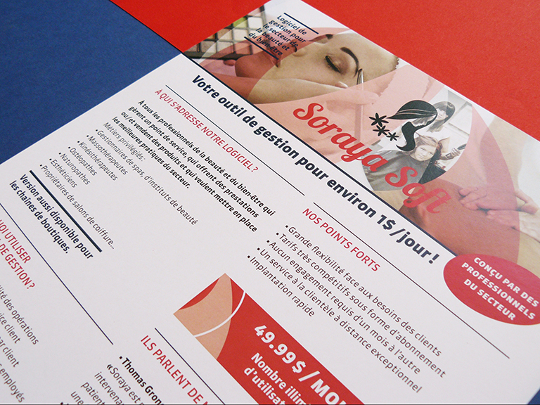
From the Eole logo, I extracted the forms of sails inflated by the wind to bring a dynamics into the images which they’re going to wrap. Photos are unsaturated to avoid many-colored effect with too garish colors, or being too austere with the use of black and white. The sober layout allows to see immediatly the important informations thanks to color chips, title blocks and typographic styles. The color range is feminine with the «Soraya pink» but also masculine with the «Eole blue», the soft red uniting both universes. The font Sanuk, with its modern and geometrical drawing, reflects perfectly the digital universe of the management software and is used for the texts; the font Lobster is chosen for the titles concerning the software Soraya Soft for its fluid, round and feminine forms which correspond to the domains of the beauty and well-being.
—
En français, ici
LEAFLET


KAKEMONOS

WEB BANNERS


—
THANKS FOR WATCHING !
—
THANKS FOR WATCHING !
—


