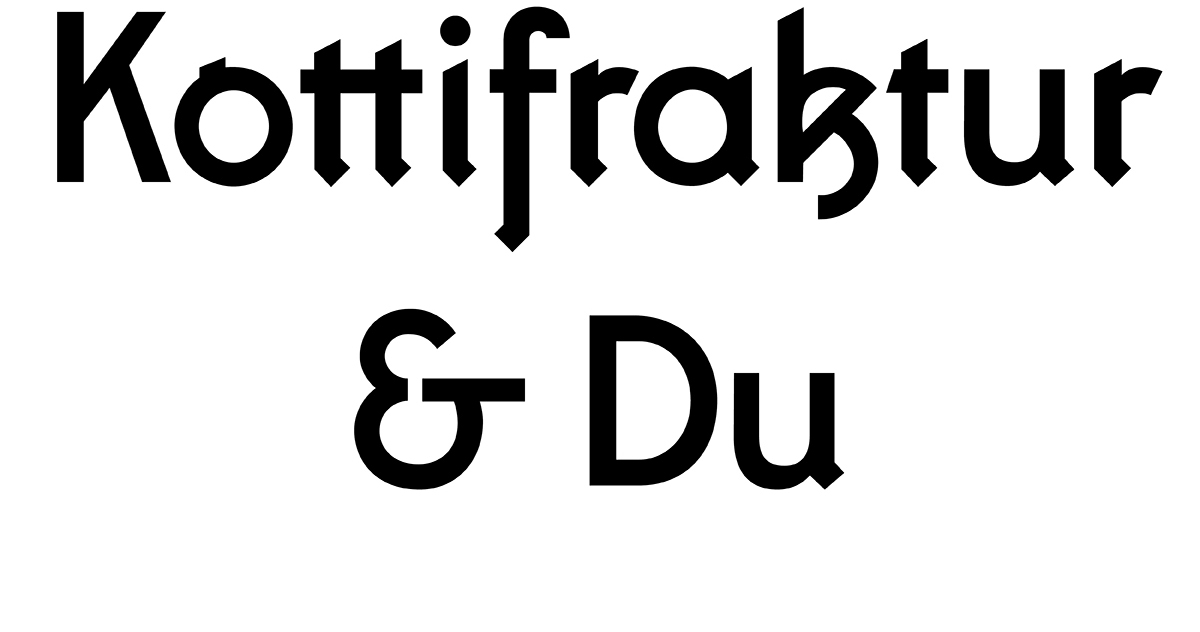
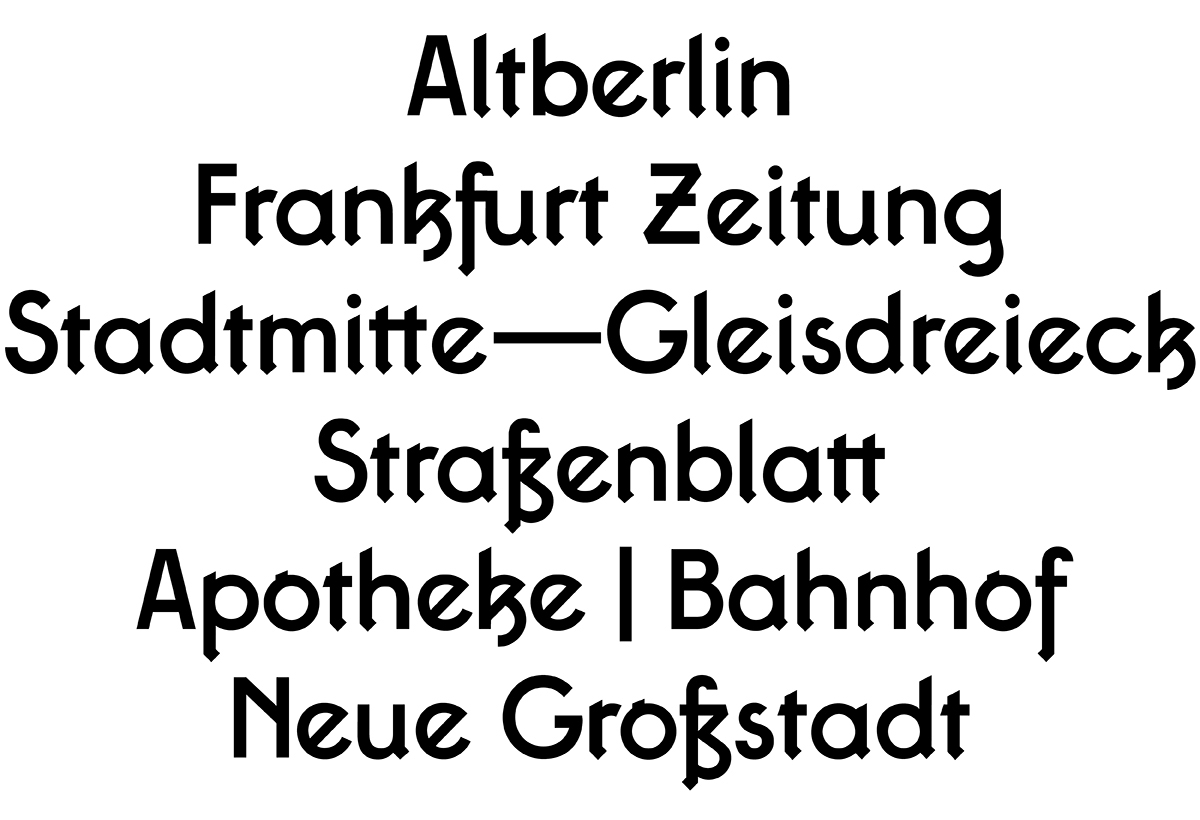
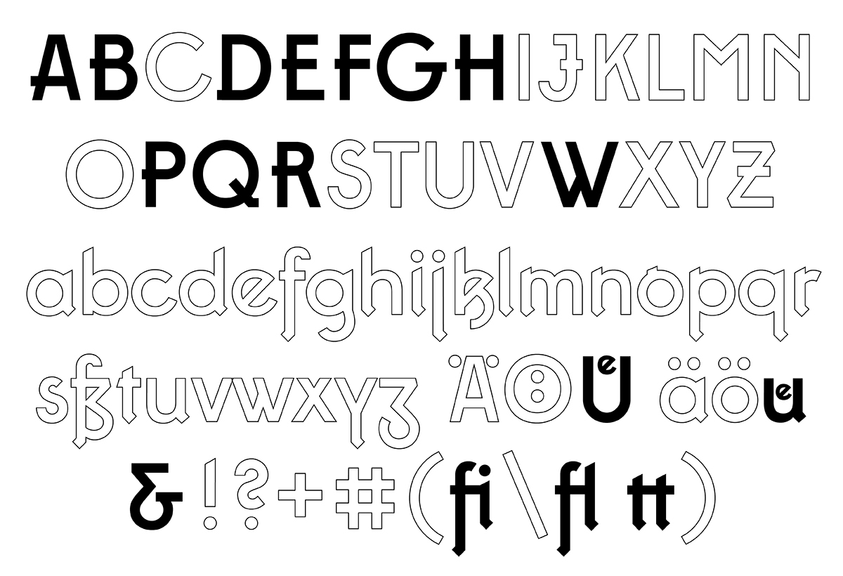
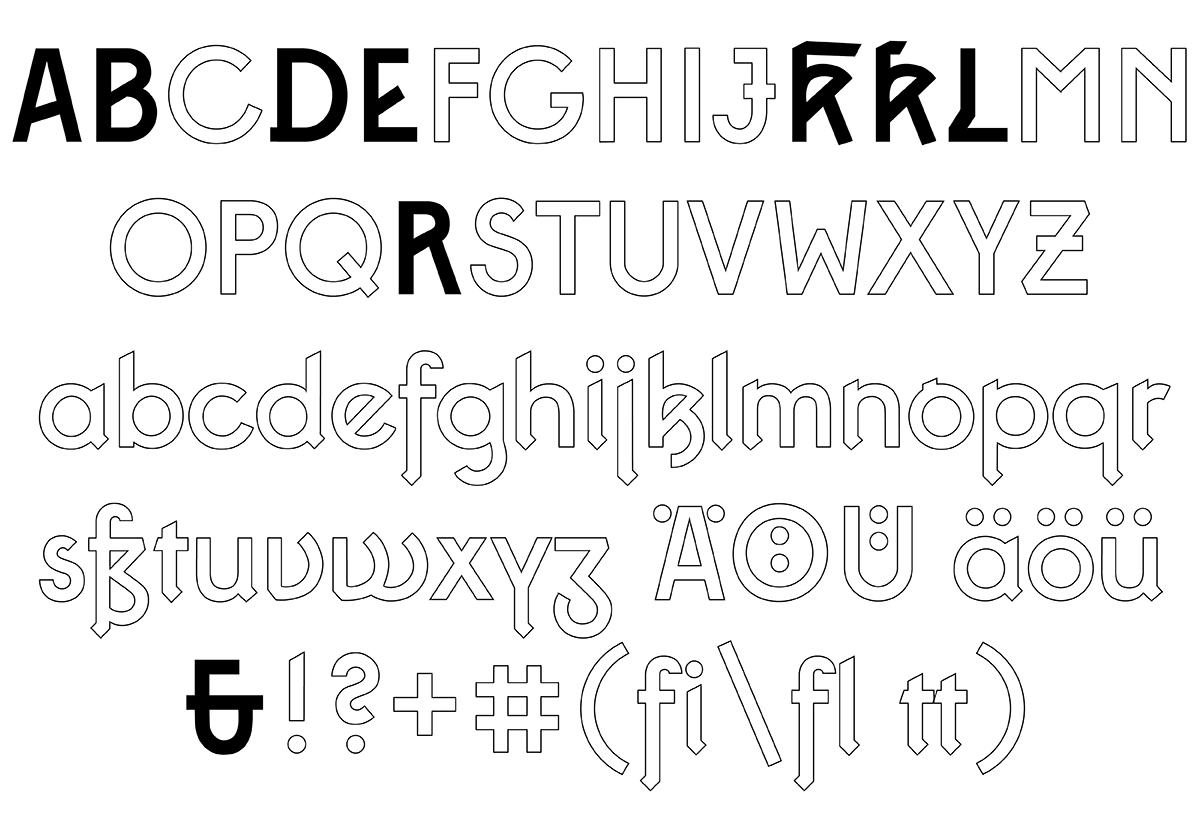
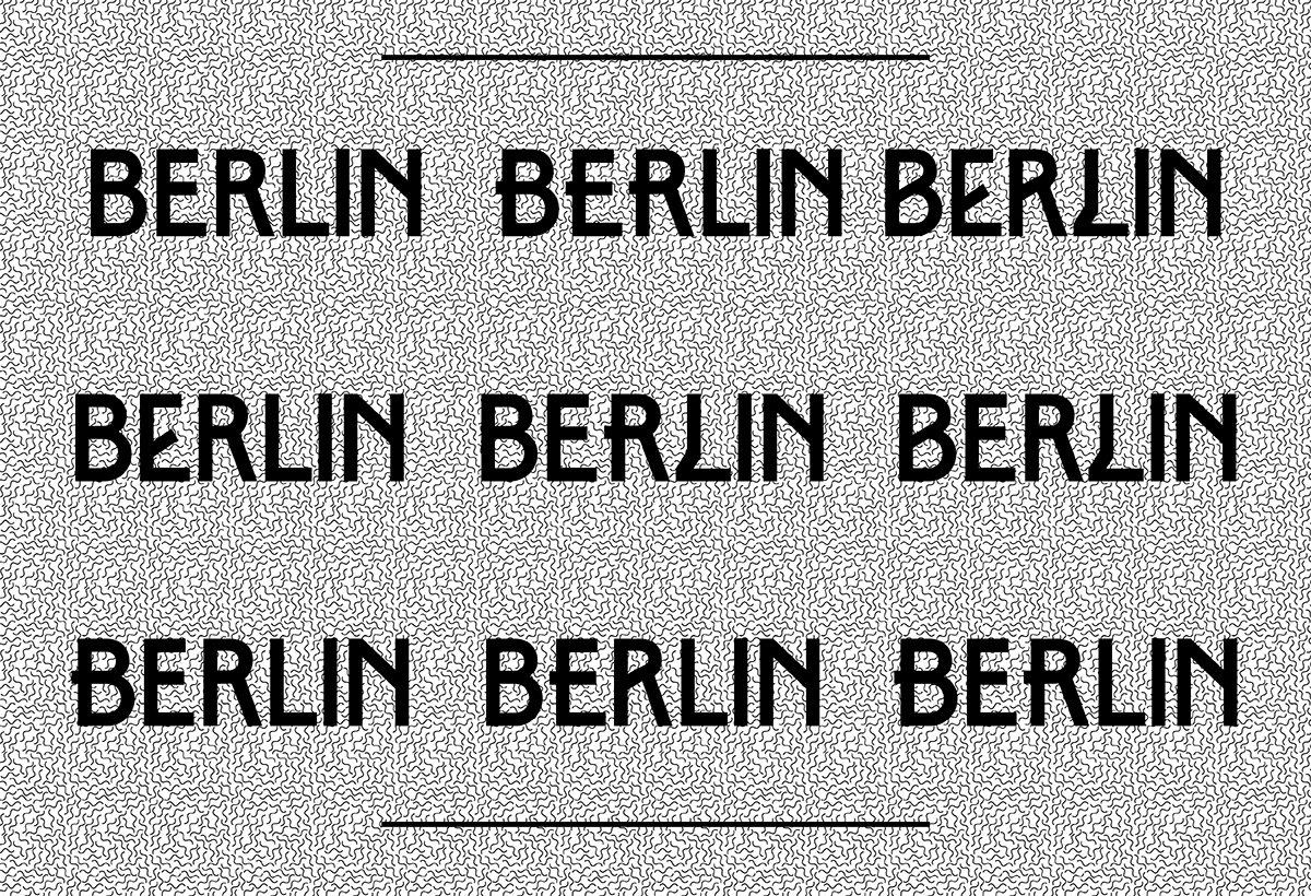
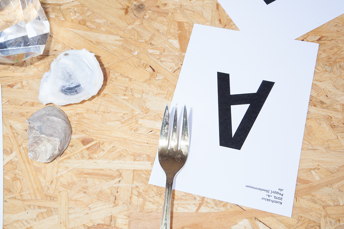
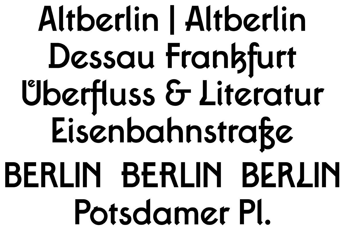
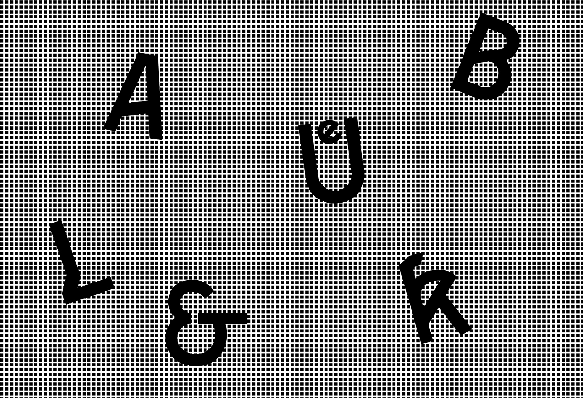
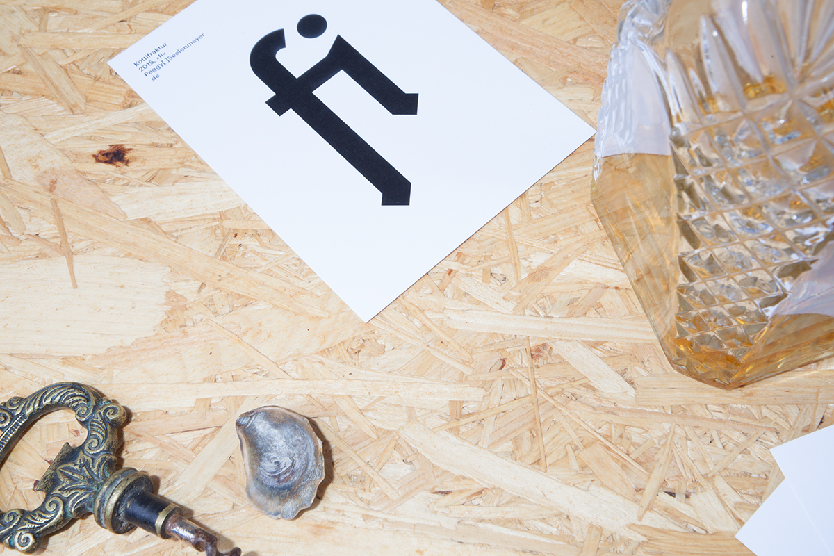
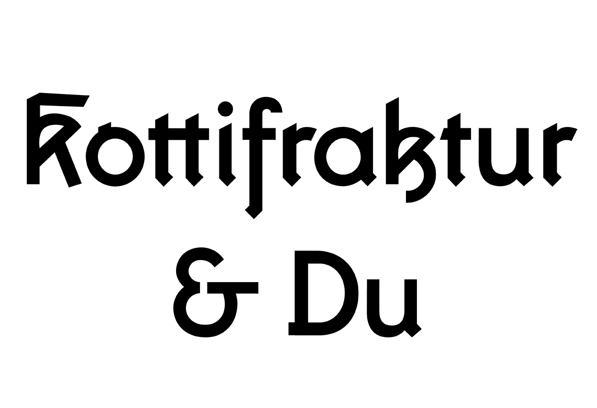
Kottifraktur is a typeface I designed and programed myself, with the mentoring of Luc[as] De Groot. The font combines classic black letter components with very clear, geometric shapes. As a result it appears nice and solid while keeping a certain retro, heavy look, which makes it especially interesting for a bigger scale use.
If you are interested in getting Kottifraktur, please write a mail.
It might also be available for purchase at some foundry soon.
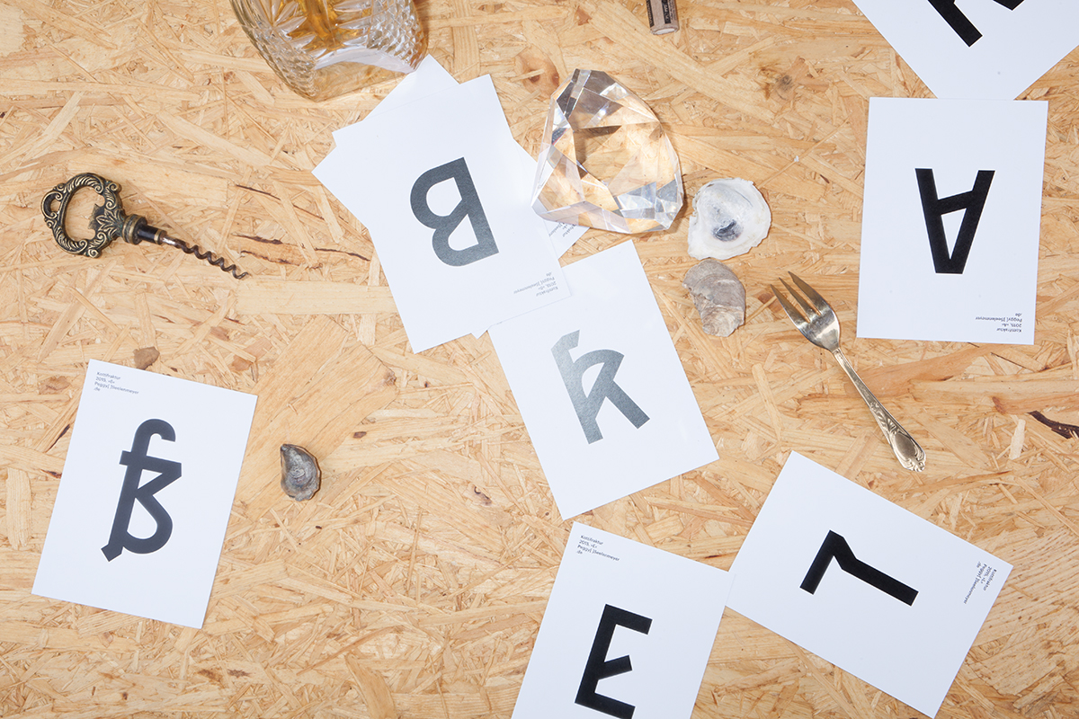
*Exhibited at Bookfair Leipzig 2014
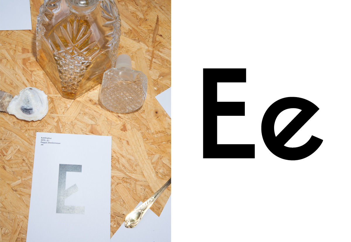
Photos: Julius-Christian Schreiner — Art Direction: Peggy Seelenmeyer
If you are interested in getting Kottifraktur, please write a mail.
It might also be available for purchase at some foundry soon.
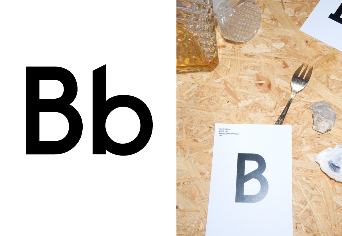
*Exhibited at Bookfair Leipzig 2014
Photos: Julius-Christian Schreiner — Art Direction: Peggy Seelenmeyer