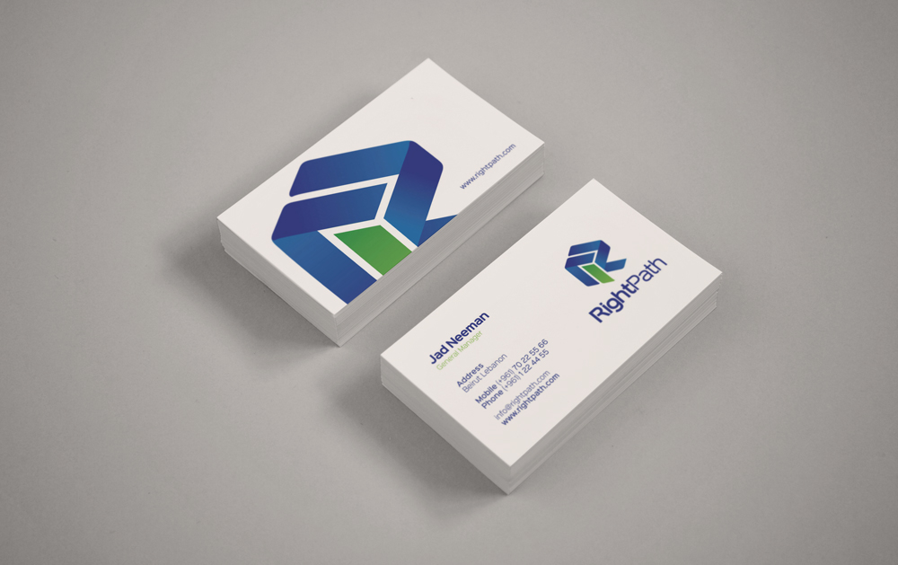
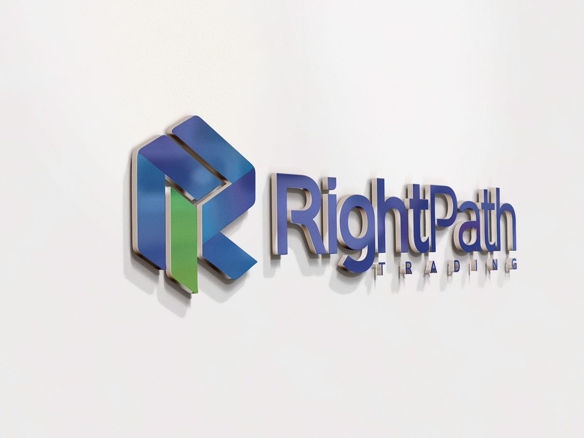
CONCEPT
In life, we're faced with different paths; some of which lead us to a better journey, and some of which serve as a detour to show us a darker side. In this identity, we have incorporate several different "paths" through the letter 'R' and we have highlighted one straight line as the correct path - the company's path. The logo is blue and the one correct path embodies the green color, which is a symbol of "the correct way"