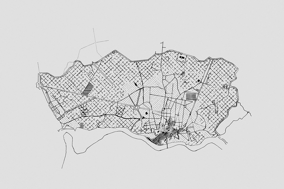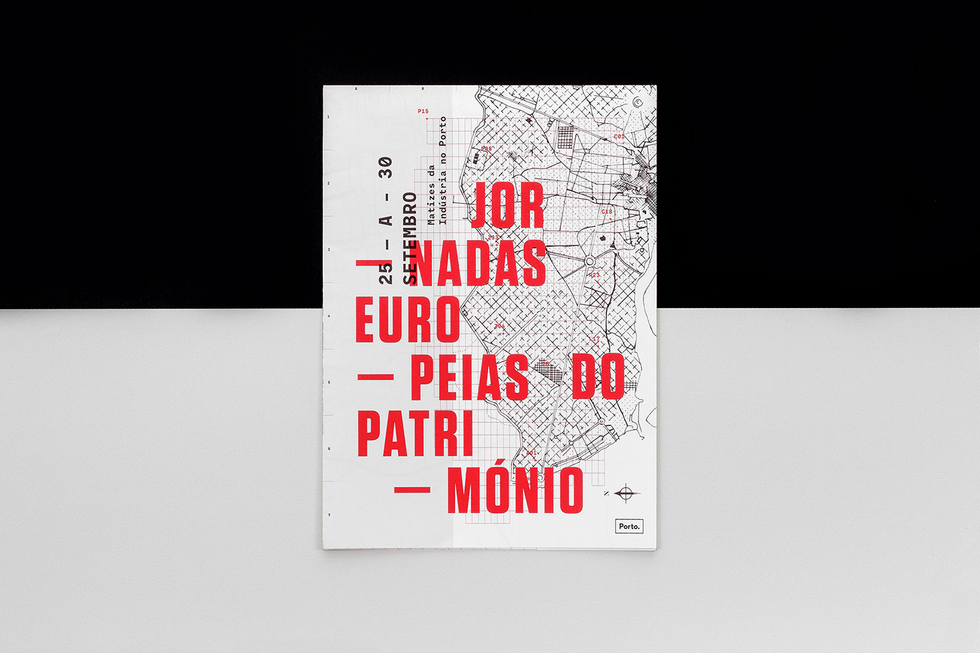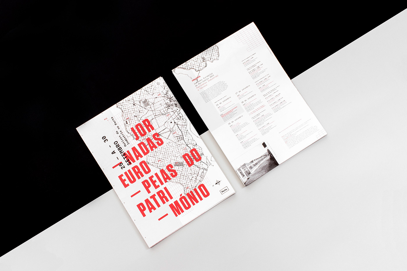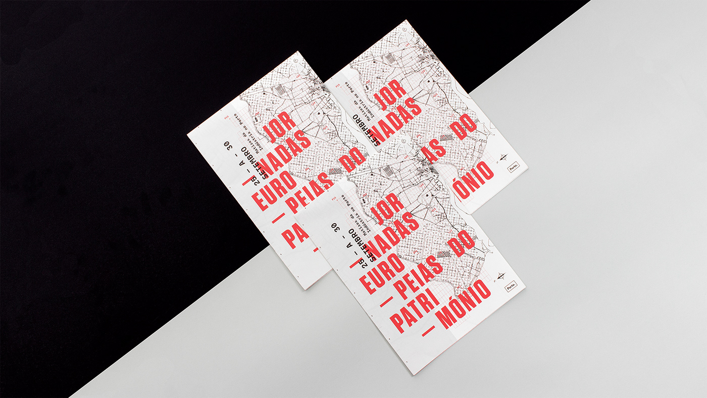
Through the identity developed we wanted to represent the European Heritage Days on the basis of the industrialization traces of Porto. Starting from a general urbanization plan of 1950, we chose to use a rough spot to graphically achieve a representation of what is the 20th century industry.
In terms of colors, we combine the color black, representative from the dirty and rude side associated with the industry, with the classic red as opposed to black, historically used in the varied media as well as in editorial objects.
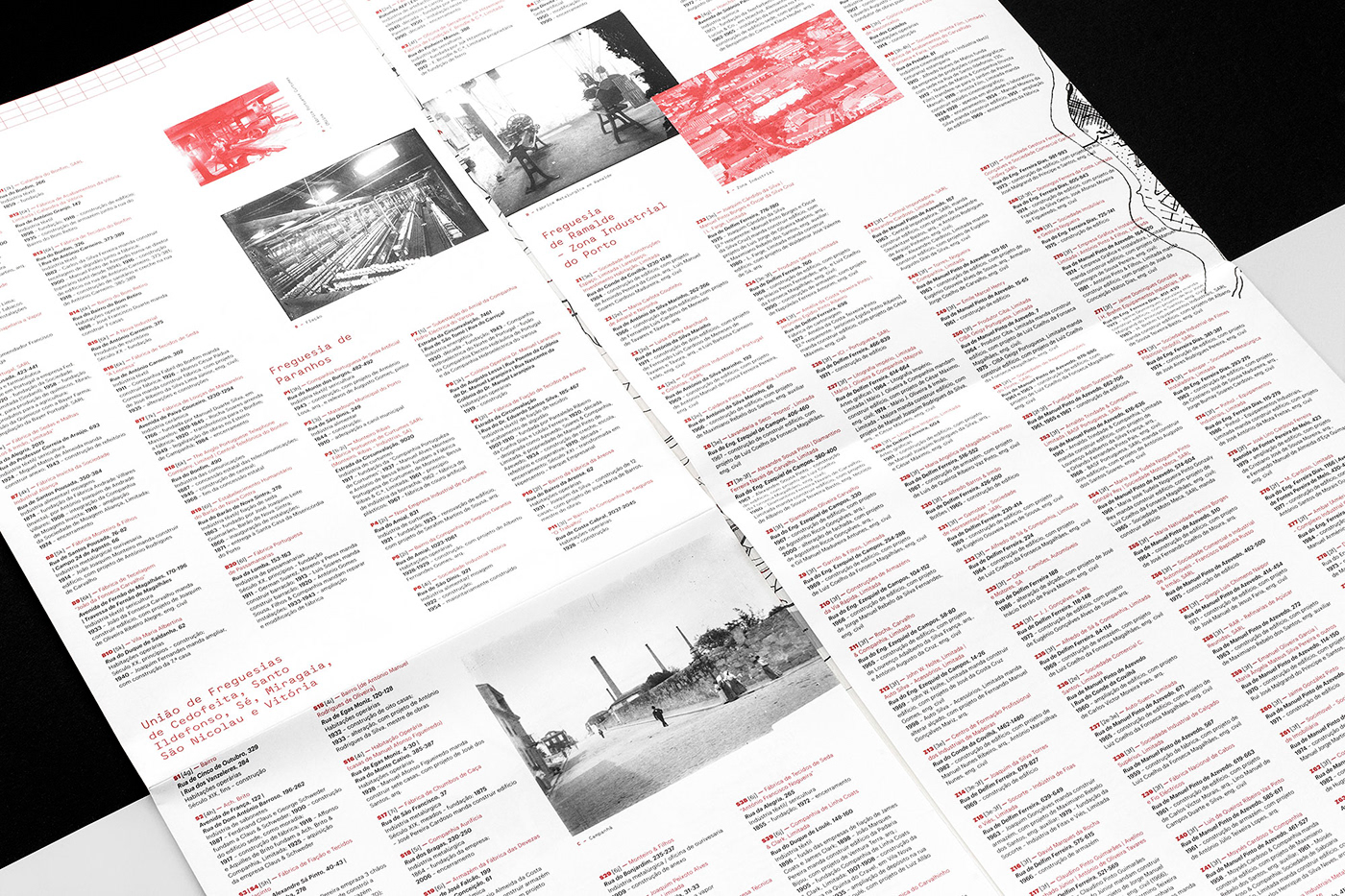
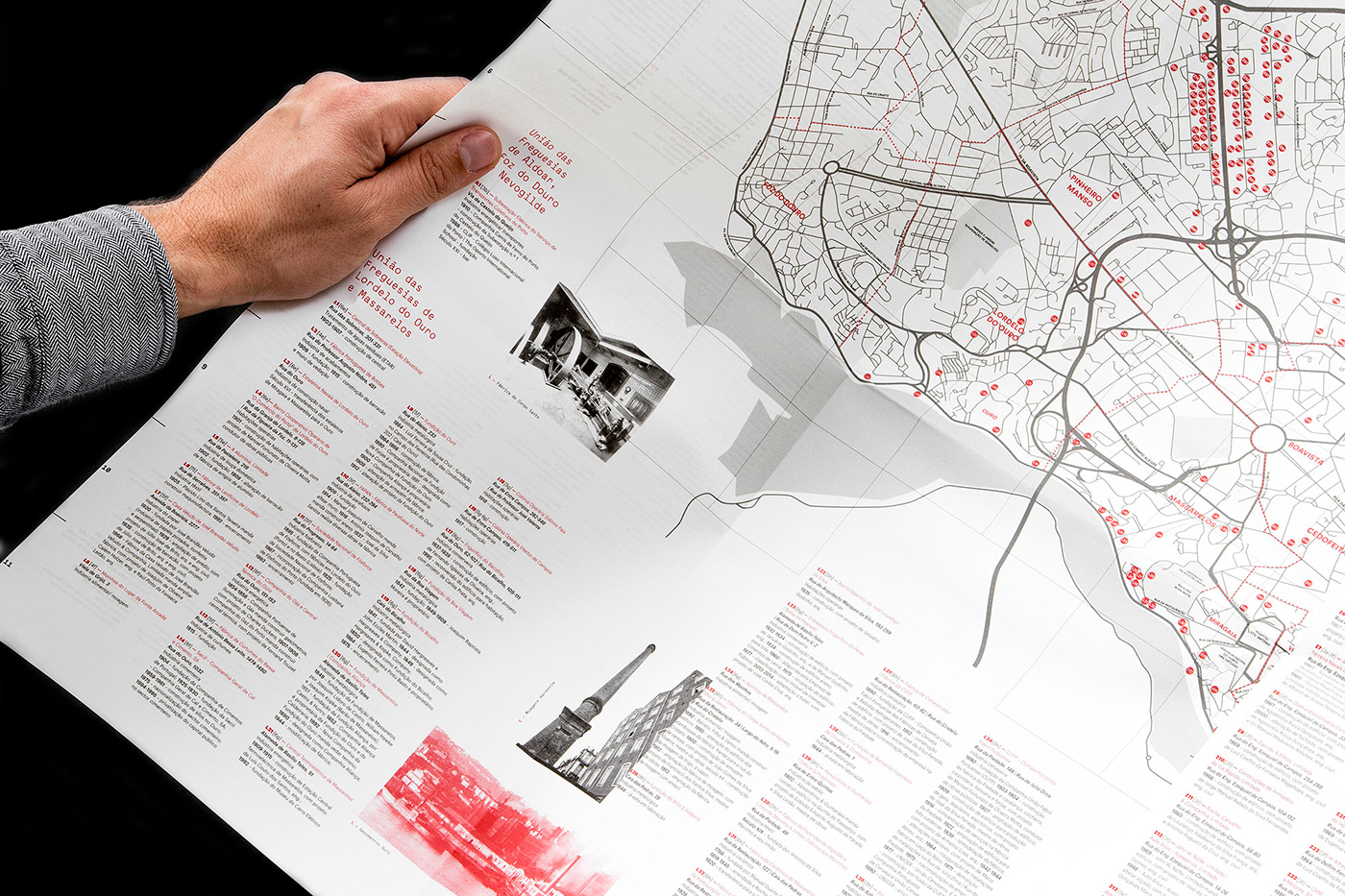
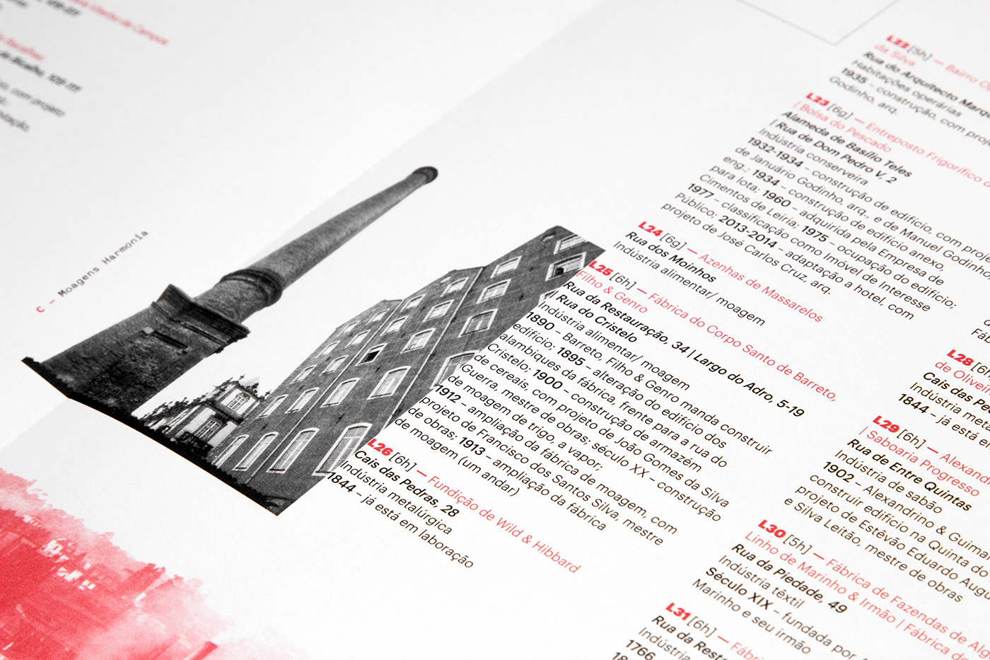
Thus, both the map and the grid represent the industry traces that ultimately shaped the residential and commercial grid of Porto during the 20th century, easily perceiving the relationship between the identity of the event and the city industries.
In terms of colors, we combine the color black, representative from the dirty and rude side associated with the industry, with the classic red as opposed to black, historically used in the varied media as well as in editorial objects.
Thus, both the map and the grid represent the industry traces that ultimately shaped the residential and commercial grid of Porto during the 20th century, easily perceiving the relationship between the identity of the event and the city industries.
-
Através da identidade desenvolvida procuramos representar as Jornadas Europeias do Património tendo por base os traços da industrialização do Porto. Partindo de um plano geral de urbanização de 1950, optamos por utilizar uma mancha tosca, no sentido de atingir graficamente uma representação daquilo que é a indústria do século XX.
Em termos de cores, conjugamos a cor preta, representativa da sujidade e do lado rude associado à indústria com o vermelho enquanto contraste clássico com o preto, utilizado historicamente na mais variada imprensa bem como em objetos editoriais.
Assim, o mapa, bem como a grelha, representam em parte traços da indústria que acabaram por moldar a grelha habitacional e comercial da cidade do Porto durante o século XX, sendo assim de fácil percepção a relação entre a identidade do evento com as indústrias da cidade.