
Uptown Yoga is a popular destination for yogis in central Texas. With 3 locations and growing, it was time for a website update. I was tasked with helping update this site to make it more modern and user friendly. The current site has a few usability issues which we addressed:
-It is not mobile friendly, so the new design is responsive and was designed mobile first
-The navigation is unclear and it is easy to get lost, the new site flow is simple and organized
-The layout is claustrophobic and frustrating, the antithesis of what a yoga studio should feel like
-The current site uses outdated elements such as Flash animation, double navigation, is slow to load

Working with a designer and copywriter out of Texas, my first task was to tackle the poor user flow and the confusing content organization of the site. Putting my Content Strategy hat on, I had to figure out what about the site wasn't working, what content needed to stay and what needed to be added, as well as who the users are. We identified three user types: New Users, Returning Users and Yoga Instructors, along with the user flow and content which will be most useful to them. We also identified content modules.

We knew that the site was going to grow over time and offer merchandise and nutritional information, so we had to create a place for those pages to live. Designing with an active awareness that this business might grow as well and offer more classes and hire more instructors, meant that the design had to be flexible.
While communicating with the designers and developers, it was also important to identify similar pages to expedite the design process, identify the page types, create consistency and allow for re-using of templates even if pages were added in the future. The site map shows what those modules / templates are.
WIREFRAMES
Header and Hero Feature Exploration
Knowing that the current site lacks from a clear navigational structure and utility items, I decided to comp some up in InDesign. I wanted to figure out the best way to showcase the new nav, search, locations and possible discounts for the site which drives users to the yoga studios. I also wondered what the hero image(s) would look like and if it had to be an image at all.

Mobile Exploration
Since there is much less space on mobile, I wanted to layout several navigation and landing page possibilities, but still try to include the pertinent information of locations (which mobile users may be even more interested in) as well as explore different navigation possibilities and additional links.

Homepage Exploration - Content Strips
Beginning to design the landing page, I experimented with the 'strips' design style which allows for one feature to be shown at a time. I also wanted to give users a preview of the real-time schedule since as a yogi myself, this is one of the first things I look for on a yoga site.

Further Homepage Exploration - Stacked Modules
The first homepage layouts explored the possibility of adding items to the footer, vs making them a more prominent feature as well as a stacked vs modular layout, both of which work on mobile.

Dropdown Menu Exploration
Exploring dropdown menus. Going from something simple to something that is a little more visual, we realized that the simple menu would be just as effective and easier to code.

Chosen Homepage Wires
Now that the nav has been decided on, we went with the modular approach. This is one of the final wireframes before we went into design. I wanted there to be a healthy mix of warm inviting visuals which convey the yoga experience as well as interesting and actionable items.

Instructors Page Exploration
Knowing that we have a large amount of instructors meant figuring out ways to present and sift through this information. I explored options using small cards with drop downs so that users can select the instructor by name or the type of yoga they teach. If they wanted to see more info, they could look at the overlay which would allow them to see details, social media and related content. The other option was expandable cards which allow users to preview all the instructors and what they teach, but also slide over and show more content while staying on the same page.

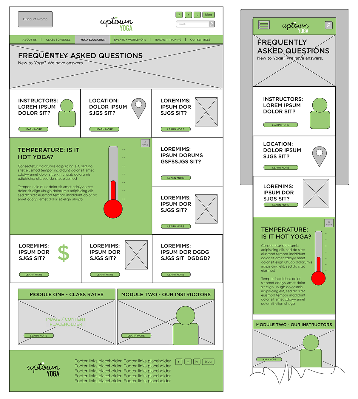
FAQ Wires - Mobile & Desktop
Applying the same template from Instructors to FAQs, I decided to make this section a little more engaging using icons, visuals and expanding modules. This works really well on mobile as well.
THE DESIGNS

The current homepage
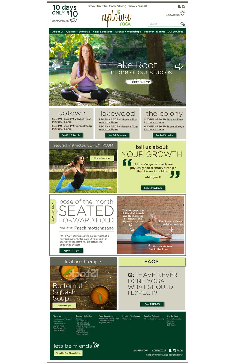
New homepage complete with a live schedule feed, quotes, educational info and FAQs.

Current page for yoga info

New yoga info page, complete with contextual cross-link modules.

Current FAQs

Expandable FAQ
Thanks for viewing! The design was done by Melody Tarver, the copy by Erika Gilbrech out of Texas.
Note, this site is currently in development and is not yet live.


