
Matt & Amy Photography
A logo design from start to finish
A logo design from start to finish
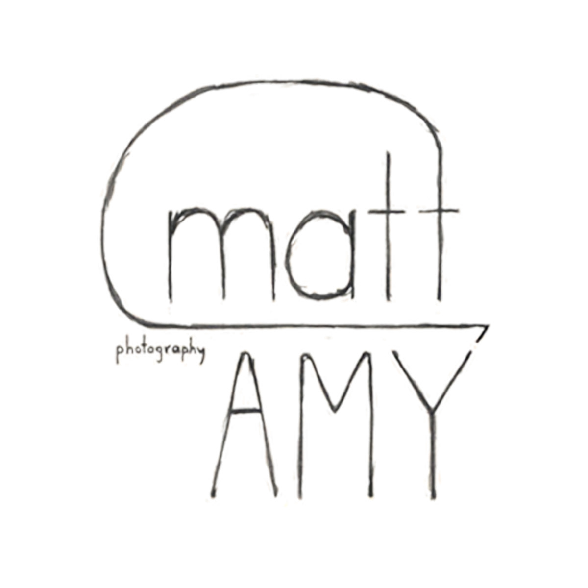
A friend of mine named Amy, and an acquaintance of hers named Matt, decided to join forces and venture into the world of wedding photography. For their business identity, Amy was looking for a vintage feel, but Matt was more interested in a modern look. The challenge, obviously, was to find an agreeable compromise between the two. Below are some of the initial rough sketches.

They decided that they wanted their logo to be enclosed in a kind of traditional frame. While they liked my birds-on-a-wire idea (see above), they didn't want it to be too pronounced, as birds can easily become a cliche.

We looked through the font selection I gathered for them, and they decided on an informal, down-to-earth script (second one on the left).

After many iterations, we arrived at the logo below. Now it was simply a matter of choosing the best color scheme. Amy's ideal choice of colors were "brick red, robin eggs blue, or a mustard yellow." I tried a variety of colors, some successful and others...well...


I was about finished with the logo when I got an unexpected e-mail. Amy had decided that wedding photography wasn't her thing and left the business. A perfect example of how unpredictable freelance design can be. Fortunately Matt still wanted to pursue it, and came up with the business name "Mattography." Since he wanted a modern feel, it was easy to go back to one of my earlier sketches for inspiration:
I chose to use the web font Quicksand for creating the logo. I'm still relatively new to the business, so I honestly don't know if it's good policy to use web fonts for a logo. But I think it works well for logo work. Kudos to Andrew Paglinawan for creating it.
It only took a small bit of tweaking and within a couple of days I had a finished logo. He also requested a design for a quarter page ad in a wedding publication named Tulle. He wanted something very simple, so I chose an extremely direct, symmetrical layout.
All in all, it turned out to be a success. I actually prefer my final logo to the original Matt & Amy design - it scales better and is a much simpler solution.


