

A gastronomia na cidade do Porto tem vindo a ganhar importância. O número de casas de sandes também tem aumentado.
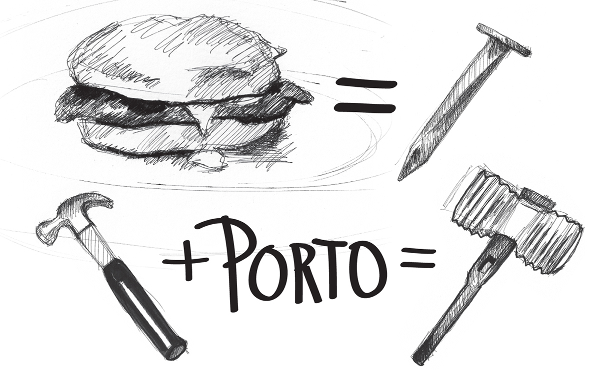
Fazendo a analogia entre a sanduíche de carne (prego) e o martelo do prego, assim como o próprio martelo típico das festas da cidade, foi criada uma marca onde o espírito da cidade está presente em toda a identidade, bem como em todos os seus produtos.
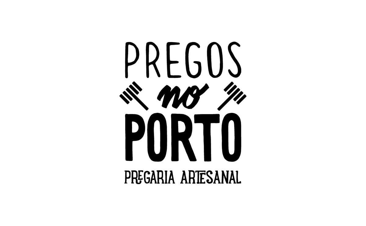
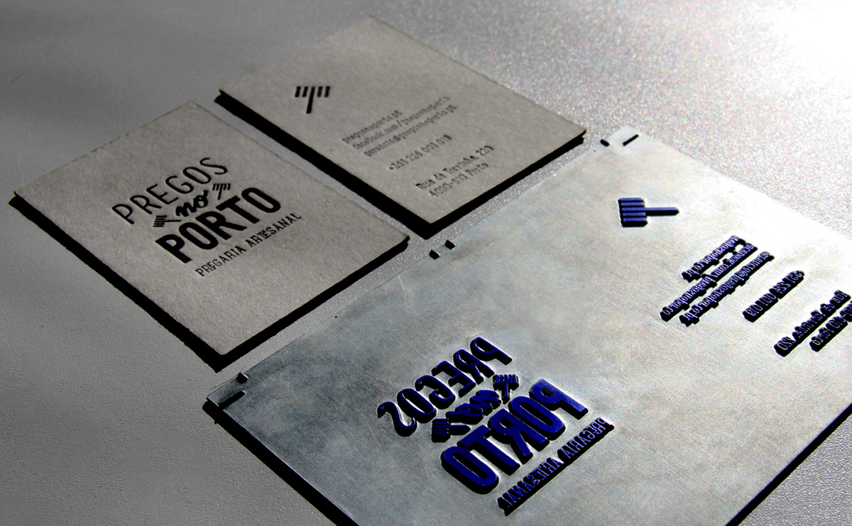
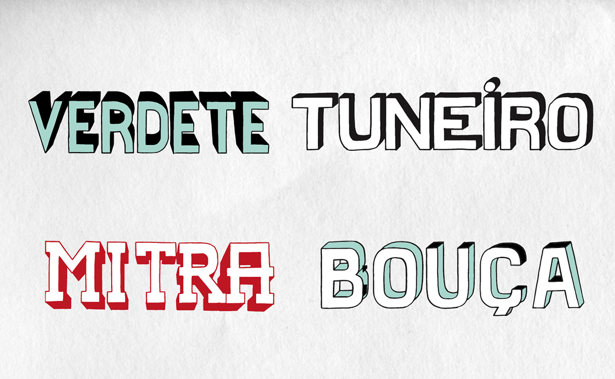
O conceito “artesanal” foi o mote para o desenvolvimento da marca e figura não só no grafismo, bem como nos próprios suportes produzidos e pintados manualmente pela equipa “LAMA - Escriptório Graphico”.
The local cuisine in Porto has gained importance. The number of sandwich restaurants has also increased.
Drawing the analogy between the steak sandwich (“prego”), the hammer associated with the nail (also called “prego”, in Portuguese), and the typical hammer used in the city's festivals, a brand which clearly includes the city's spirit in all its identity, as well as in all its products, was created.
The "artisanal" concept was the motto for the development of the brand and image not only in graphic terms, but also in the promotion material produced and hand-painted by team "LAMA - Escriptório Graphico".
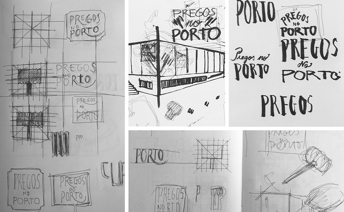


Handmade drawing to vector...


We choose the Lunch Box Slab font to complement tthe body copy: www.myfonts.com/fonts/kimmy/lunchbox-slab/

... and from vector to hand made painting


Creative Direction and design: Ricardo Daniel
Signage and menu lettering illustrations: Lama, escriptorio graphico
Photography: Più Più Produções
Obrigado a todos, thank you all


