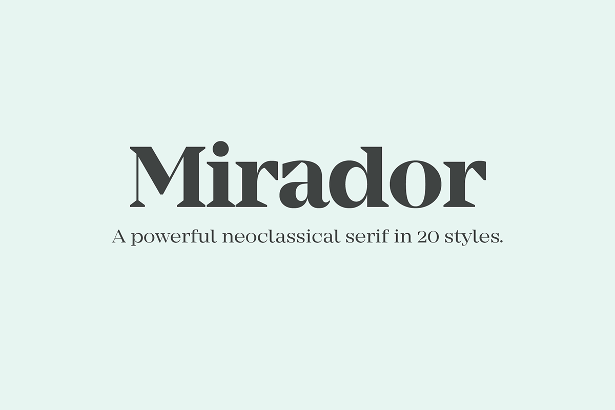
Mirador.
A neoclassical serif.
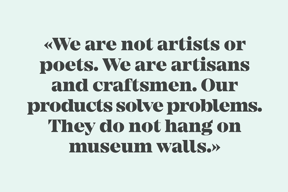
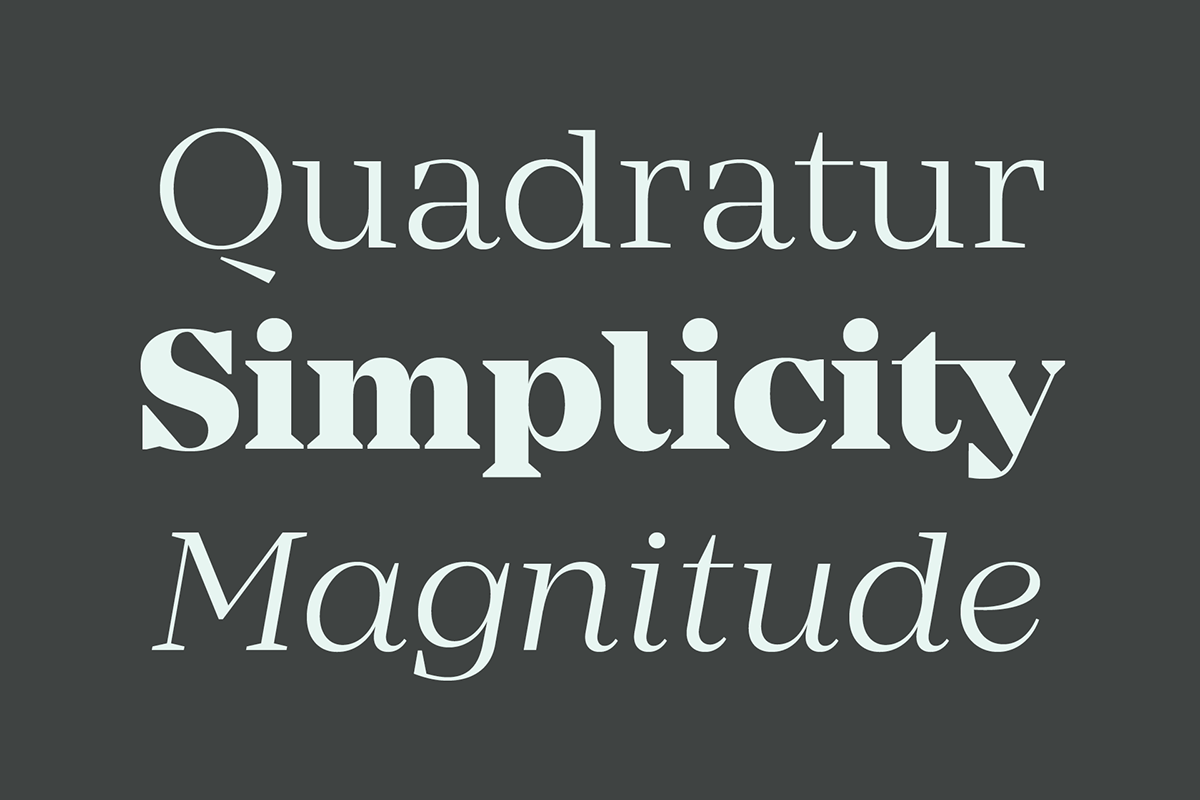
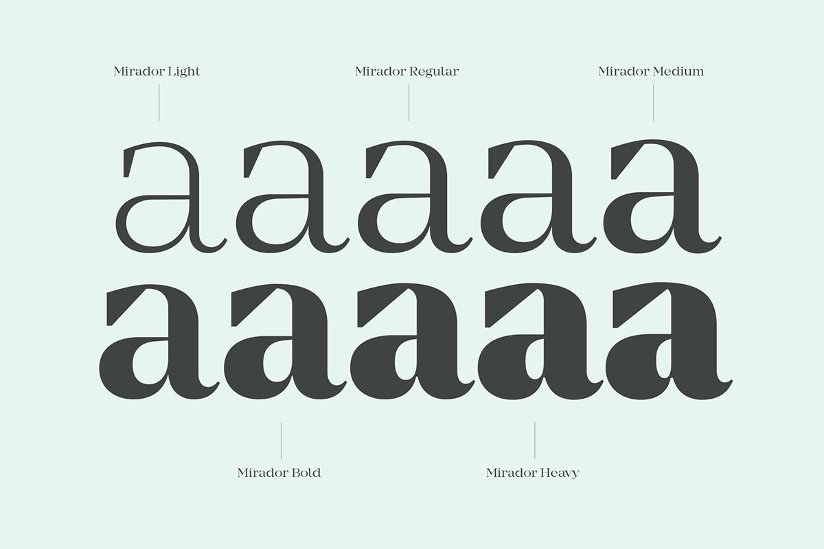
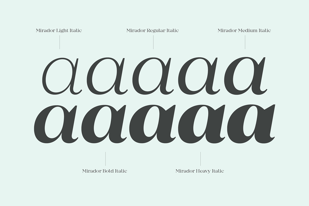
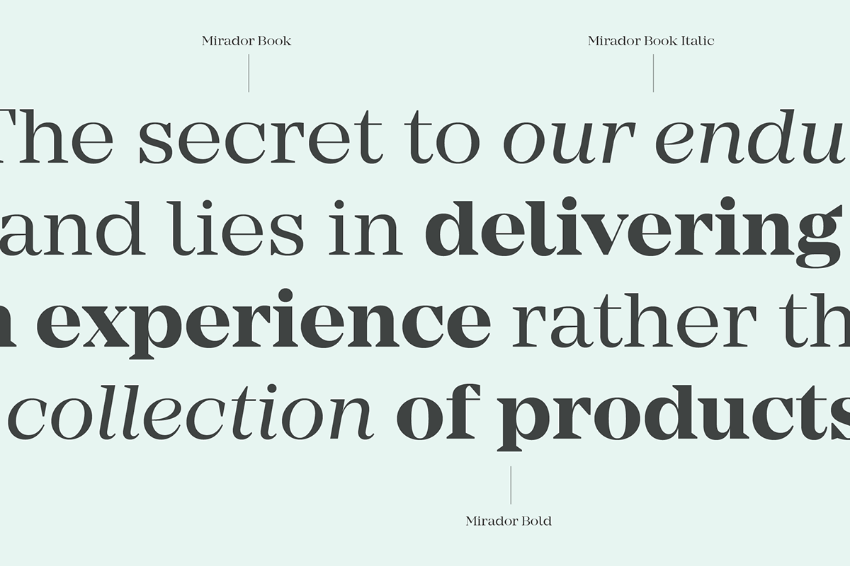
Mirador is a powerful neoclassical font family designed for various usages. It is a contemporary take on high contrast typefaces featuring wedge serifs, a large x-height and many opentype features. Mirador comes in 10 weights with matching italics.
Buy Mirador on Myfonts
Buy Mirador on Myfonts

Characteristics
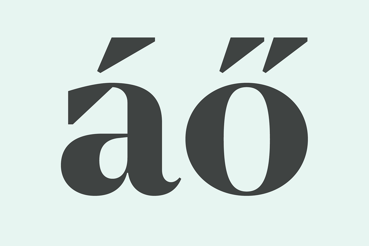
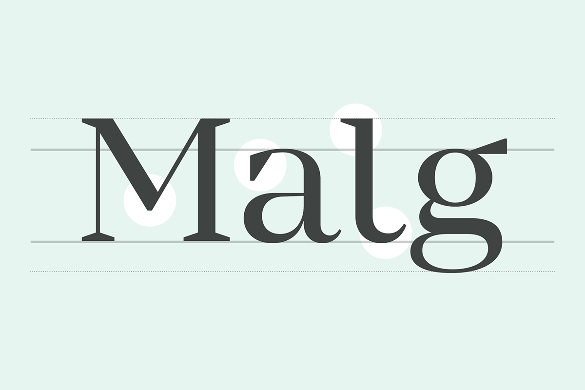
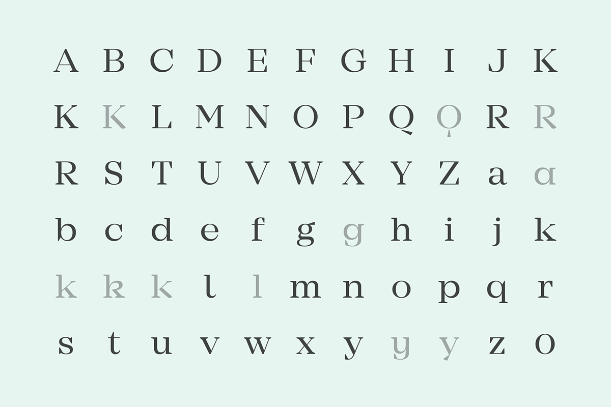
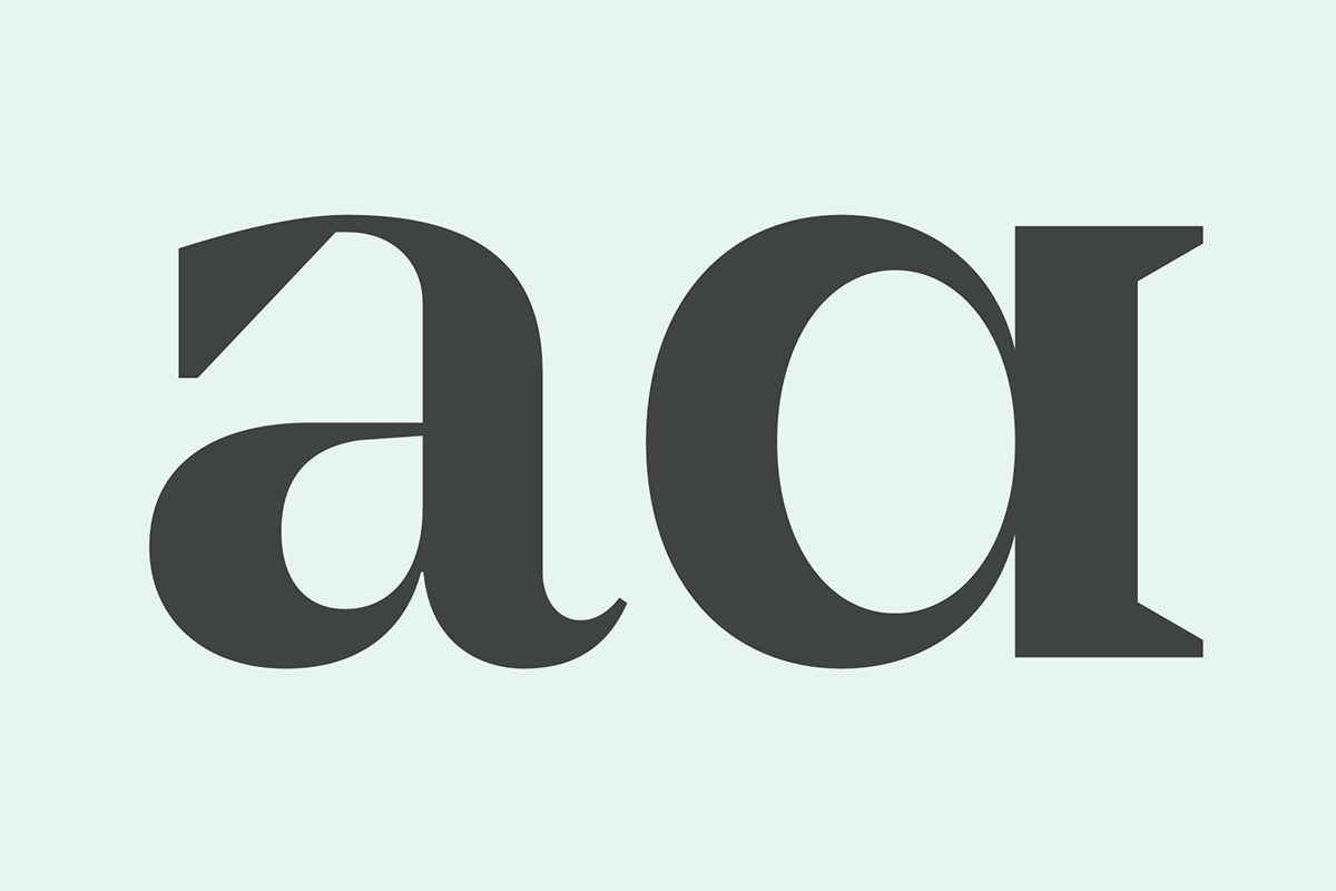
As a product of tradition and modern interpretation, Mirador comes with a classical double story lowercase 'g', a tail on lowercase 'l', a lifted apex on uppercase 'M', round dots and most importantly, wedge shaped serifs. In order to achieve a compact and strong appearance, Mirador has a large x-height with small ascenders and descenders.

Alternatives
Alternative glyphs are a great way to add a distinctive tone in certain fields of application. Mostly, these additional characters are limited to a few glyphs only. Mirador takes the next step and offers 25 unique alternatives — all with their diacritic counterparts.
Opentype
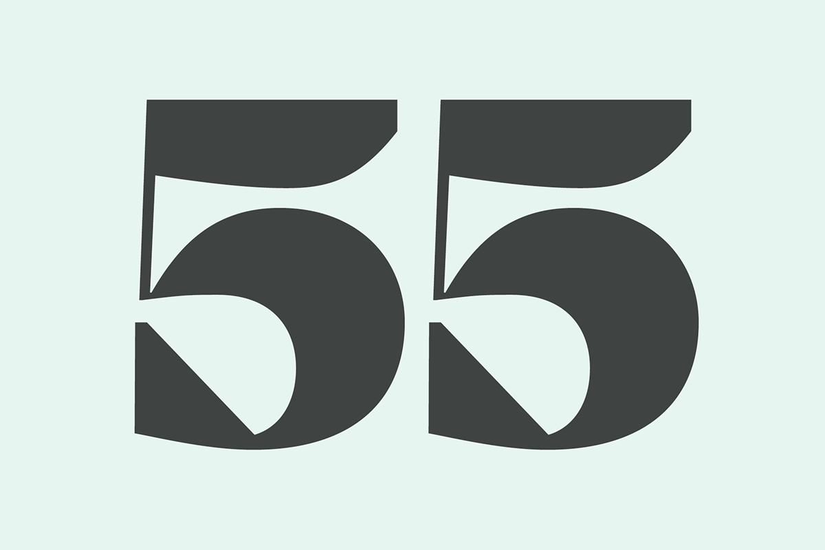
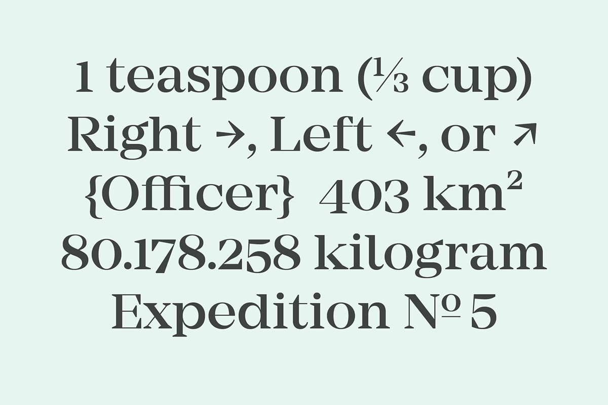
Mirador comes with a large set of opentype features enabling the usage of small caps, localized forms, various numeral sets, slashed zero’s, case sensitive forms, fractions and many more.
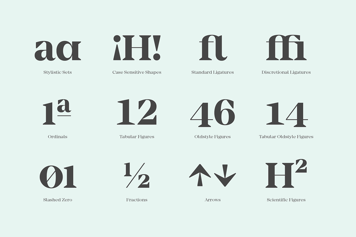
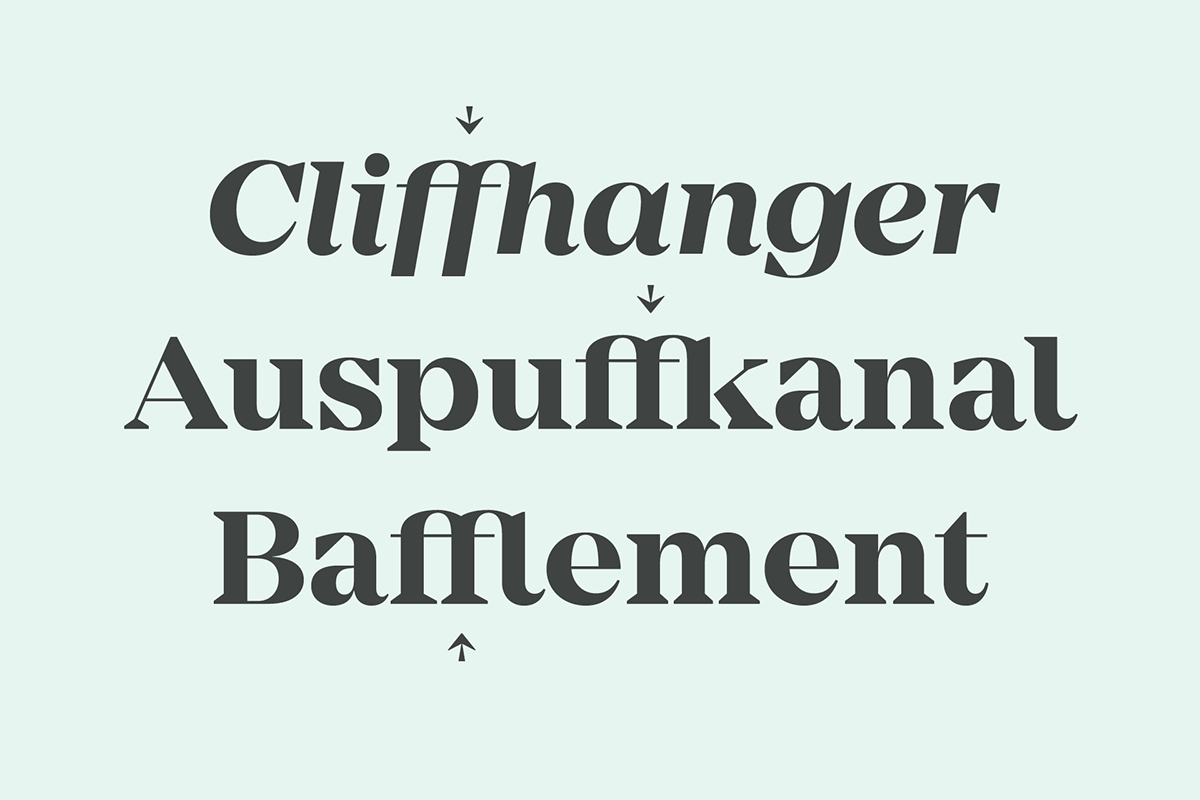
Ligatures
Ligatures are not only beautiful special characters but they help fixing the problem of colliding glyphs. Although one of the most common glyph combination f/i works in Mirador without a ligature, combinations like, f/b, f/l or f/k have standard build in ligature substitutions.

Languages
The family supports all european and western languages and comes with 800+ glyphs per font.