
Yekan Bakh typeface is designed to meet today's demand, because it’s a simple neutral typeface especially for digital media and good to use in print. These features are the reason why Yekan Bakh works in different contents with no fuss.
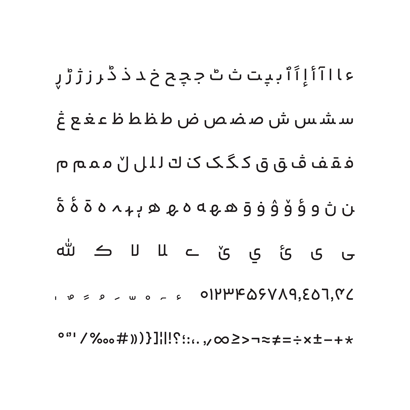
Characters are designed remarkably simple in this typeface. Details are limited as much as possible, and the strokes are simplified.
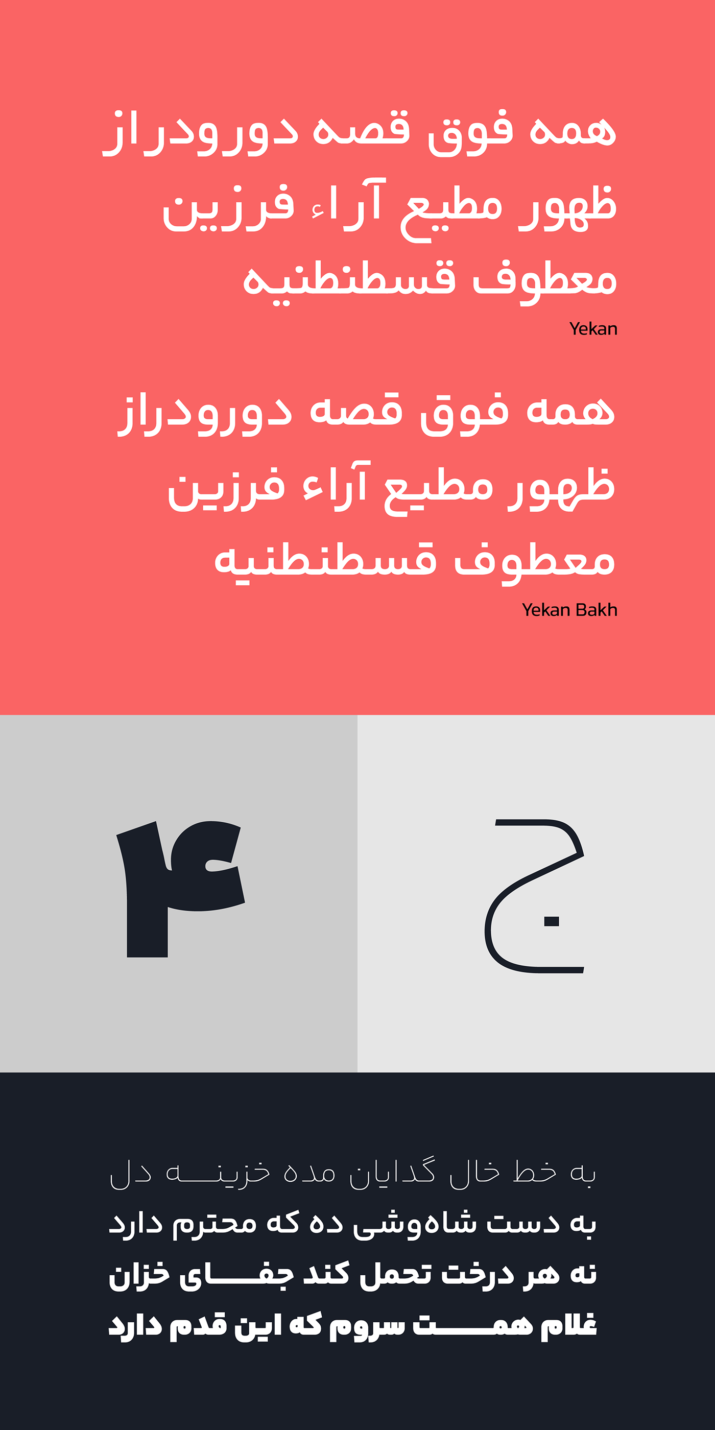
Yakan Bakh fits in Monoline typeface category, but the widths are not exactly the same. Optical illusion plays a major role in here, and being aware of the pen’s angle is very important. The stroke’s thickness on every curve and joint are designed very carefully so they can be seen accurately.
I used geometric forms in Yekan Bakh design, yet I did not limit myself to only using them and the characters are not completely geometric. The reason was to keep it legible and consider optical illusion in the design. In addition, geometric forms give a cold and machinelike character to the letters, especially in Arabic script which is not very geometric-friendly.
Yekan Bakh came from redesigning and developing Yekan typeface. Yekan typeface was designed in Masoud Sepehr Design Studio in 1980. Yekan Bakh was designed by Reza Bakhtiarifard in 2015, and the 8-weight font family was completed in 2016. In 2022 the major update of Yekan Bakh was done while being published by Fontiran. Now Yekan Bakh has 8 weights and a variable font. For Latin language the Kanit open source typeface is used.
تایپفیس یکان بخ برای نیاز امروز طراحی شده است، چراکه فونتی است ساده، خنثی، ویژهی فضای پیکسلی و مناسب برای فضاهای چاپی. این ویژگیها باعث شده تا یکان بخ در موقعیتهای مختلف کارآمد و بدون دردسر عمل کند.
در این فونت همهی کاراکترها بهشکل اغراقآمیزی ساده طراحی شده است. جزئیات تا جای ممکن حذف شدهاند و حرکتها سادهسازی شده
در این فونت همهی کاراکترها بهشکل اغراقآمیزی ساده طراحی شده است. جزئیات تا جای ممکن حذف شدهاند و حرکتها سادهسازی شده
یکان بخ در دستهی فونتهای مونولاین (تکضخامتی) قرار میگیرد اما بهطور کامل دارای ضخامت یکسان نیست. اینجا خطای دید نقشی پررنگ بازی میکند و آگاهی از تأثیر زاویهی قلم نیز بسیار مهم است. در سر هر پیچ و هر تقاطع ضخامتها با وسواس بسیار زیاد طوری تنظیم شدهاند که درست دیده شوند.
در طراحی یکان بخ از فرمهای هندسی کمک گرفتم، اما خود را به استفاده از آن فرمها محدود نکردم و کاراکترها بهطور کامل با فرمهای هندسی منطبق نیستند. دلیل این کار حفظ خوانایی و در نظر گرفتن خطای دید در طراحی بود. همچنین فرمهای هندسی باعث میشوند حروف شخصیتی سرد و ماشینی بهخود بگیرند؛ بهویژه در رسمالخط عربی که چندان با فرمهای هندسی میانهای ندارند
«یکان بخ» نتیجهی بازطراحی و توسعهی تایپفیس یکان است. تایپفیس یکان در استودیوی دیزاین مسعود سپهر در سال ۱۳۵۹ طراحی شده است. یکان بخ توسط رضا بختیاری فرد در سال ۱۳۹۴ طراحی شد و خانوادهی ۸ وزنی این فونت در سال ۱۳۹۵ تکمیل شد. بهروزرسانی عمدهی یکان بخ در سال ۱۴۰۱ و همزمان با ارائهی آن در فونتیران انجام شد. یکان بخ اکنون دارای ۸ وزن و نسخهی وریبل است
تایپفیس یکان در استودیوی دیزاین مسعود سپهر طراحی و اجرا شده است. این تایپفیس بهدست من، رضا بختیاری فرد در سال ۱۳۹۴ بازطراحی شده و خانوادهی این فونت در ۸ وزن، در سال ۱۳۹۵ تکمیل شد


Yekan Bakh Typeface in Use


