

The Centrepoint is a shopping mall which delights in providing a holistic shopping experience with its in-mall activites. The Centrepoint is also great for families with children in tow to have fun, eat and shop at the same time. This mall have been specially designed for the convinience of the kids and adults. The Centrepoint has been accredited with Business for families mark and this mark recognises establishments with outstanding family- friendly practices and services.


Our brand identity has a unique logo and its based on geometric shapes used.
The logo starts from a four sided cube turning into a circle at the end which makes a whole "C".

This two colours are our primary colours. Eye-catchy and bright to get noticed.
They give us a friendly welcoming personality.

For the typeface, we have used Comfortaa as it gives a rounded, friendly look.


Exclusion zone
Logos need space to stand out, so we've set an exclusion zone around ours. Use the size of the pink disc to create a clear space without interference, this allows our logo to be seen and shine.

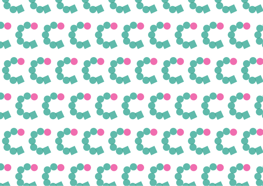
Pattern with our logo that can be applied to wrapping papers and also shopping paper bags


