

ScoutSavvy Hand Lettered Logo & Icon
This hand lettered logo & icon design is for a new app that helps employers hire women in the tech industry.
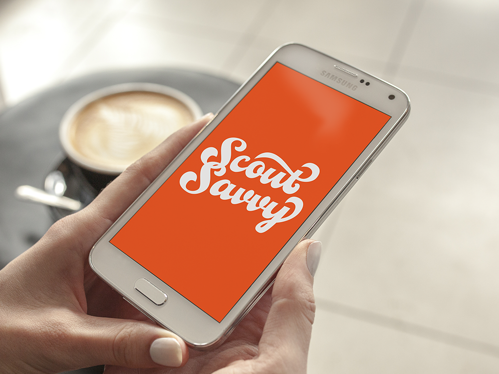
Kathryn reached out to me to create a hand-lettered logo and icon that would represent your new platform that matches tech savvy women with company cultures that align with their personal values. This service would cause both employers and job seekers to be happier and have long-term employment relationships.

MOOD BOARD
When creating my Pinterest mood board, I put together a diverse set of script samples to feed my inspiration when starting this project. I came up with a few ideas of possible art directions to ensure we were both on the same track when production began.
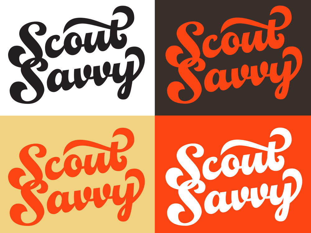
We ended up choosing a sharp script concept with a responsive layout. This direction included a horizontal logo, a stacked logo, a detailed icon and finally a more simplified icon for smaller browsers. This design would also include curved embellishments to add a bit of feminine flavor to her branding.

DRAWING
I decided to go with a vintage script that paid tribute to an overall “Scout” theme. This style was feminine with it’s large bottom curves, while staying legible by maintaining a strong thick to thin contrast with my letterforms.
For the stacked logo, I began to add embellishments surrounding the text, but given that this design was to be used mainly for smaller applications, I decided to keep this design more simple and clutter free. Then for my icon design, I created a campfire to represent the kind of fiery passion and drive behind finding a job that fulfills you.

STACKED & HORZONTAL LOGO
Creating a word mark that is used in both a horizontal and stacked format can be challenging. So it’s important to make sure both pieces work well in their dedicated spaces, look consistent, and most importantly remain readable.
When tackling this challenge I always like to start with the stacked logo first due to the negative space between the words – which when done incorrectly can create a huge eye sore. People’s focus needs to be on the words themselves, not the spaces surrounding them.
If you look at my first drawing for the stacked logo design, you’ll notice that had originally added a curly extension of the “Y” to fill better the bottom space. I did this because usually I’ll create different ligatures for each format to avoid eyesores, but luckily I found a visual solution for both that needed little to no adjustments.
The main difference between the two formats is that one is on a slanted axis, and the other is straight. Both align to the same grid, so no matter where and how this logo is used, it will remain recognizable.


ICON DESIGN
For the icon, I created two versions of the design to be used in various applications in different sizes. The campfire icon with the wood logs should be used for larger profile images, and as the main visual cue for the app. While the smaller fireball should be used in a small square ratio format, for things such as a website avatar or small company thumbnail.
When designing these icons, I knew that just a simple black and white color scheme with a pop of color wouldn’t do the design justice. Originally I had played with the idea of adding texture but it made the design look too urban and messy. Not quite as professional as it needed to look for a job-matching service.
I stuck with a warm color scheme to make the design more vibrant when used on either a light or darker-colored background. I then complimented the orange and yellow by using a dark brown to increase contrast instead of using a harsh black.


