Seobra
Identity
Identity
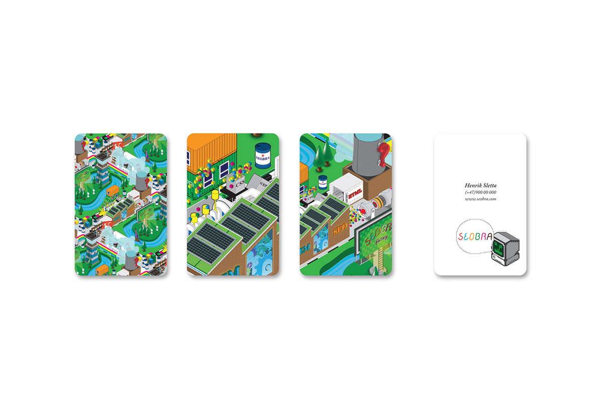
Seobra is a company that helps businesses with marketing on the Internet, through a technical review of websites and content strategies to increase visibility. We have developed a unique logotype and a playful color palette. The logotype has an unconventional form that establishes the professional as well as maintaining the informal. Seobra had a need to describe their working methods and process. The illustration shows the complete cycle in Seobras work process, where the information about the company on the internet is shown as boxes and palettes. These go through the different stages, and is finally processed through the factory, which is the production stage with SEM and SEO (Internet marketing optimization). Throughout the process, the different stages is closely observed and analysed by the tower (Override Process Seobra) and reports to the boat (Communications Client / Seobra). Everything is drawn in isometric perspective and acts as single objects, and put in context, they form a colorful and exciting landscape on a complicated topic.