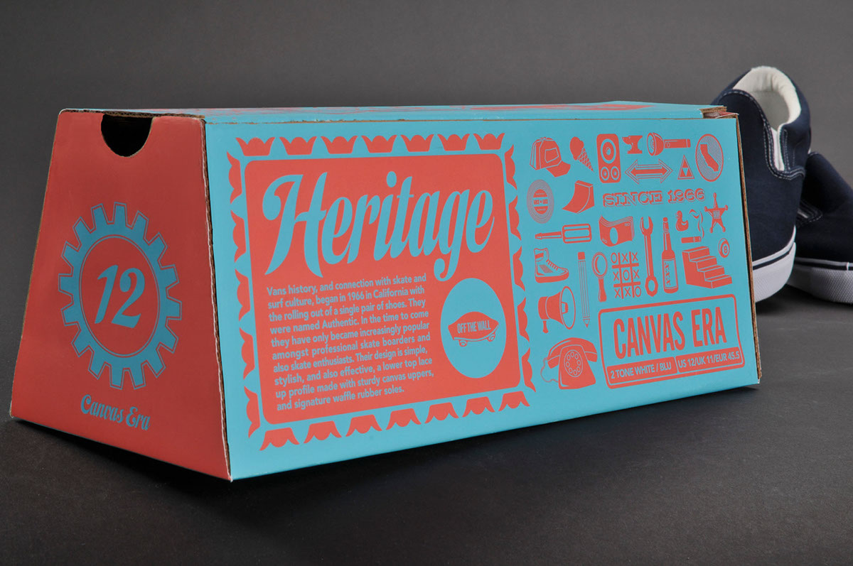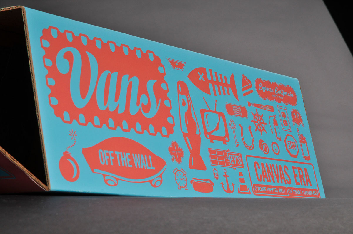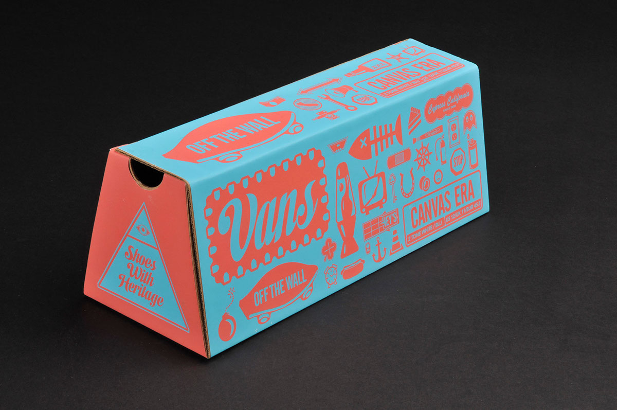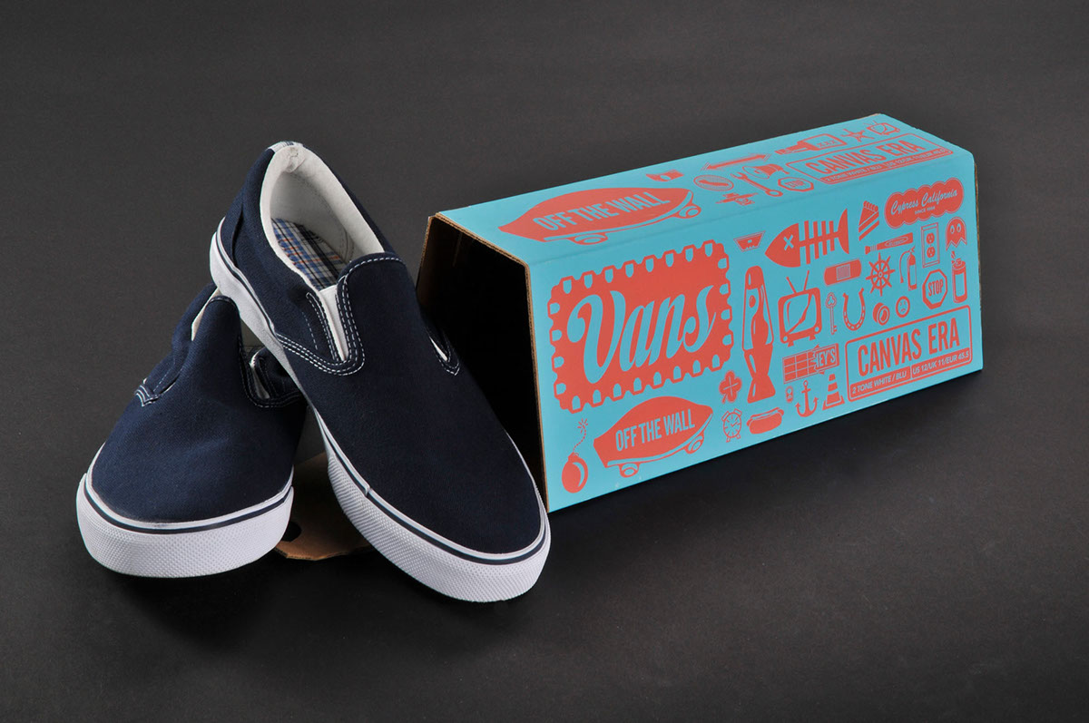
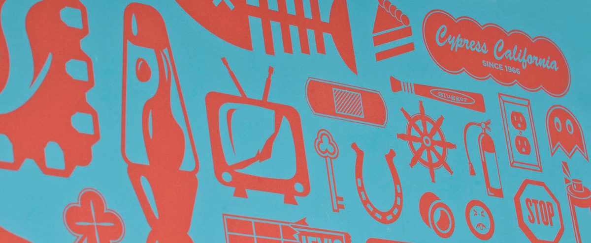
With my packaging for Vans shoes I wanted to pay homage to vans roots in the late sixties and early seventies, in the California skate and surf scene. I chose extremely contrasting colors, which I felt were reminiscent of the period I was aiming to speak to. I also chose these colors because I felt they would be effective in attracting attention, even at a quick glance. The graphics covering the package are intended to reinforce Van's brand image, as well was act as something that members of the skateboarding / surfing community can connect and identify with. I chose to use a non traditional shoebox shape, because I saw it fitting, as Vans has always been an alternative shoe brand, for alternative athletes. The new box design uses less cardboard than regular shoeboxes, and is size flexible, in that by varying the way the shoes overlap it can house most shoe sizes without needing alterations. In addition to being more efficient, the new box design is more appealing visually, both in that it is more dynamic in shape than rectangular boxes, and displays graphics more appealingly.