Лови момент! Дизайн этикетки для вин «Carpe Diem»
Студия 43'oz и популярная кишиневская винотека "Carpe Diem" представляют уникальное вино с одноименным названием "Carpe Diem" (лат. лови момент).
Целевой аудиторией продукта стали молодые люди с активной жизненной позицией, трендмейкеры, те кто живет полной жизнью, задавая ее темп. Заказчик и автор вин, был готов к новому, нестандартному подходу оформления своего продукта, и до этого обращался не в одно агентство, прежде чем остановиться на концепции, предложенной нашей студией.
Особенность оформления линейки "Carpe Diem" в том, что она не построена по традиционным, шаблонным решениям для винных этикеток. В основу заложены экспрессия, эмоции, что более важно для выбранной аудитории и формирует RTB.
Seize the moment! Wine label design «Carpe Diem»
Studio 43’oz and a famous Moldavian wine room “Carpe Diem” present unique and a same-name wine “Carpe Diem” (lat. – seize the moment).
The target audience of this product became young people who lead an active lifestyle, trendmakers, those who lives a full life. The customer and the wine author itself was ready for a new, creative approach for a product design, and the client addressed several agencies before settling upon a concept offered by our studio.
Special thing about the design of “Carpe Diem” wine is that it’s not created by traditional stereotyped solutions that are usually used for wine labels. At the heart of a design there is expression and emotions which are more important in RTB-factor for chosen target audience.

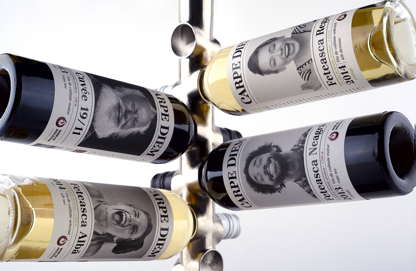

На этикетке, опоясывающей бутылку на 360°, изображены лица людей, как лучшие индикаторы эмоций. При этом, несмотря на нетрадиционную для рынка стилистику оформления, продукт органично смотрится на винной полке. Основой коммуникации с потребителем будет именно этикетка. Это новинка для рынка, и на полке в окружении винной классики будет выделяться особенно сильно.
At the label that surrounds bottle for 360° there are shown people faces like the best emotional indicators. In spite of non-traditional (for market) design stylistics the product looks smoothly on a wine shelf. Label is the base of consumer communication. It is something new on a market and will definitely stand out on a shelf with classic wine.

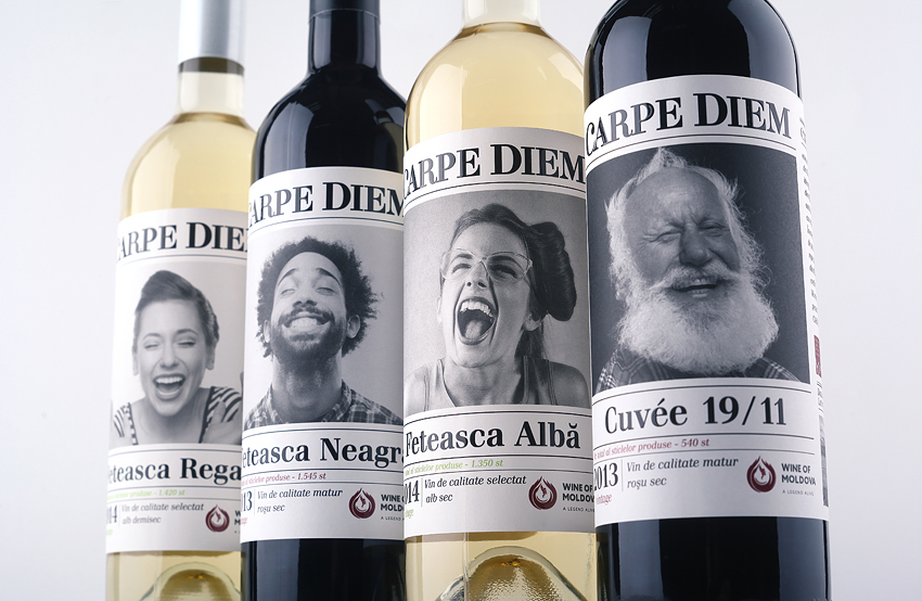
Таким образом, оформление отвечает заявленным требованиям – дизайн передает настроение и характер, вложенный в процесс создания самого вина, философию его создателя. Линейка "Сarpe Diem" представлена четырьмя SKU и уже в продаже в одноименной винотеке. Вино Carpe Diem Feteasca Neagra получило золотую медаль на европейском конкурсе Berliner Wine Trophy 2015.
As a result the appearance meets declared requirements - the design conveys disposition and temper that was enclosed in a process of wine creation and the philosophy of its (wine) author. The “Carpe Diem” wine is presented in 4 SKU’s and can already be found in a same-named wine store. The wine Carpe Diem Feteasca Neagra was awarded a gold medal in a European contest Berliner Wine Trophy 2015.


