

When viewing a collection of his work at the Museum of the City of New York, it seemed playful, vibrant, and clever. His work seems very straightfoward and clean, and simple, but not in an easy way so much as in a perfected, finessed way. I left the exhibit so inspired that when I went home I took out all my colored paper, got a fresh x-acto blade and had some fun. This project consists of two posters, a brochure, and a calendar.
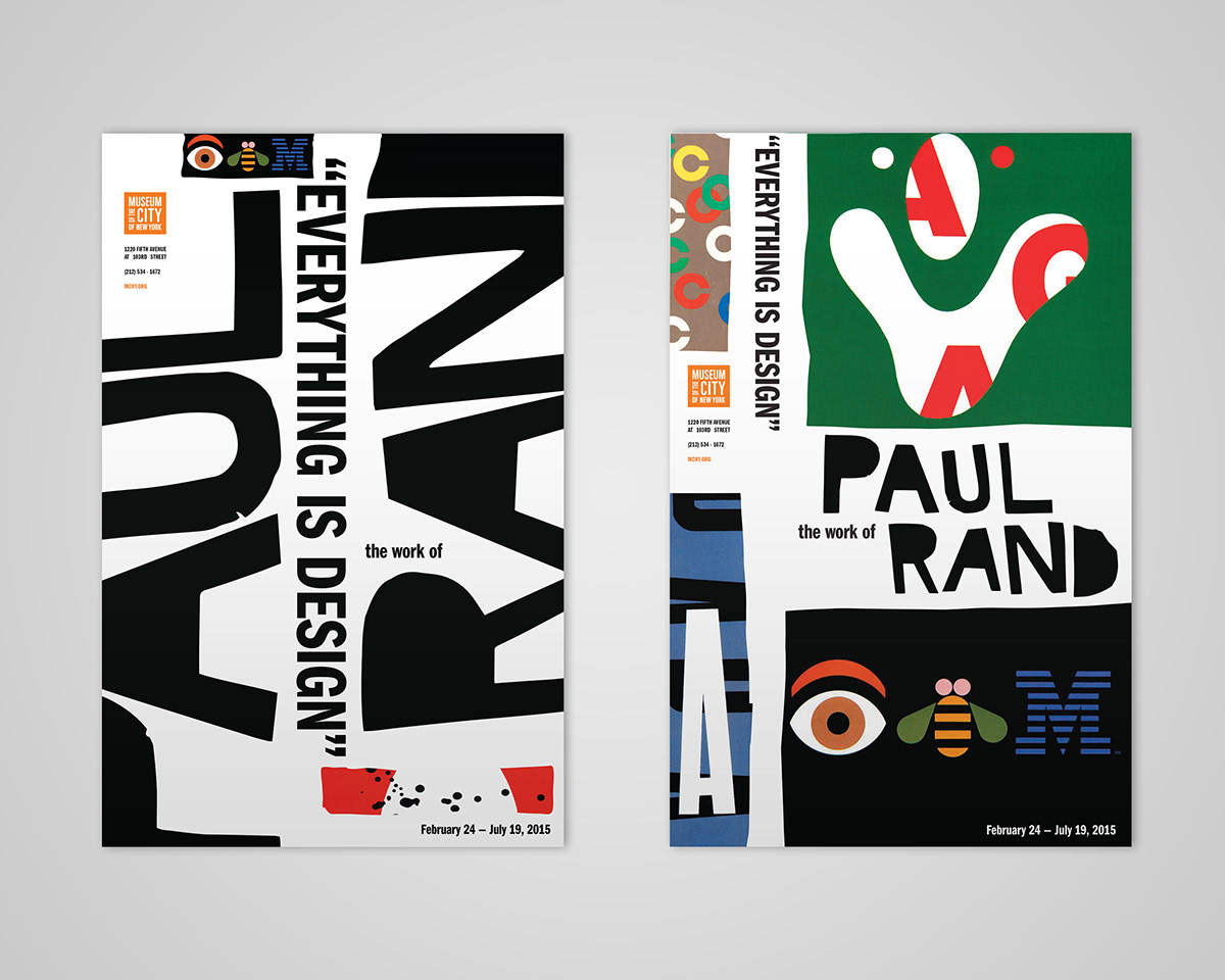
The poster on the left is type oriented, the one on the right is image oriented. It took a few tries to get the letters cut out right.
The brochure and the calendar have the same playful qualities of the posters while also being mailable. They were a little more challenging, when trying to match the concept while also organizing the information in there. So I concentrated heavily on where the information was going in relation to the images, organizing them so that the information is well organized while also laid out in a very playful and simple manner.
The cover and opening spread of the brochure.

Flat mockups of the brochure.
The cover and opening spread of the calendar.
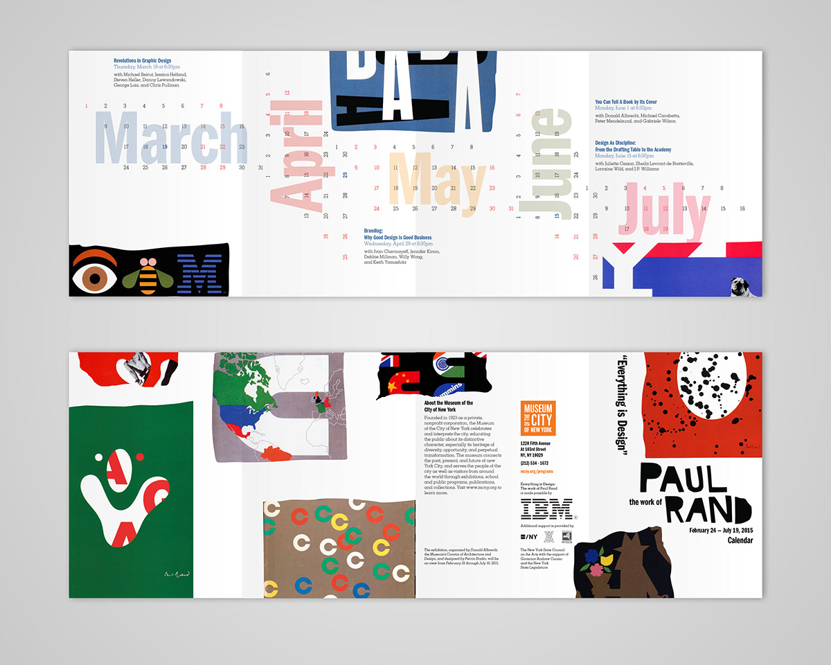
Flat mockups of the calendar.


