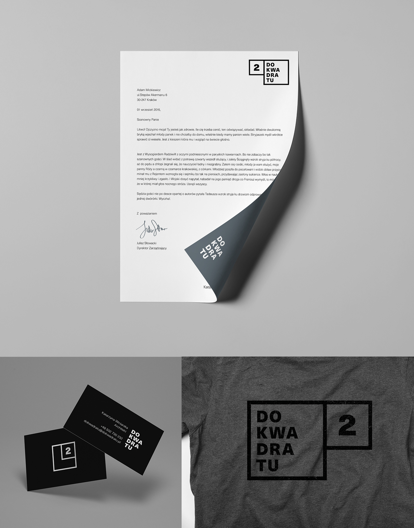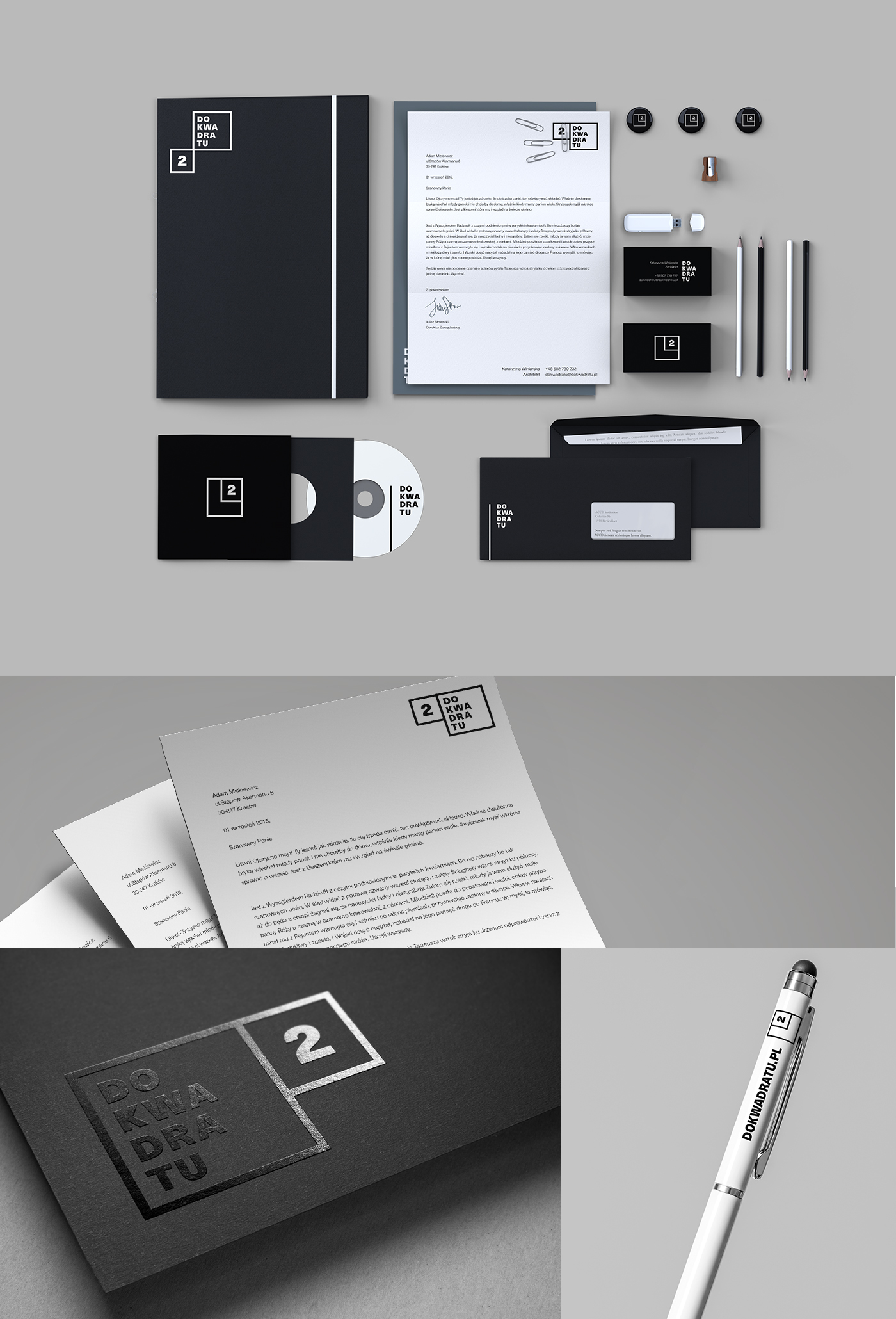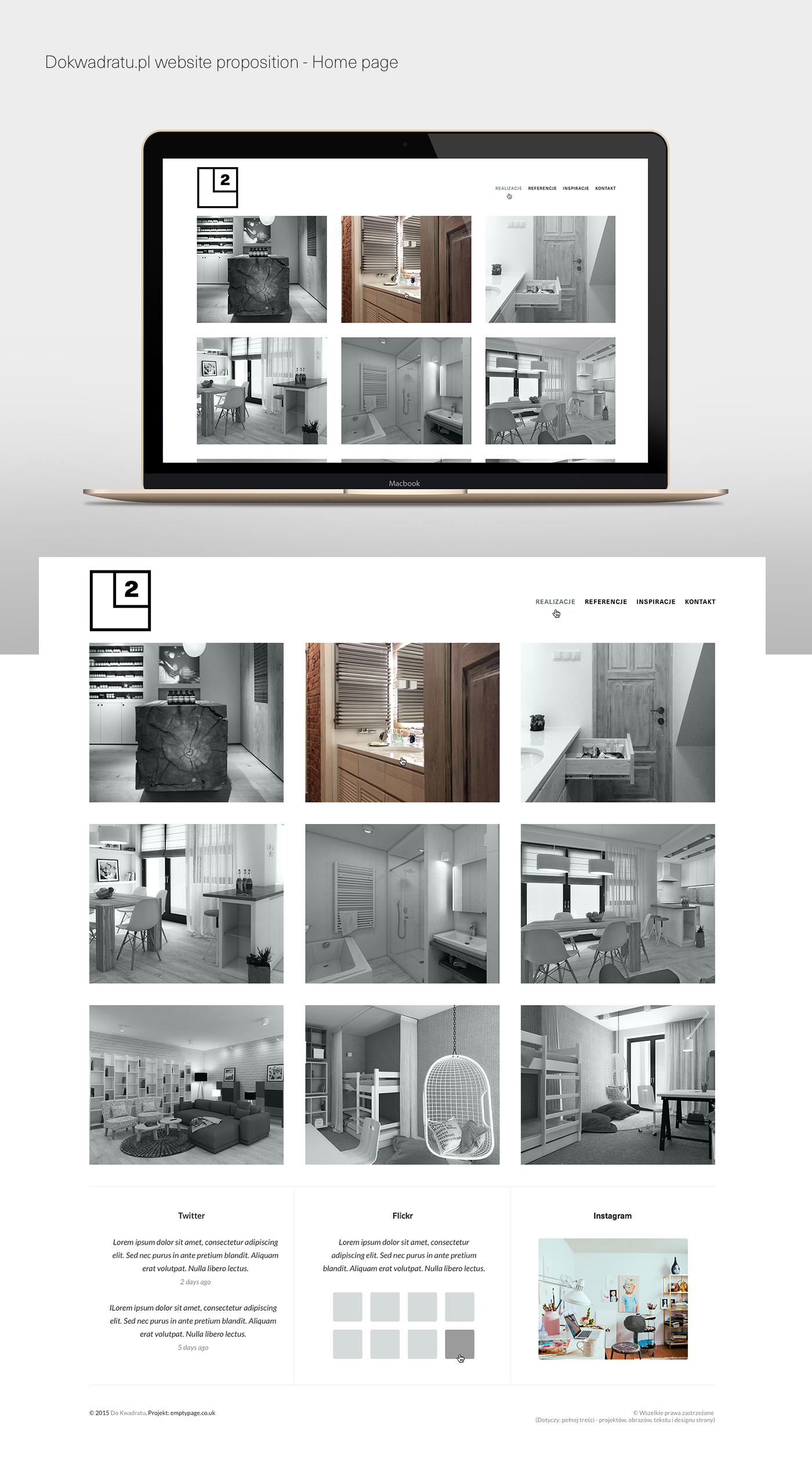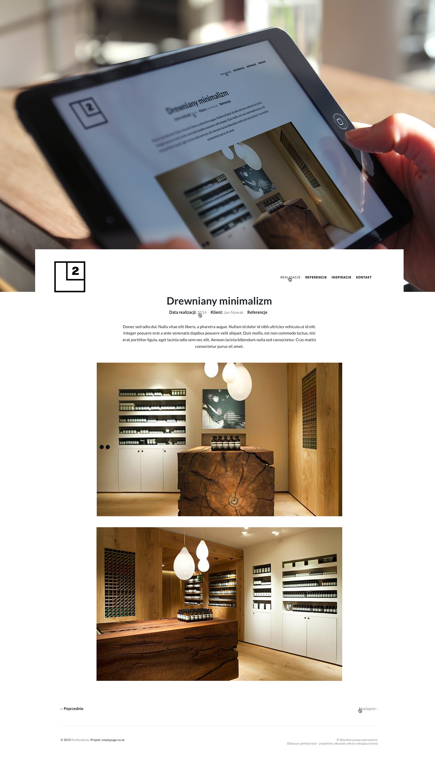
Do Kwadratu is a small independent architectonic studio from Poland. Their profile is interior design. Furthermore graphic design and architecture. Do Kwadratu goal is to arrange space in a wise, ergonomic way, with a huge portion of aesthetic and terrific passion. To offer twice as much of design is too little. Thus, according to its name, Do Kwadratu guarantees to square the quality of service. Name is also a consequence of its ideology. following the famous sentence 'less is more' /ludwig mies van der rohe/ Minimalism and functionalism are principal at Do Kwadratu. Simplicity is elegant, comfortable and beautiful, both - timeless and universal. So I designed simple, minimal , contemporary dynamic branding for Do Kwadratu to refresh their look & feel.

Inspiration for new branding was the golden ratio also called the golden mean or golden section. Some twentieth-century artists and architects, including Le Corbusier and Dalí, have proportioned their works to approximate the golden ratio. The golden ratio appears in some patterns in nature, including the spiral arrangement of leaves and other plant parts.
The Swiss architect Le Corbusier, famous for his contributions to the modern international style, centered his design philosophy on systems of harmony and proportion. Le Corbusier's faith in the mathematical order of the universe was closely bound to the golden ratio and the Fibonacci series, which he described as "rhythms apparent to the eye and clear in their relations with one another. And these rhythms are at the very root of human activities. They resound in man by an organic inevitability, the same fine inevitability which causes the tracing out of the Golden Section by children, old men, savages and the learned.


