
Background
The infamous brewery contacted us to brand their new cheap beer that weren’t allowed to be called light. They tried to make it into crappy adjunct beer but they failed, it became delicious.
The case
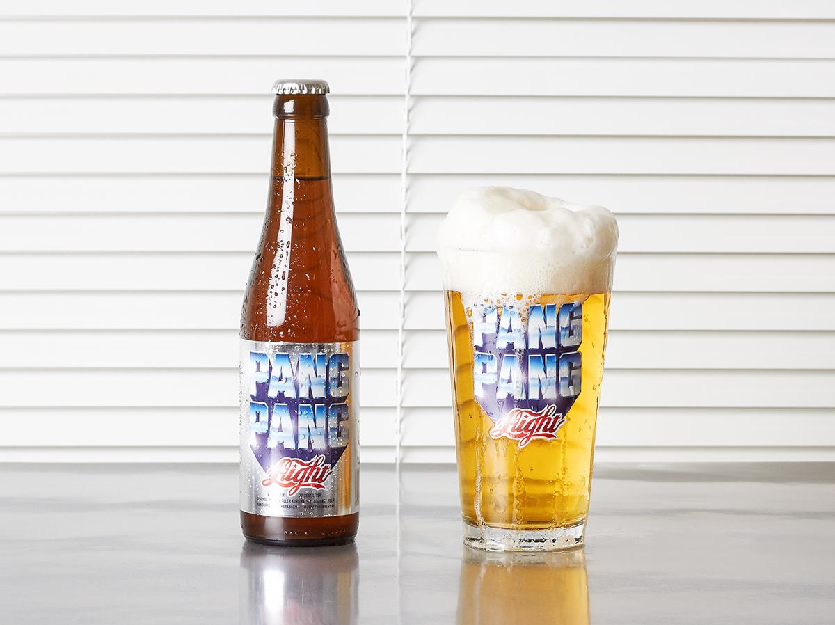
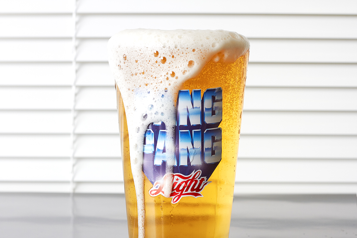
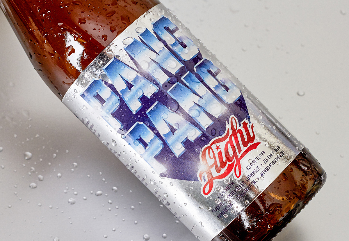
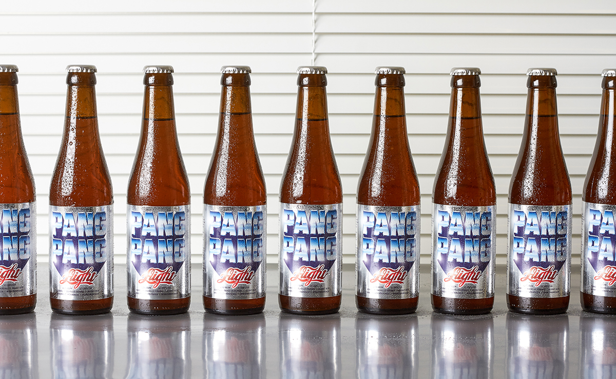
In a world full of giant breweries trying to pose as craft brewers PangPang stands out as the original that everyone are trying to come across as. However founder and master brewer, Fredrik Tunedal, decided to turn it around and copy the big breweries instead by trying to make the crappiest beer he could. He used the cheapest adjuncts he could find and went all out of his way to try and make the beer as bland and boring as he possibly could. He did horrible stuff to the yeast to stress it, it all became a time travel to “when men were men and beer was beer”, a horrible time. The problem was it turned out to be delicious and people loved it. We got the assignement to brand it as a cheap light US beer, even though it wasn’t allowed to be called “light”. The name became “Aight” and we were inspired by USA in the 80’s, Mad Max and cheesy chromed metallic typography. The typographic solution deliberately makes people read “Light” instead of “Aight” while an inspector who knows the name will read “Aight”. The beer has been a success so far and it seems the secret of PangPang brewery is not the ingredients or the recipe but the actual craftsmanship.
In a world full of giant breweries trying to pose as craft brewers PangPang stands out as the original that everyone are trying to come across as. However founder and master brewer, Fredrik Tunedal, decided to turn it around and copy the big breweries instead by trying to make the crappiest beer he could. He used the cheapest adjuncts he could find and went all out of his way to try and make the beer as bland and boring as he possibly could. He did horrible stuff to the yeast to stress it, it all became a time travel to “when men were men and beer was beer”, a horrible time. The problem was it turned out to be delicious and people loved it. We got the assignement to brand it as a cheap light US beer, even though it wasn’t allowed to be called “light”. The name became “Aight” and we were inspired by USA in the 80’s, Mad Max and cheesy chromed metallic typography. The typographic solution deliberately makes people read “Light” instead of “Aight” while an inspector who knows the name will read “Aight”. The beer has been a success so far and it seems the secret of PangPang brewery is not the ingredients or the recipe but the actual craftsmanship.


