


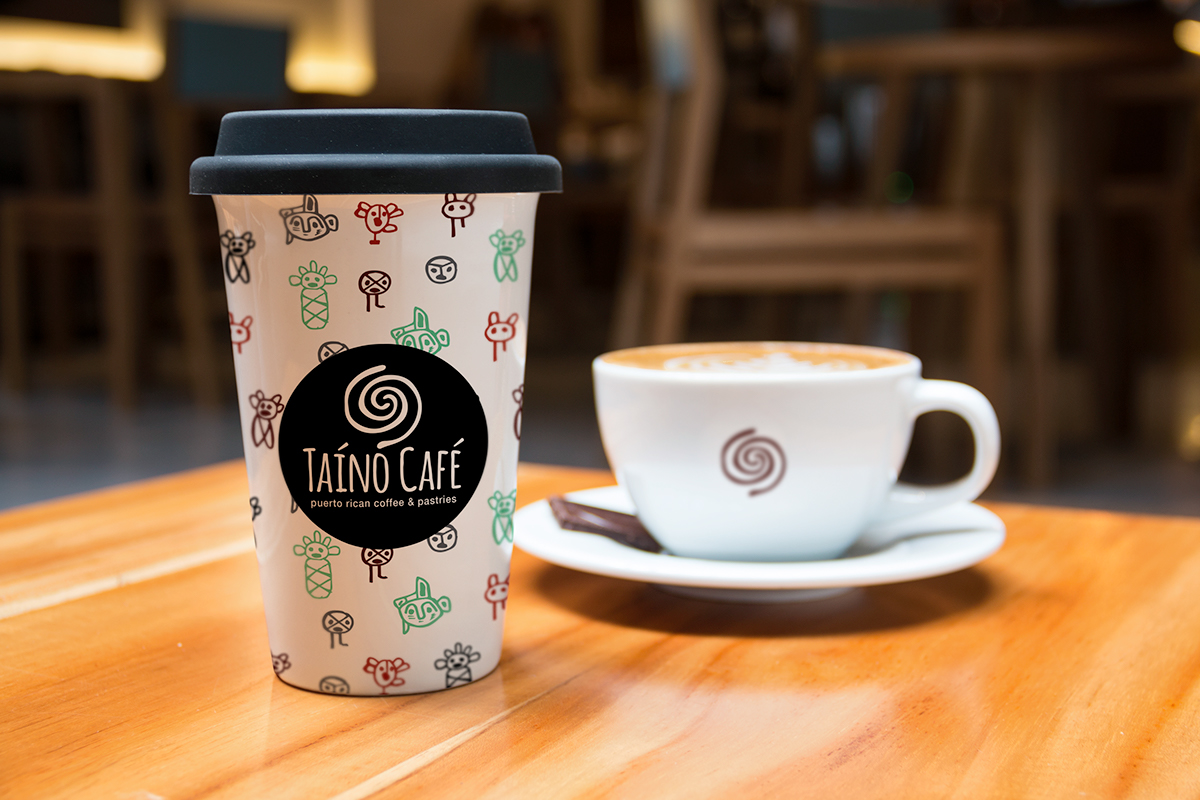
Taíno Café brings to New York the taste and feel of Puerto Rico with a modern flare. To do this, many ingredients and flavors from the island are used throughout the dishes as well as local ones available in the city
I created the logo, web and print designs for this project. I wanted the logo itself to feel natural, since the café uses many natural ingredients from Puerto Rico as well as New York. The symbol used is a modification of the Taíno word for water. Fresh water brought together the natives, while coffee is what beings together people of today. I wanted to hint coffee without being obvious as well as represent two people interacting with each other


