


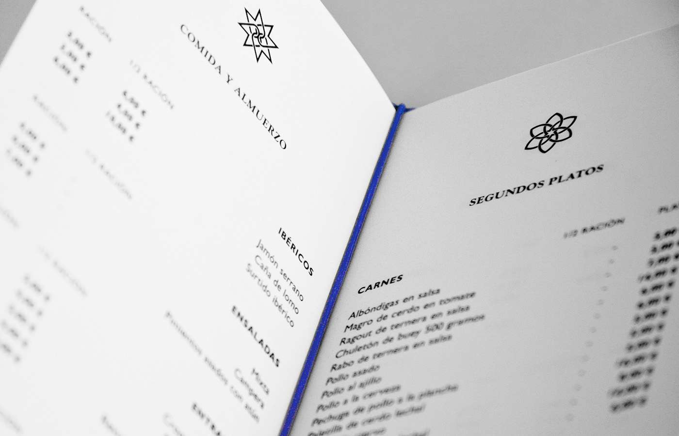


Branding for a rural hotel located in an old Arabic site in southern Spain, and called after the site, which name is Inz Almaraz and means "Women's Fortress". The brand conveys the geometrical and floral patterns that decorate these Arabic fortresses. Blue as the predominant colour is due to the common usage of fountains in such a culture. The use of wood on the menu's jacket appeals to the rural aspect of the hotel and the material used in the geometrical patterns in the Arabic tradition.
Client: Inz Almaraz Hotel
Client: Inz Almaraz Hotel
Creativity and design: Jose Carratala


