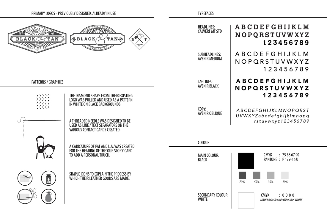
ABOUT:
The Black And Tan Trading Co. is a husband and wife team from Hamilton, Ontario specializing in hand stitched leather goods and metal fabrication.
I was asked to design packaging solutions for a variety of purposes that showcased their mission and values, their aesthetic, provided clear and cohesive branding, and maintained an eco-friendly quality.
The packaging must be
- protective enough to ship items worldwide,
- visually appealing for use in the local retail stores where their items are currently carried,
- and functional for use at local markets.
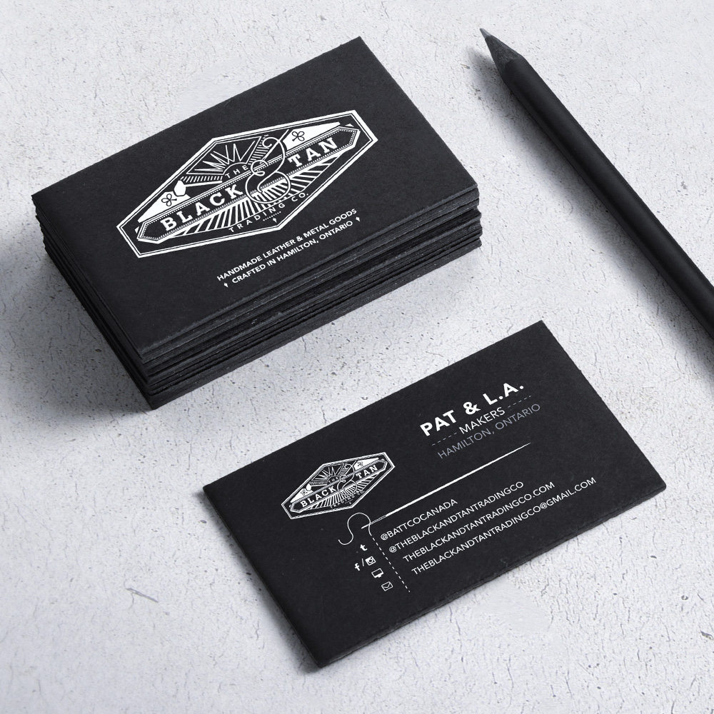
To start, I came up with tag lines that would act as informative placements on their business card and other packaging. Emphasizing the fact that they were from Hamilton, I used the 'Handmade leather & metal goods crafted in Hamilton, Ontario' on a variety of their cards and tags.
Their new business cards were printed on a matte suede cardstock. A needle was used as a seperating element and a dotted line representing the thread was 'stitched' between the social media icons and their related links.
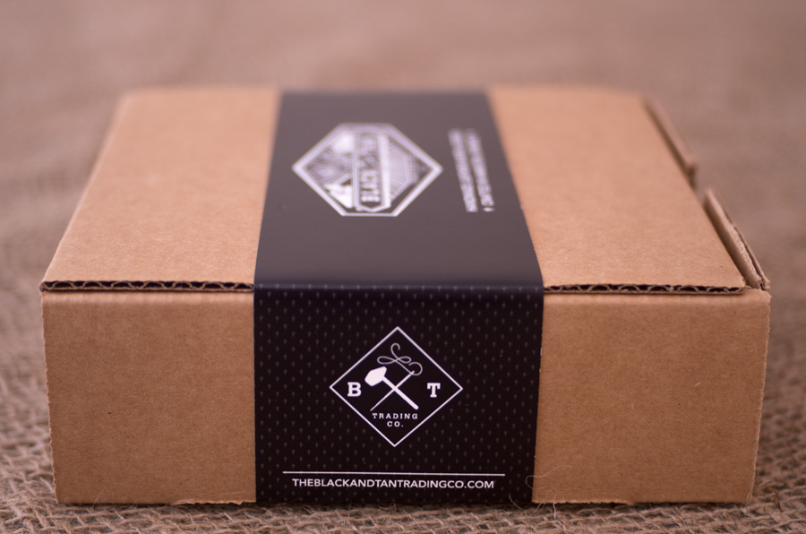
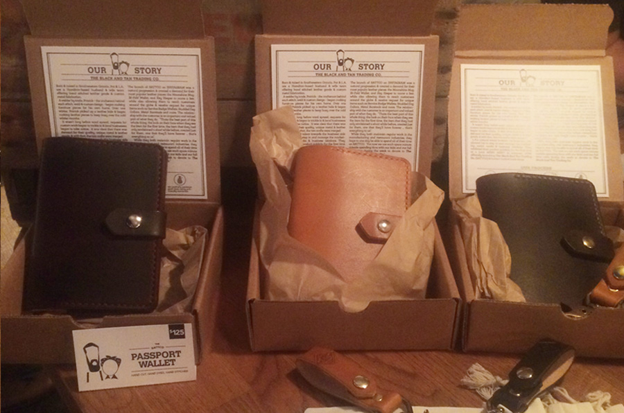
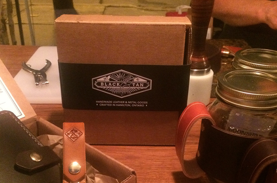
For larger items, I designed a long, black band printed on matte card stock that would serve as a wrap for a small, recycled mailer. The diamond shape from their existing logo was used as a small watermarked pattern along the side and bottom of the band, leaving the top pure black. The box would open to reveal the item, wrapped in biodegradable paper, and tied with hemp twine. A 'Thank you for your order' card was designed and printed on thick, recycled card stock.
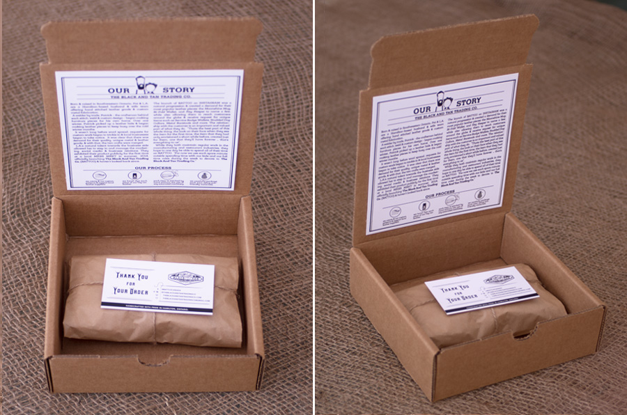
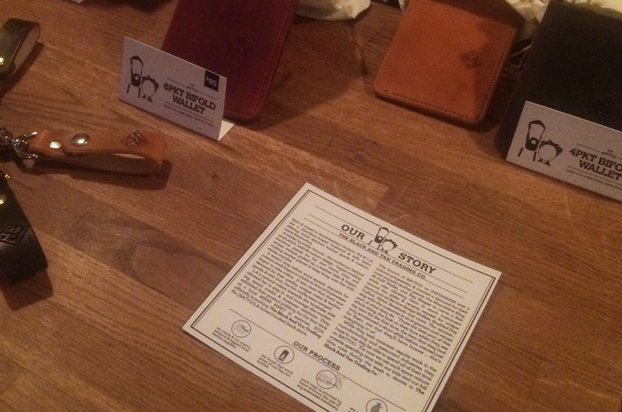
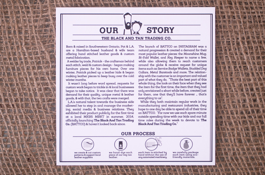
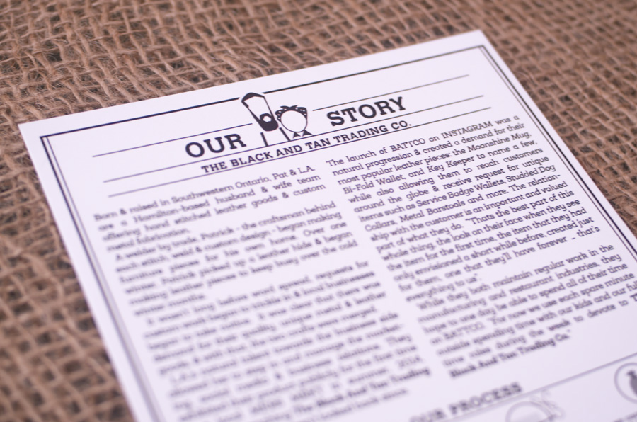
Because BATTCO wanted a way to present their story to customers, I designed a small icon of the couple to act as a header on a 5"x5" thick card, and typed their story in columns below, giving a feel of vintage newspapers and announcements. Their process for leathergoods was broken down into 4 main components, each represented by an icon and an explanation below.
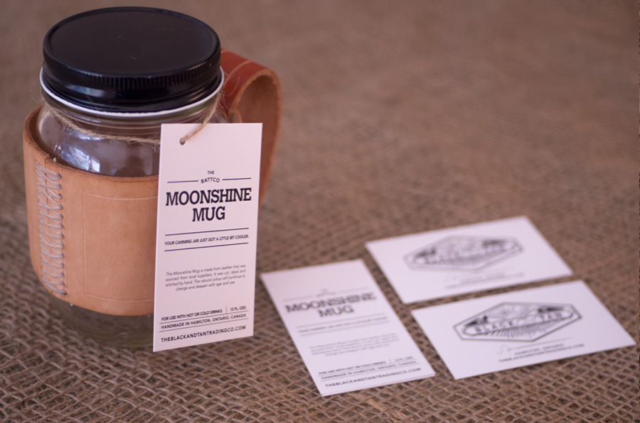
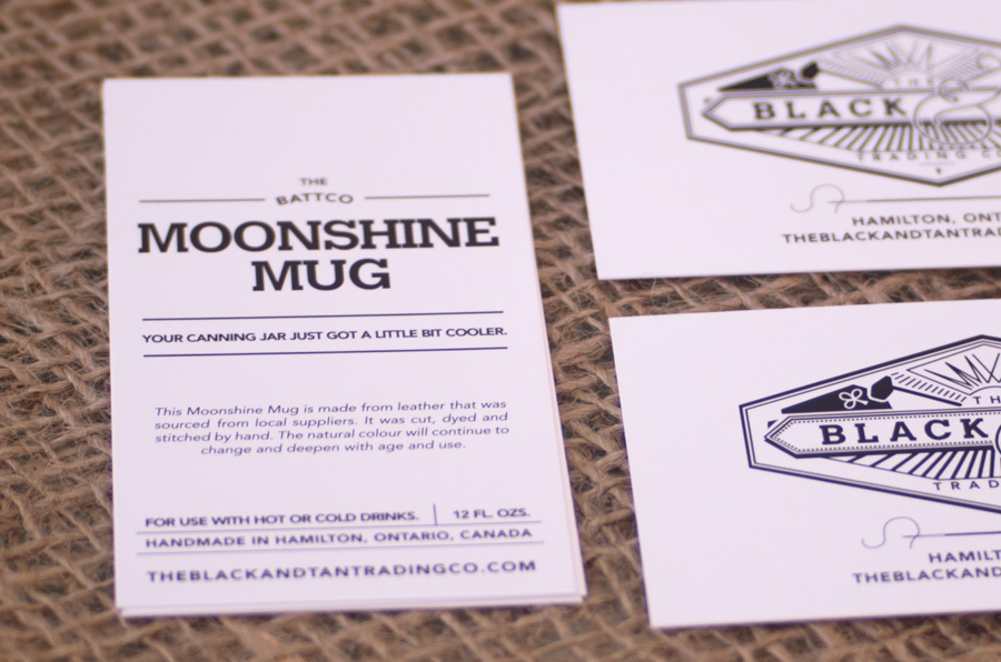
One of their most popular items, the Moonshine Mug needed it's very own tag. I kept the design of the front very minimal, emphasizing the name of the product and a slogan that I coined: 'Your canning jar just got a little bit cooler'. Information about the product follows as well as their contact information, and the back features their logo.
For smaller items, such as their wrist cuffs and key keepers, I used their logo new tag line along with their web URL to create a simple graphic that was then hand printed onto a series of cotton bags.

To see some of their work or find out more about them, visit their regularly updated Instagram page.
Below are some shots of the items in use at a local market (mkrs mrkt) in Burlington, Ontario. For this event, I also designed custom price cards which were folded to stand in front of each item and featured their icon caricatures with a bold product title, similar to the hang tag on the Moonshine Mug.