P22 Basel Roman - Font Digitization
14 years in the works
The Task
In mid 2001, P22 was approached by a Daniel Garrison, a Classics scholar at Northwestern University about possibly digitizing a long lost "Garamond" typeface. This font was used by Johannes Herbst (a.k.a. Ioannes Oporinus) in 1543 to publish Andreas Vesalius' "On the Fabric of the Human Body (De humani corporis fabrica) in Basel. Mr. Garrison has been involved in a major translation of this work and had the vision to seek out an accurate digital typeface to present the translation.
The P22 Basel Roman font project had a few twists and turns but eventually Garrison collaborated with another designer to develop a font that suited the needs of this in-depth annotated translation project perfectly.
As it turned out, the face in question could not be attributed to Garamond. However, it did have a certain sturdy appeal and there did not seem to be any existing digital version of this typeface. The task was deceptively simple—digitize this font. But how?
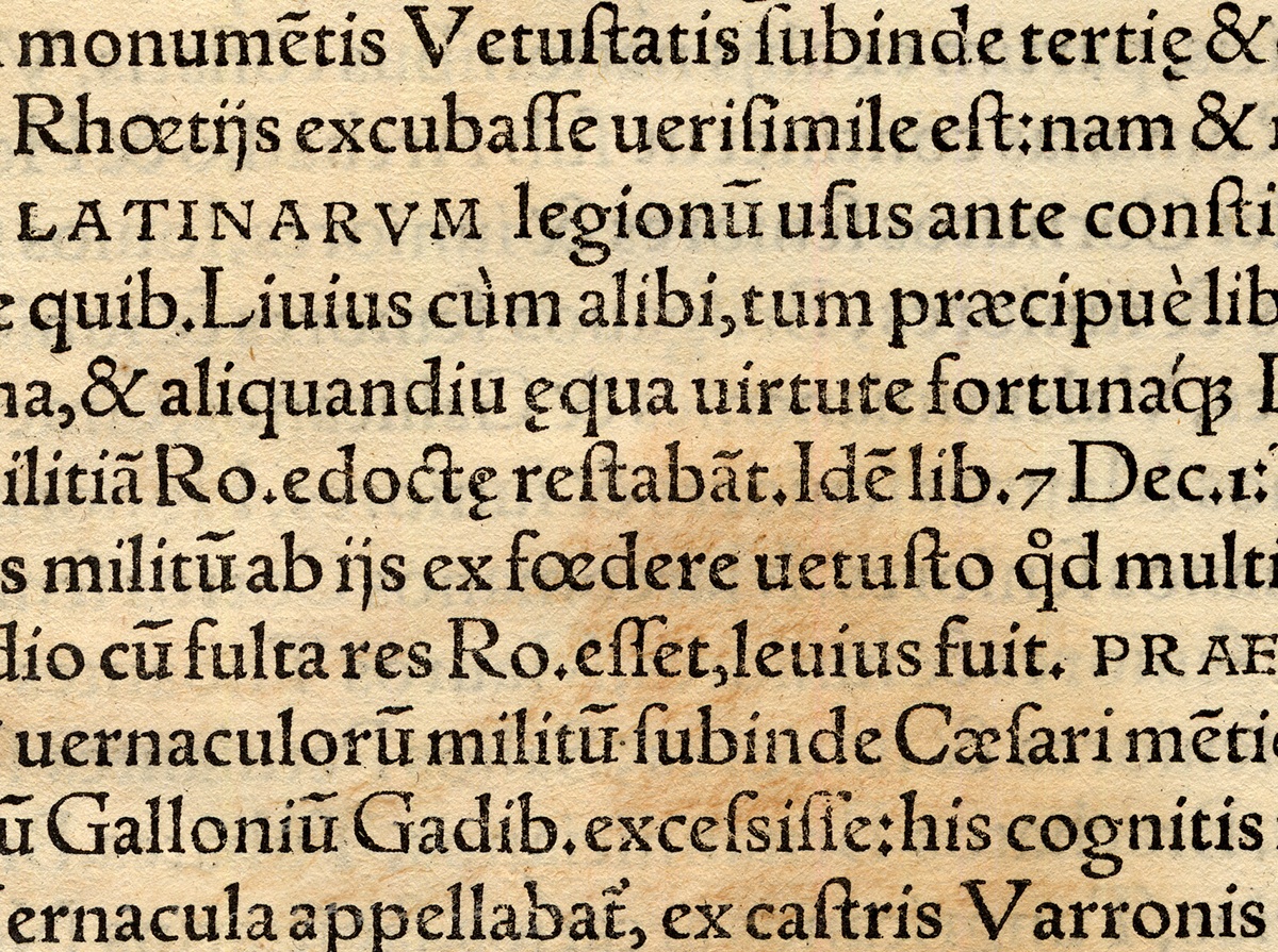
The first obstacle in digitizing this typeface was to acquire access to printed specimens. The original designer or exact origin of the typeface is unknown. Without access an the original printing of the book, we would have to work from copies made from the facsimile edition, two steps removed from the original printed pages.
One stroke of good luck resulted from the discovery of some leaves printed in Basel in 1551 by Ioannem Oporium (Oporinus) offered for sale from a well-known online auction house (yes ebay!). The online scans appeared to be the same font, so I took the gamble to bid and won the auction. The seller had many pages that had no “interesting” woodcuts or decorative initials, so I was able to obtain several after determining that the pages were indeed the same font as the Fabrica book.
One problem in digitizing a 500 year old type design lay in deciding what type of character to give the digital version of the typeface. There is a “quick and dirty” way to digitize that involves scanning the original art, utilizing software to trace bitmap images of the letter shapes and then converting them to scalable outlines.
However, this quick method is often insufficient in providing enough detail and results in rather crude outlines. This was definitely the case since there were no original drawings to work from and the only available specimens were printed samples of a 15-point font (where the ink spread and paper coarseness varied from each instance of each character). Another way to digitize is to re-draw the letterforms, making at attempt at determining the intent of the original design.
The original approach to digitizing the Basel type was to try something different from these two conventional methods. Several instances of each letter were auto-traced and then overlaid upon each other (see below.) By making a judgment on the “average” of these scans, a fair approximation of the original outline could be determined. Test words were then studied to see that there was an overall continuity to the letterforms. The end result is a sturdy antiqua face that has the feel of being made from hand-cut punches.
Some letters required in the modern Latin alphabet (J, j, U, v, W, w) simply did not exist in the Roman alphabet from the 16th Century. To provide users with a fully functional font, these letters, along with many other characters present in the modern day computer character set, needed to be designed.
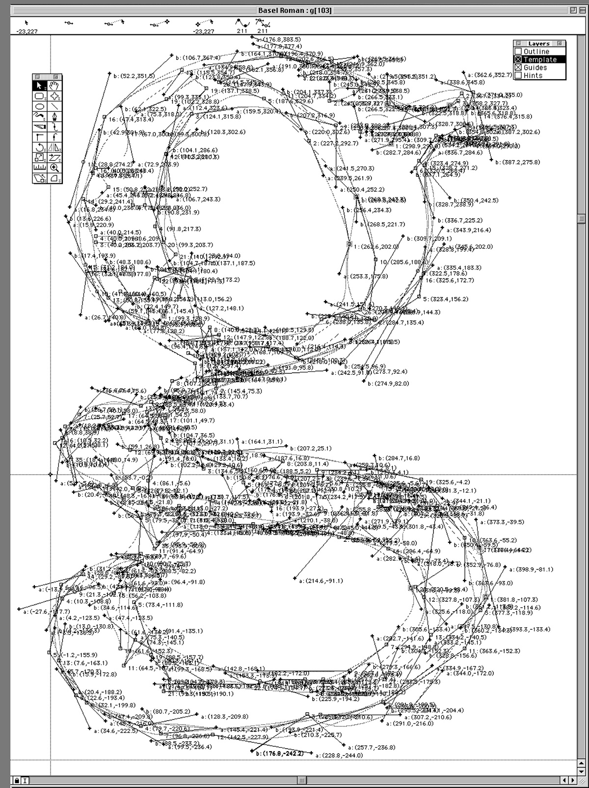
Overlay of several versions of scanned 'g' in Fontographer circa 2002
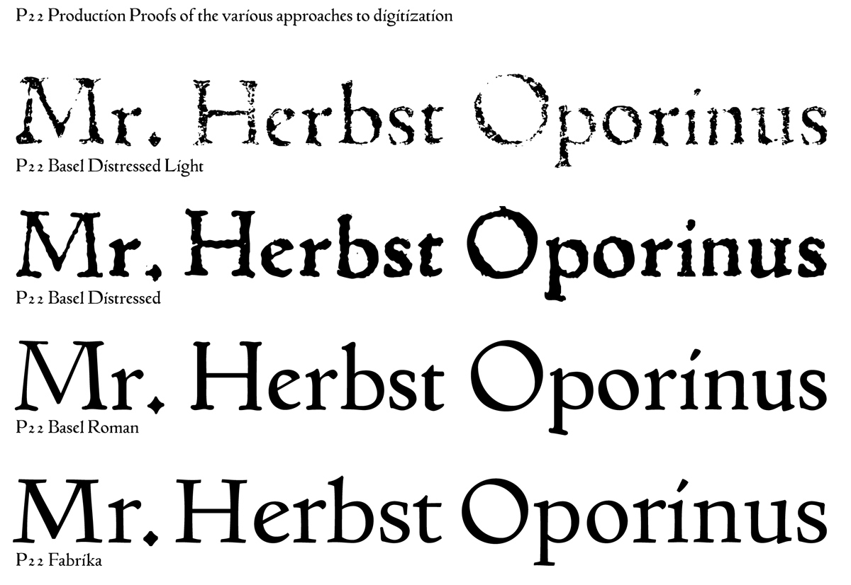
Several years had passed since the inception of the project and its scope had been revisited and enlarged to require a wider range of applications. The original digitized version was made to look how we felt the original punchcutter had made the outlines: without fake distressed edges or ink squeeze, but also without too much of the mechanical precision that the computer can achieve.
A second version of the font was created by Colin Kahn right from the digital scans with very distressed edges in several variants so that it might approximate a poorly inked and roughly printed page.
A third version of the Basel font was drawn by Paul Hunt as a modern adaptation for serious typographic work that is not just historical pastiche. The resulting suite of typefaces was intended to work together as a unique family that employs three distinct approaches to a historical revival. All versions would share the same scale and spacing.
All of these fonts were intended to be released in early 2008 with expanded OpenType functionality, including ligatures, small caps, historical sorts, as well as other typographic features and extended language support.
All of these fonts were intended to be released in early 2008 with expanded OpenType functionality, including ligatures, small caps, historical sorts, as well as other typographic features and extended language support.
Many things shifted in 2008 and the font suite was not completed. The first "P22 Basel Roman" was completed but not offered for general sale until late 2015. "P22 Fabrika" was developed as a functioning prototype, but ultimately not finished.
The P22 Basel font was featured in the Antiqua-Boom issue of Slanted Magazine in 2007 and will be available soon via P22.com
Mentions of the Basel Typeface in Typographic History:
"During the first quarter of the sixteenth century, a distinguished collaboration developed in Basel. Johann Froben, the printer, had as his scholar-editor
Erasmus, and as his illustrator-decorator the young Hans Holbein. Froben was one of the most renowned publisher of humanist literature, and in the pre-Tory days managed to exert significant influence on European printing, including that of Paris and Lyons... Among the important books printed in Basel was Froben's own New Testament in Greek, with a Latin translation by Erasmus. It appeared in 1516. From the printing office of Michael Isengrim, also of Basel, a large botanical work by Leonhard Fuchs was issued in 1543...An outstanding work on anatomy was brought out by Oporinus in 1568. The author was Andreas Vesalius and the Title De Humani Corporiu Fabrica."
Erasmus, and as his illustrator-decorator the young Hans Holbein. Froben was one of the most renowned publisher of humanist literature, and in the pre-Tory days managed to exert significant influence on European printing, including that of Paris and Lyons... Among the important books printed in Basel was Froben's own New Testament in Greek, with a Latin translation by Erasmus. It appeared in 1516. From the printing office of Michael Isengrim, also of Basel, a large botanical work by Leonhard Fuchs was issued in 1543...An outstanding work on anatomy was brought out by Oporinus in 1568. The author was Andreas Vesalius and the Title De Humani Corporiu Fabrica."
Warren Chappell, A Short History of the Printed Word. New York 1970 p.103
The roman font of the Fabrica has strong affinities with the type used by Froben in Basel in 1526, illustrated in Updike 1937 facing p. 143. Johannes Froben (1460_1527) was Erasmus_ host in Basel for several years and published a number of his books. Updike describes this Roman as "massive and monumental." However, Updike describes the 1543 Fabrica as "a volume not at all of the Froben order, but reminiscent rather of Plantin or some Italian printer. Its noble old style type and delicate italic, delightful initial letters and the careful anatomical engravings . . . make up a remarkable volume. The closeness of the type-setting is noteworthy and recalls much earlier books, and its presswork is uniformly good." (143 f.). "In spite of the distinction given to the Basel press by the competence of the Froben, the cuts of Holbein and a series of bold types, the city did not long retain any importance as a centre of printing style. Its affinities were German and though a number of admirable books in the Basel style were put forth, its influence, though at first strongly exerted upon early Parisian and Lyonnese craftsmen, was purely temporary."
Stanley Morison, Four Centuries of Fine Printing. London: Benn, 1924, p. xviii.
Charles Whittingham of the Chiswick Press revived this type style as Basle roman, cut by William Howard of Great Queen Street, London, soon after the middle of the 19th century. "The type is based on the kind of roman used in the early part of the sixteenth century by Johann Froben, of Basle. It is a pre-Garamond roman, what we would call a Venetian rather than an old face, such as was in use at Basle and at Lyons, down to around 1550. It is a heavy face, with an oblique stroke to the eye of the e, and other characteristics which ally it with fifteenth-century types. The stress is definitely diagonal, so much so that the o has an angular appearance. The old-fashioned long s was used with the fount and the squarish terminals of this letter are conspicuous. The short s has a noticeably steep spine. An oblique stroke is used for the dot over the i, another fifteenth-century characteristic. This type was much too exotic to appeal to printers in general, but its antique flavour attracted William Morris. In 1889 he had his prose romance, A Tale of the House of the Wolfigs, set in Basle roman. In another romance, The Roots of the Mountains, 1890 (the book actually appeared in 1889), Morris used the type again, but had a different e cut, one with the bar nearly, but not quite, horizontal."
A.F. Johnson, Type Designs: Their History and Development. (London: Grafton, 1934), pp. 109_111.

Colophon for De Humani Corporiu Fabrica featuring full showing of lowercase and small caps

