






—
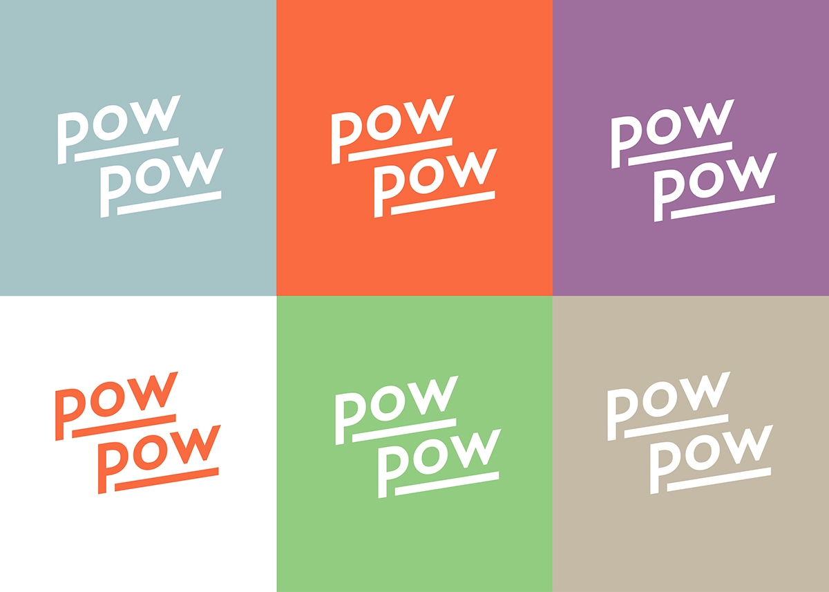
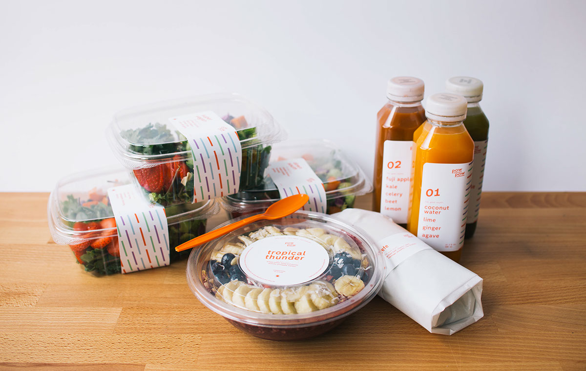
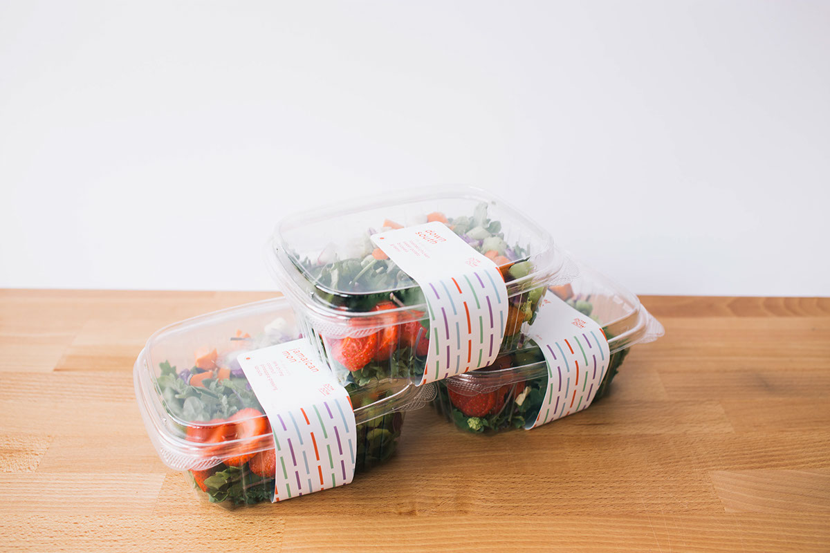
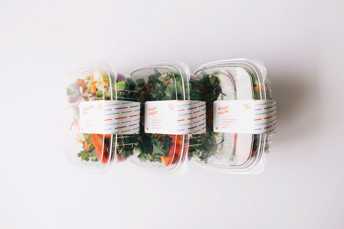
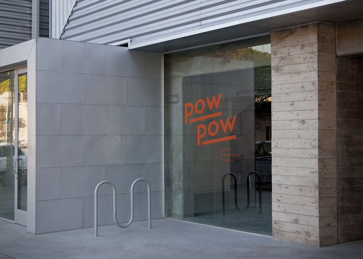
PowPow is a fictional grab n' go dining concept focused on providing thoughtful cuisine in an accessible environment. The restaurant offers convenient and healthy food for those on the go with an inspiration of Japanese food culture and hawaiian surf culture. The name is a fusion of a rough translation of steamed buns (bao) and the familiar phrase "pow pow" which evokes a fast action, such as grabbing food on the go.
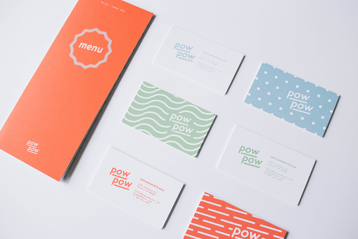
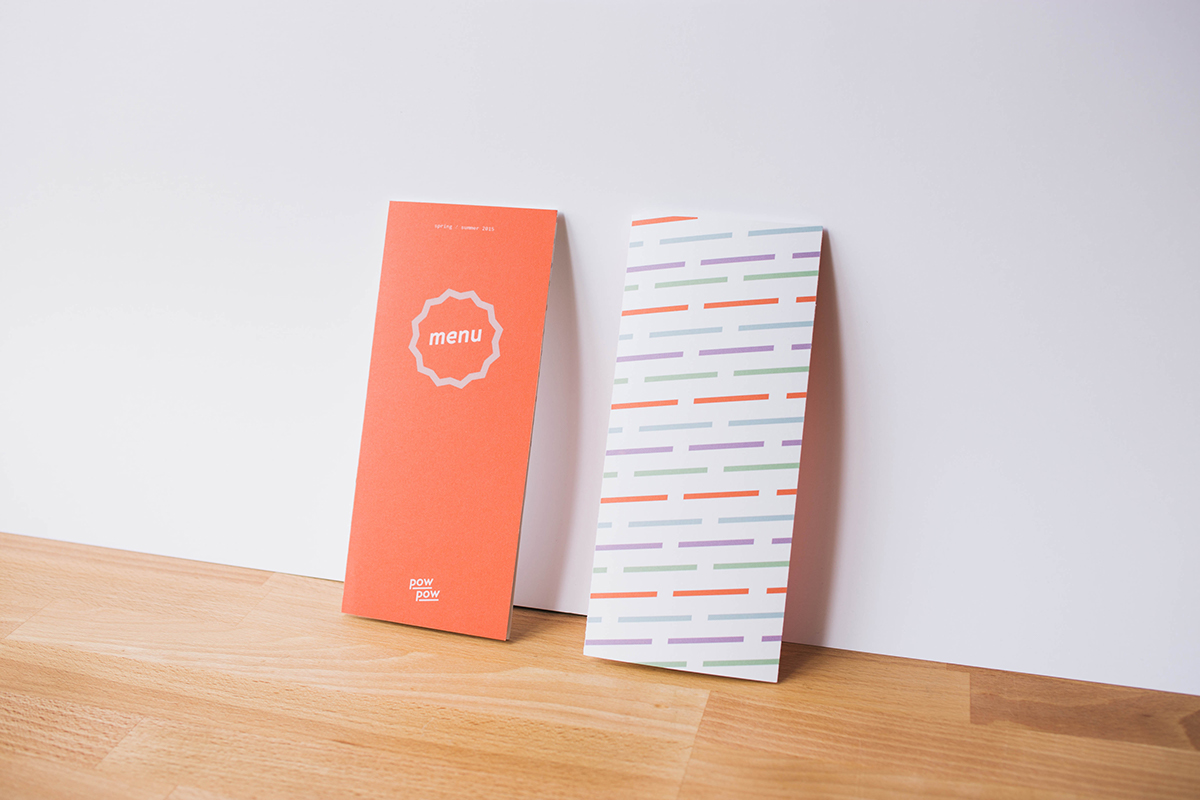
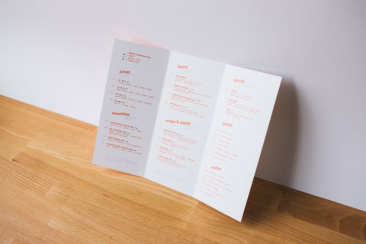
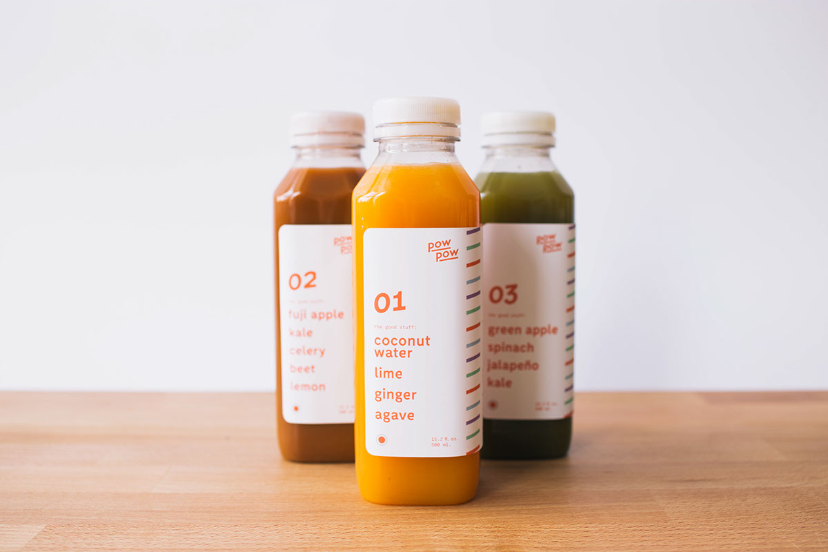
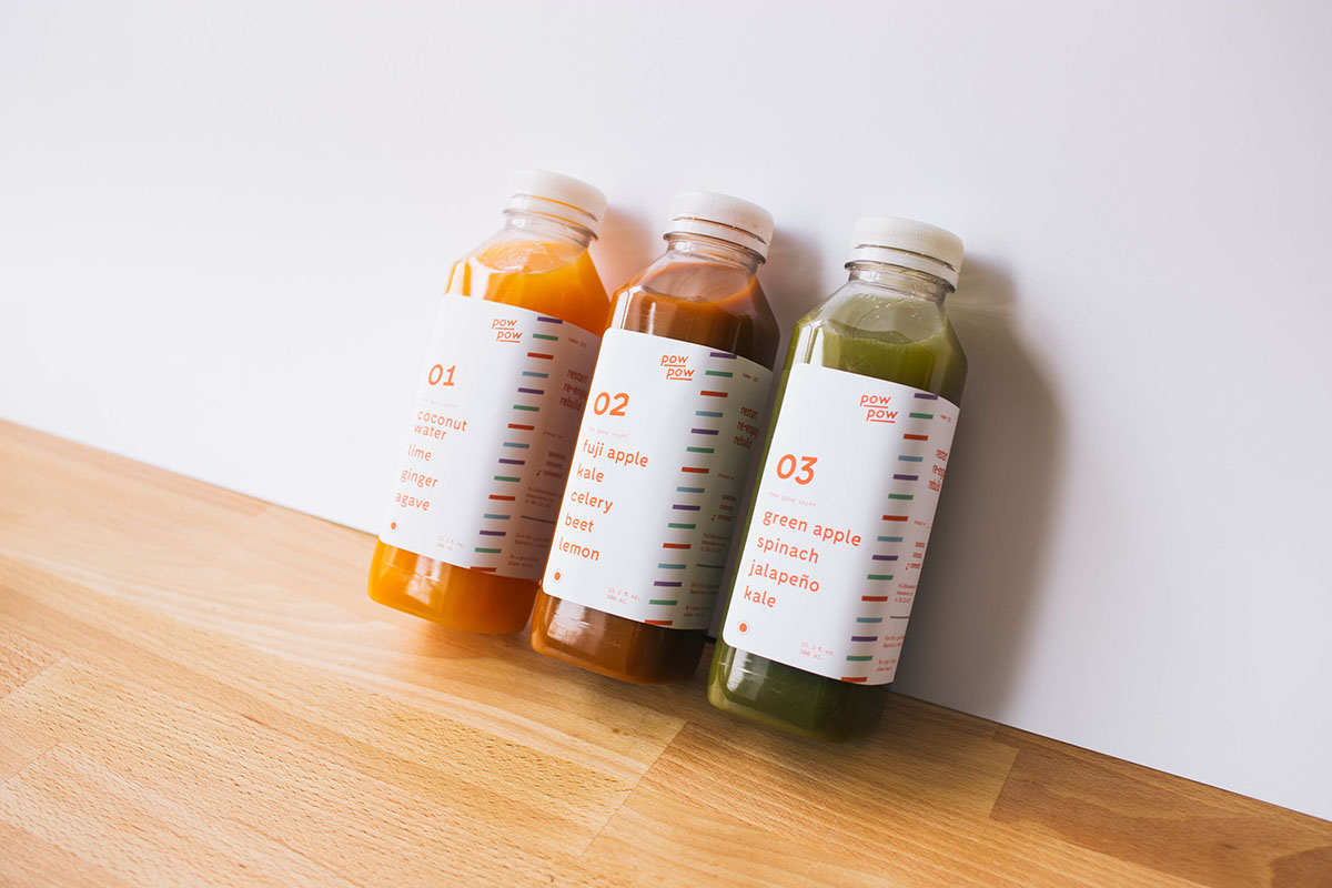
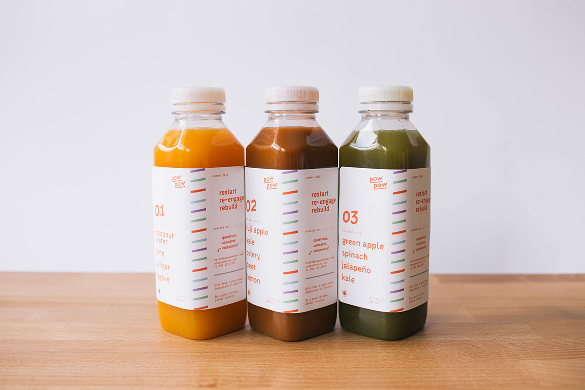
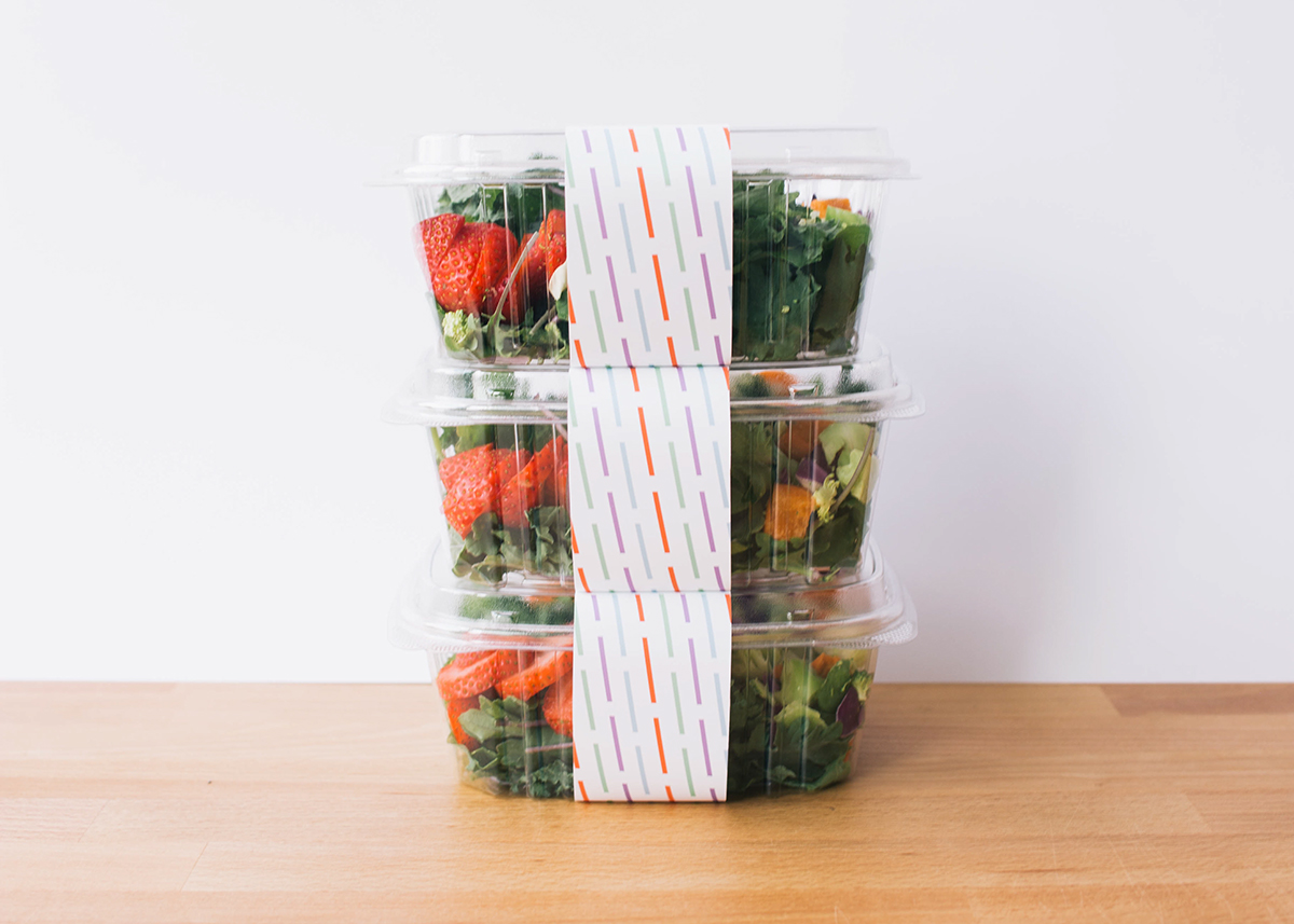
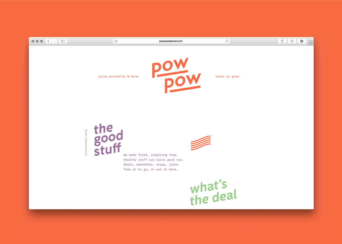
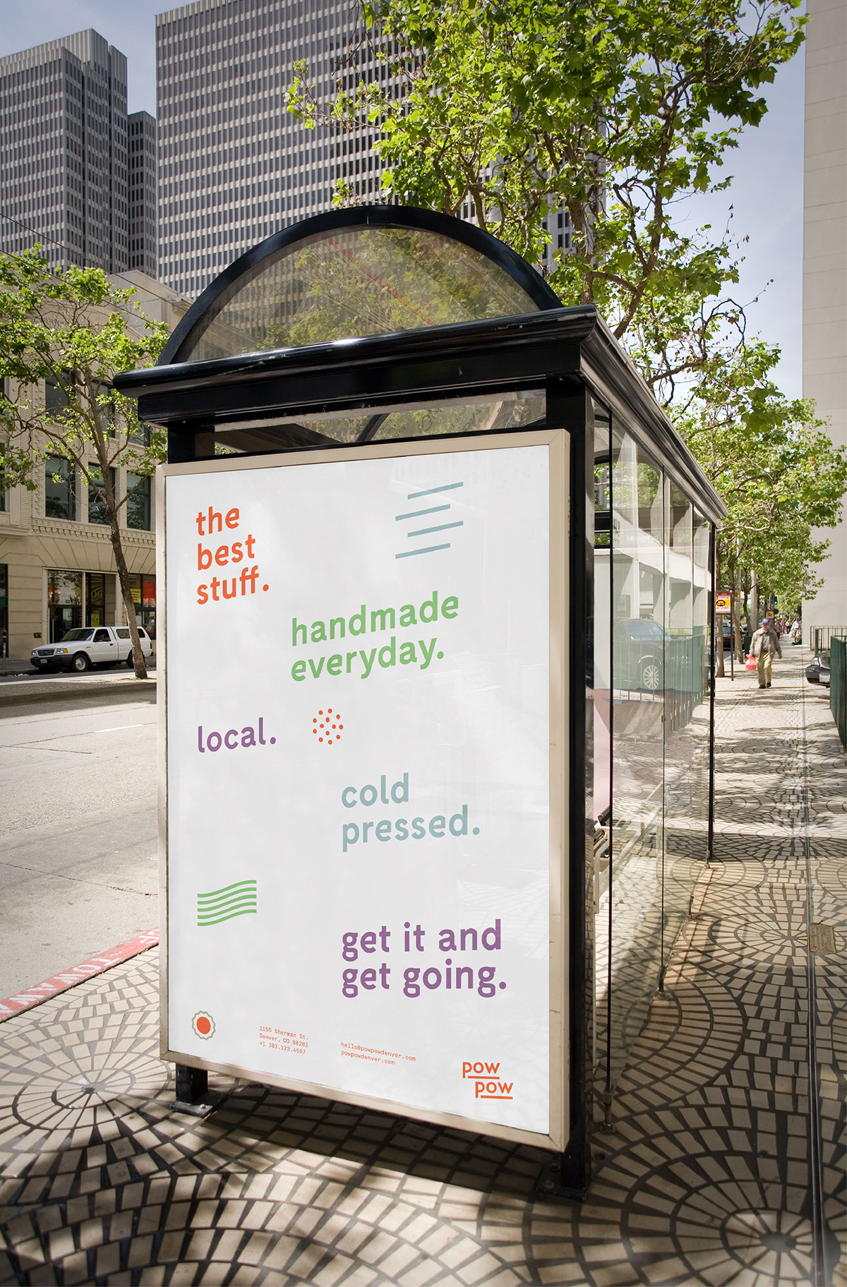
The cold-pressed juice market is slowly becoming more and more dense. PowPow is designed to stand out from the crowd by design and concept. Colors were chosen carefully to be light, friendly, bold and remniscent of fresh ingredients. The typography is inspired by Japanese pop culture while remaining restrained and modern. PowPow's voice is honest and straightforward so its customers know what to expect.
—
Credit to Fabian Fohrer for the Fabrik Typeface.
All photos by myself.

