Andy Wang's profile

Populace Restaurant


Populace Restaurant
Branding

Populace, meaning “of common man”, is a non-profit restaurant aimed to open in Vancouver. From the profit earned, Populace aspires to help children in schools of Vancouver achieve a healthy lifestyle. Populace promotes the idea of ethical eating, using locally-sourced ingredients and organic products in the kitchen. The brand is honest and proper, and well connected to Nature.

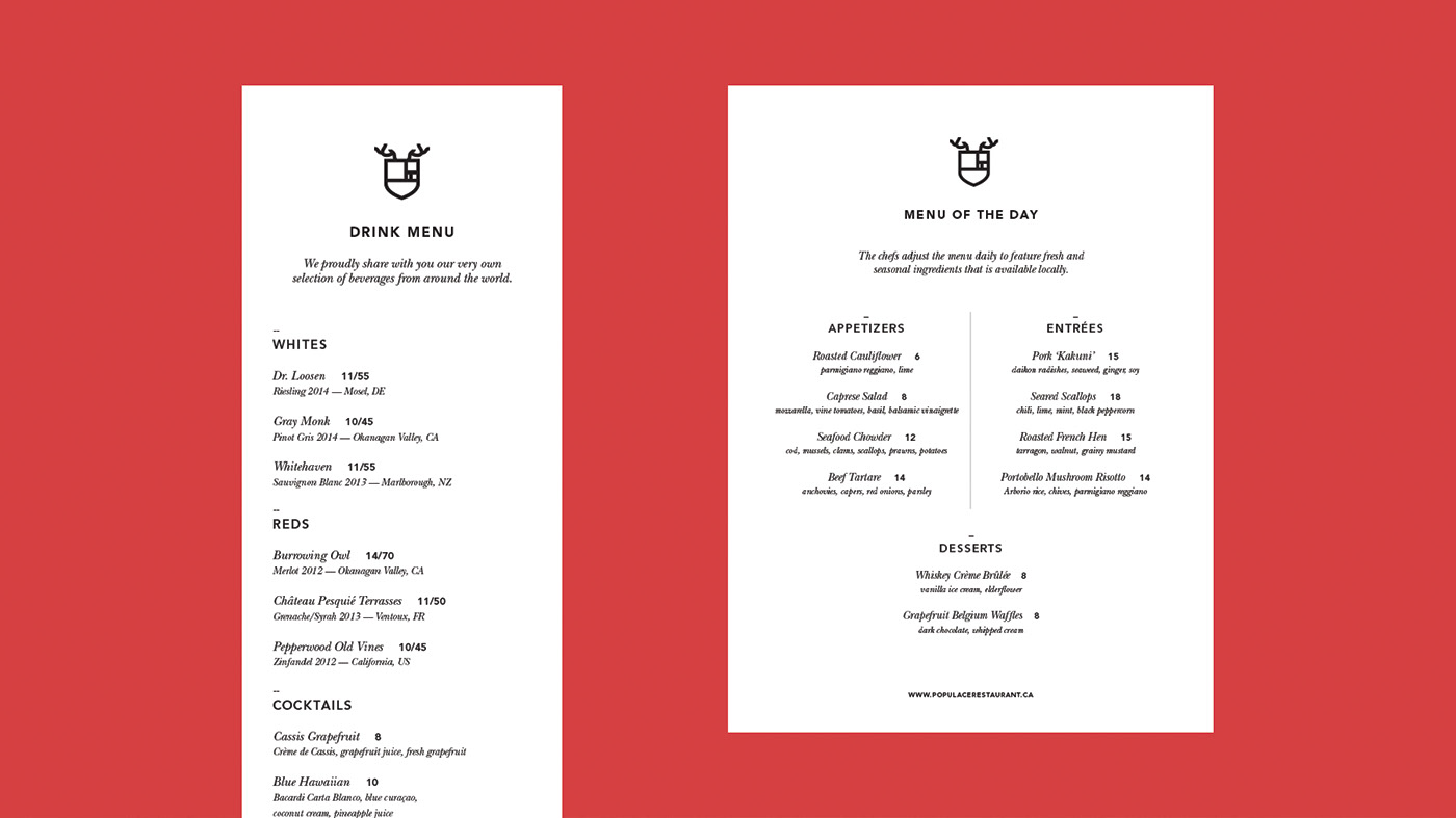
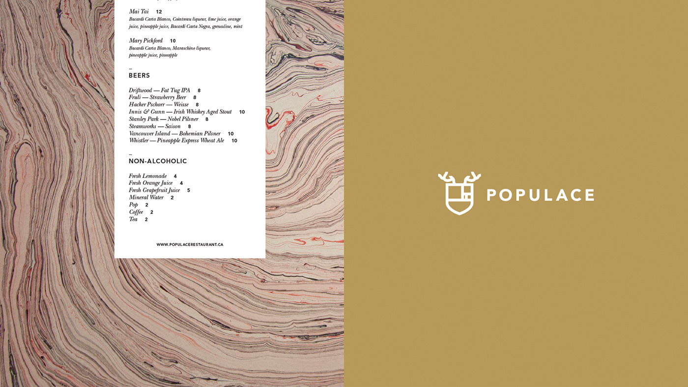
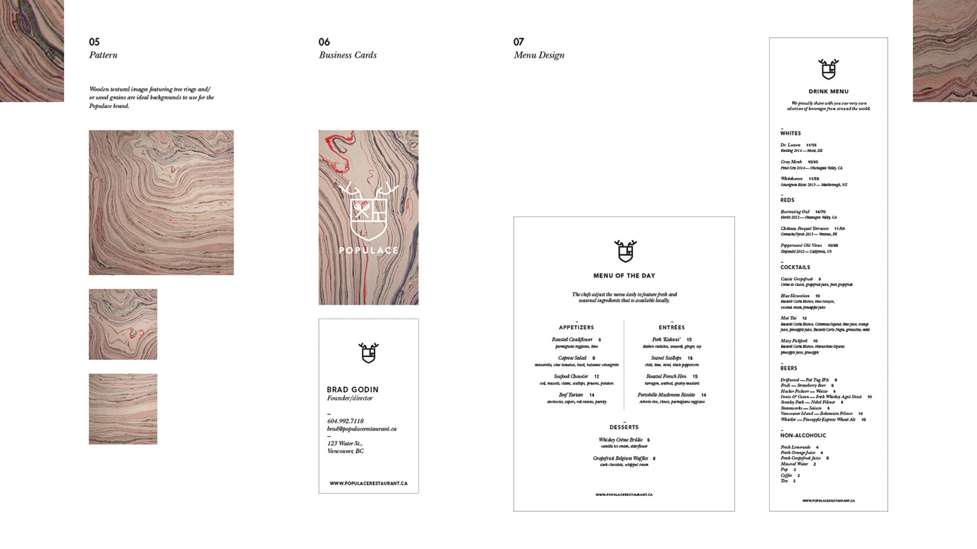
The Populace logo has a strong tie to Nature. It features a crest, with the Golden Mean - a symbol of mathematics in nature - built in. It also wears a pair of antlers on top, to connote the idea of the vast natural resources and wildlife we have in the West Coast. The forks and knifes are to symbolize the dining service it provides. The design is an line-art minimalist logo with Avenir as the main typeface. 


Populace Restaurant
Published:

Owner

Populace Restaurant

Populace, meaning “of common man”, is a non-profit restaurant aimed to open in Vancouver. From the profit earned, Populace aspires to help childr Read More

Published:

Creative Fields