Wolff Architects Rebranding

Wolff Architects is an internationally acclaimed architectural practice having had their work published, exhibited and lectured on, all over the world. Some of their work includes the V&A Watershed, Inkwenkwezi Secondary School, and the Red Location Museum of Struggle. They believe in developing an architectural practice of consequence through the mediums of design, advocacy, research and documentation.
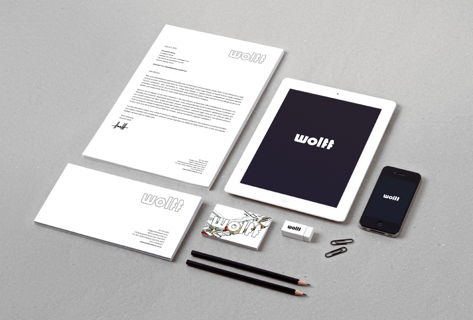
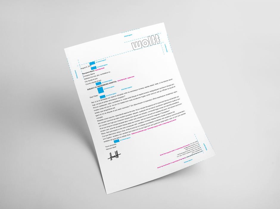
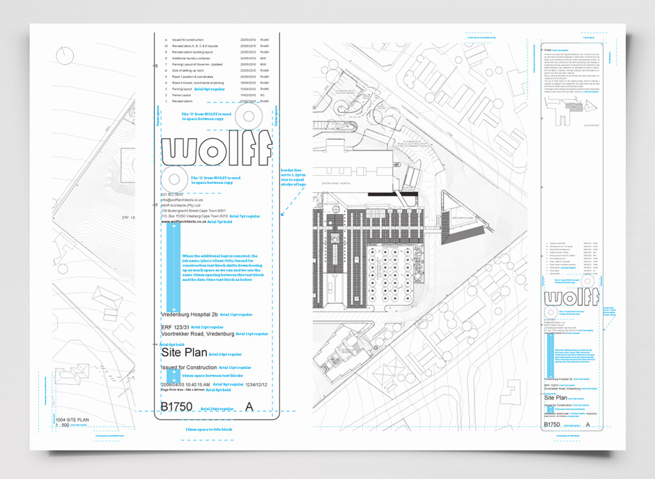
K&i was appointed to rebrand Wolff Architects identity, and create a system, setting up multiple templates for various stationery items, architect title blocks and publication layouts to be used by their in-house team.
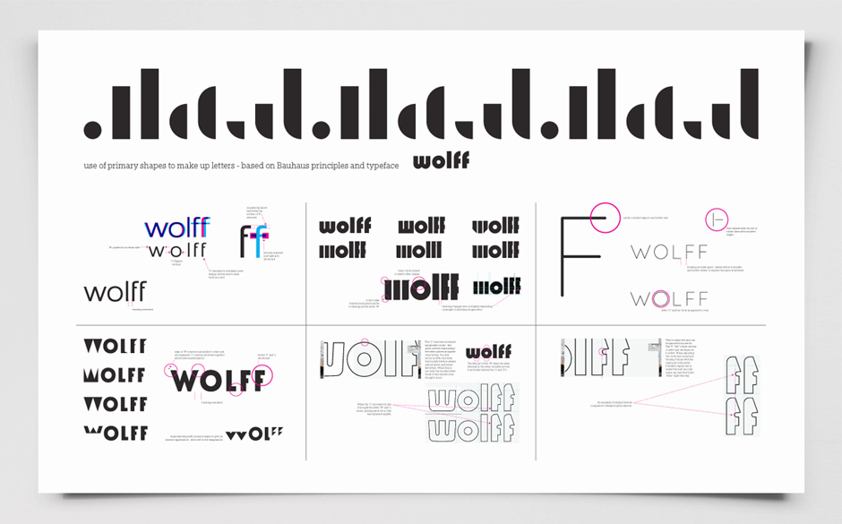
The identity was developed taking inspiration from the Bauhaus period. The individual letters that make up the wordmark are based on Herbert Bayer’s ‘Universal’ typeface. The letters adopt the inherent simple geometric shapes, sans-serif and monotone stroke weights representative of ‘Universal’ and all appear in lower case.
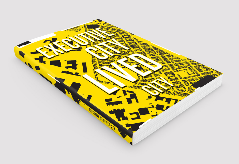
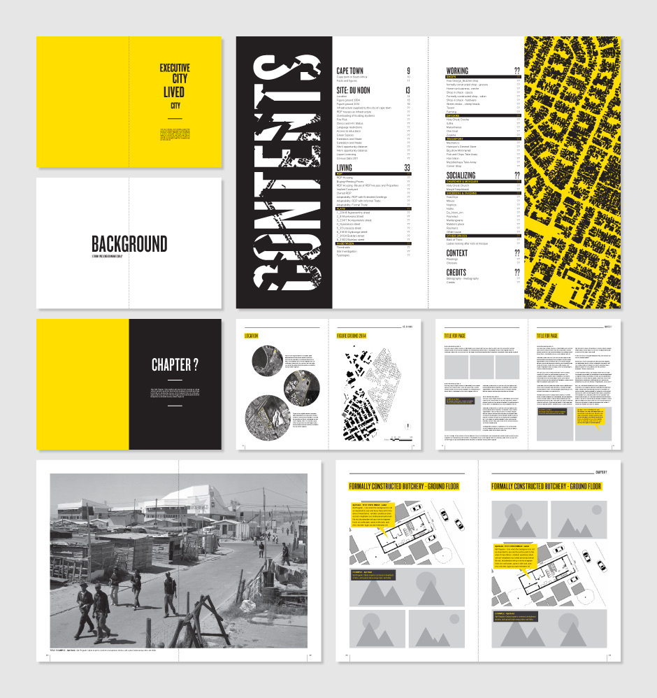
The publication template was created looking at key methods of presenting information in different ways, whether it be large double page spreads for hero shots, or single pages with multiple elements i.e. diagrams or sections of body copy combined with visuals in a two or three column layout. Typeface, colour and composition of elements were defined as well as the final design of the publication cover.