

In the last entry I thought that EXIT4 had its visual identity and branding well and truly established. That was until I gave my logo for critique to my tutor at the beginning of class to get his reaction and suggested feedback.
Although he did like the initial concept such as the reason why I named it ‘EXIT4’ and that the beginnings of the logo was starting to be fleshed out, he reckons that 1 element out of the various in containment of the logo spoke more to him about his perception of EXIT4.
So his focus was more towards the ‘X’ justifying its simplicity and its straight to the point.
And that is where I am with the logo and thankfully that my dream to own a studio in South Auckland is not on the cards yet but in due time it will. So to me it is important to flesh out a visual ident when it comes time to establish the studio.

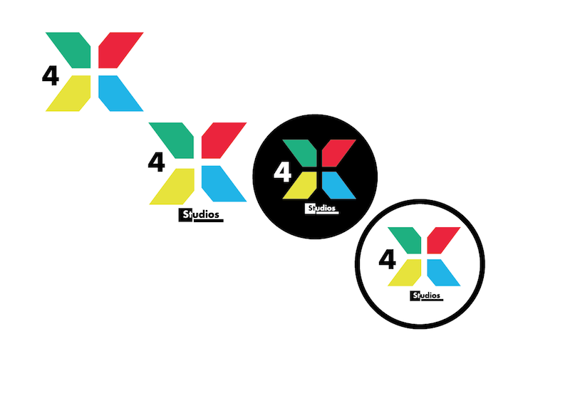
So by looking back at what was the finished article, I decided to have a play around with the X element and also took on the number 4 and the logotype to give me a fair advantage.
And like a badly setup episode of PIMP MY RIDE, I smashed up the shapes and refine the elements choosen.
And like a badly setup episode of PIMP MY RIDE, I smashed up the shapes and refine the elements choosen.

What I wanted to do with the top one play through was to move the 4 down into a quadrant in the vein of how compasses have 4 points denoting North/South/East/West and of course being from the South, I wanted to place it rightfully in the South Bound quadrant.


Its still early days regarding the overall look and feel to the logo......will keep you posted


