
This Wild Adventure Journal Design
For the past few years, I have been chronicling my relationship with God in a series of journals. I always buy the same type of journal and always design some type to go on the front. The idea is that when I open my journal, I want to be inspired by what is on the front. My theme this edition was to focus on the adventure; to always remember that life with Jesus is supposed to be wild and fun and enjoyable. Here you'll find my full creative process for developing this piece.

Hand Rendering
I always start my designs with a sketch of some sort. Here I started by using a brightly colored brush pen to draw out a rough of how I wanted the piece to look. From there I went back with Micron pens and Sharpies to refine and create a white on black image. This step of the process doesn't lead to polished designs, but it does help get my brain moving and making creative decisions. Its a good way to streamline my direction before I throw things into the computer. Often times, I will draw on tracing paper so that I can play with ideas manually, trying new letter styles or arrangements by putting pieces of paper on top of my original and sketching on them.
Though I enjoy all of the design process, I especially love this step. Creating things by hand really makes me come alive and getting the inspiration from my brain to the paper is so satisfying.

Digital Process Work
Next, I place an image of the hand rendered design into Illustrator. Then I begin the process of digitally refining any mistakes I made when composing the piece originally. Or I can use the tools in Illustrator to take the project in a different direction.
Many people will chose to use the Live Trace tool to vectorize their type. As someone who highly values the details, I find this option unacceptable. Live Trace is great for certain purposes, but taking detailed typography and turning it into a vector image is not what it is made for. Instead, what I sometimes do is to use the Pen tool to trace a basic wireframe of the design. From there I use the Width Editor tool to mock out my design and make sure my letter widths are consistent. This is something that is very hard to do by hand and so I always take time to tweak my thicks and thins during this step. I use guidelines to correct any letters that may not be uniform. I don't adhere to the guides super strictly. Sometimes things look better when they break the boundaries, but it serves as a good starting point.

Now I have taken my rough line width drawing and gone back over it with the pen tool. Though it can be tricky to use, it gives me the control I need to get my letters looking exactly as I want them. I generally draw in segments, that way I can move things around and adjust spacing later if need be.

My type is nearly complete! There are just a few small adjustments that need to be made. One problem I come across with digital lettering is that it can feel stiff and unwelcoming. Its cleaner than a hand drawing and it should be, but something about the sharp corners makes it a bit unapproachable. To fix this issue, I will round the corners of the edges on my type. It creates a sublte effect that you may not notice looking at the final piece, but when comparing unrounded to rounded, it become obvious which draws you in more. I also go back and adjust small mistakes I may have made during my Pen tool rendering. I scan each letter meticulously to make sure I don't miss anything. Below are two examples of small adjustments that I have made to clean up the design a bit. Red is process and black outlines are final.

At last the type is done! At this point, I have worked out all the issues I can find and am ready to call it complete. I outline everything, then create it into one final compound shape to make it easy to send to the printers.

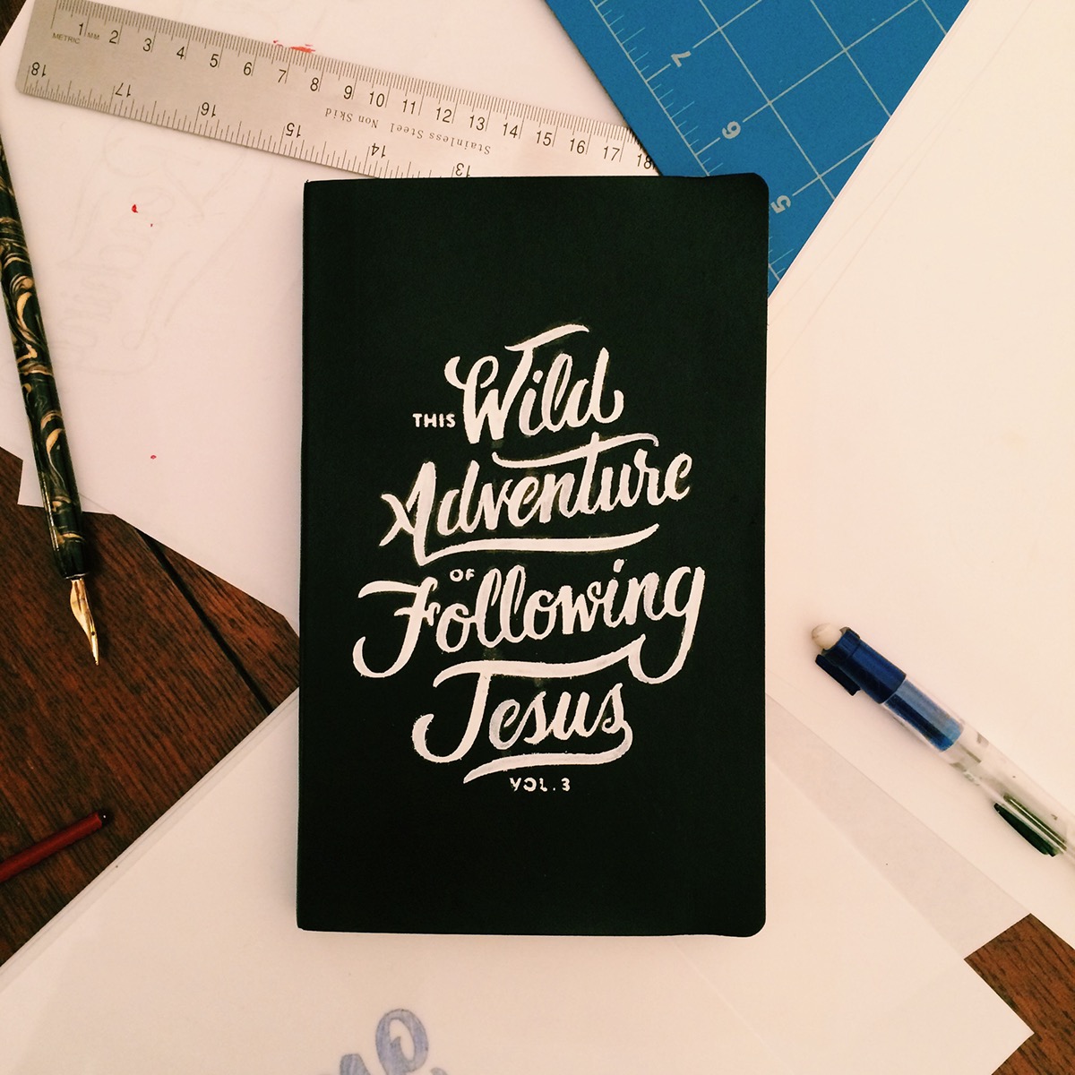
Journal Application
I send my Illustrator file into a local T-shirt shop and have them produce a cut-vinyl sticker of my design. Essentially what this means is that my design is cut out of sticker material, like a stencil, that I can paste onto my journal. Once I have the stencil adhered, I use paint pens to color in the design. I wait a couple of hours, then remove the sticker to find my journal complete!
Thanks for viewing!


